Analytical Tools Clustering
In this article
Clustering
Clustering is an unsupervised machine learning algorithm available in Gathr Analytics to discover themes from unstructured data. Clustering can be done on a column containing text. Clustering is language independent and hence can find themes from multiple languages. Themes discovered from the data can be used to group similar records on the basis of their themes and hence can be used to find similarities or anomalies in the record.
For example, Clustering helps you analyze unstructured data, like Summary of Jira Issues or Commit messages in GitLab or SonarQube.
How to Cluster Data
- Assume that you have fetched issues from Jira.
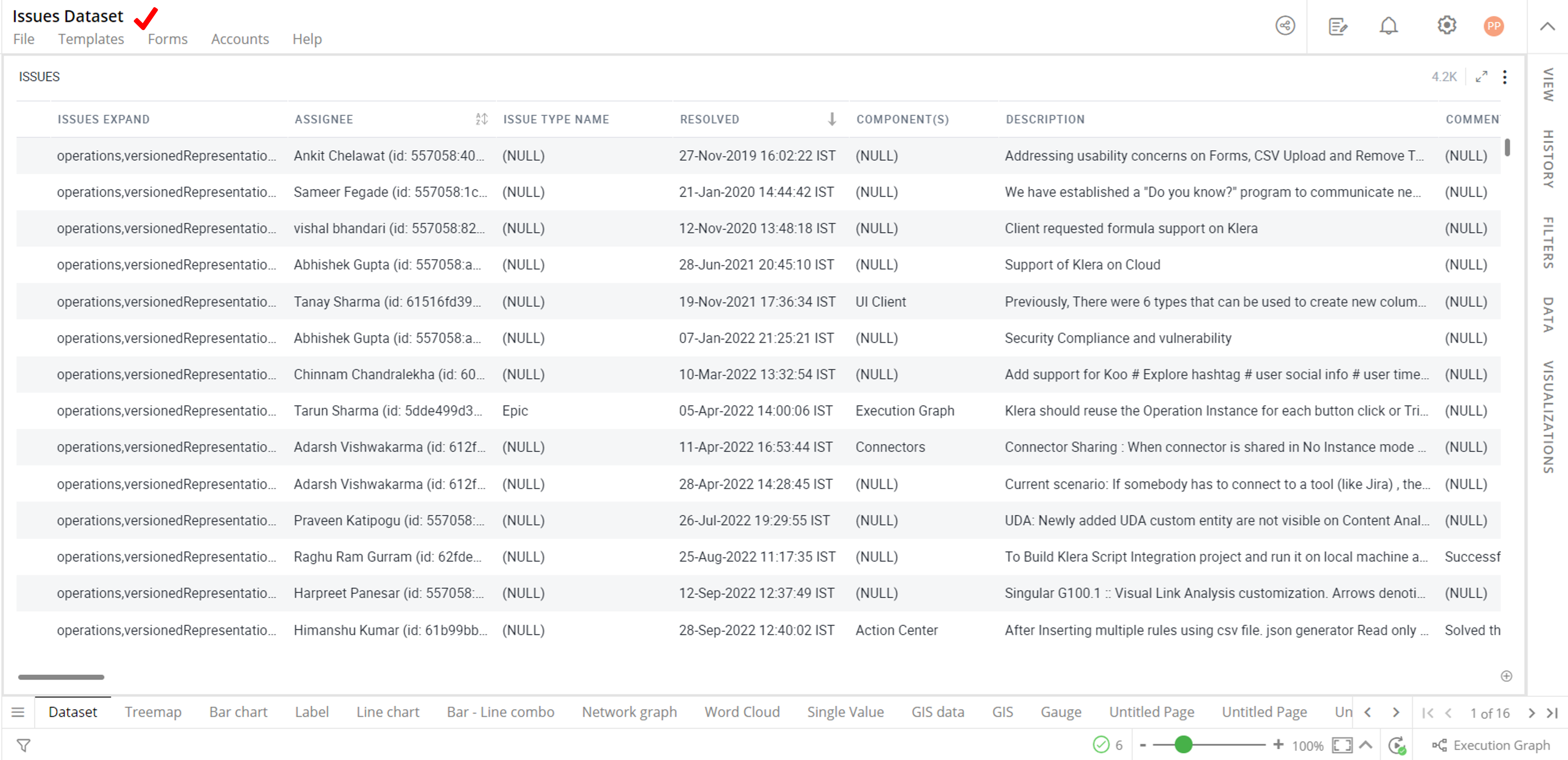
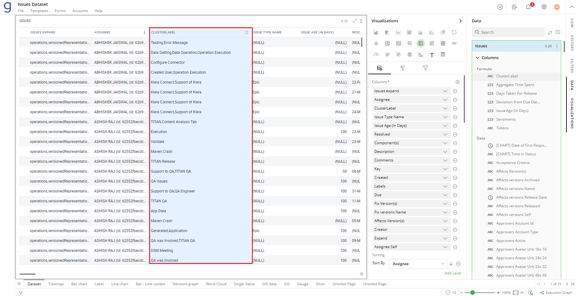
Jira Issues
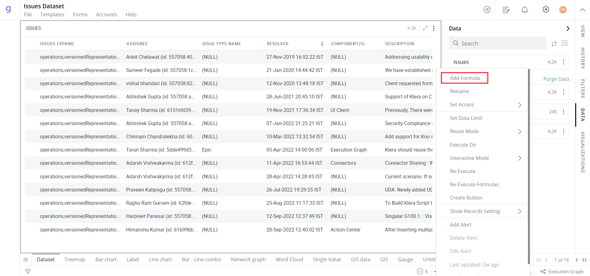
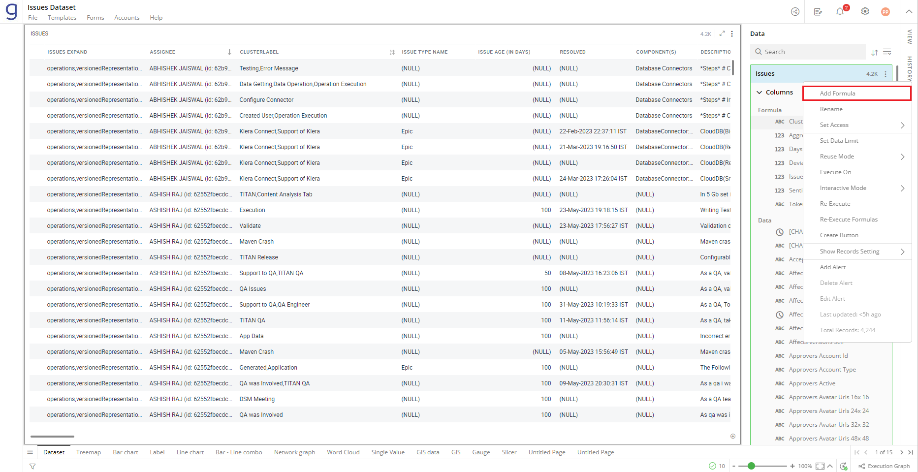
Open the Data Panel and click on this
 icon to select ‘Add Formula’ option as shown in the figure
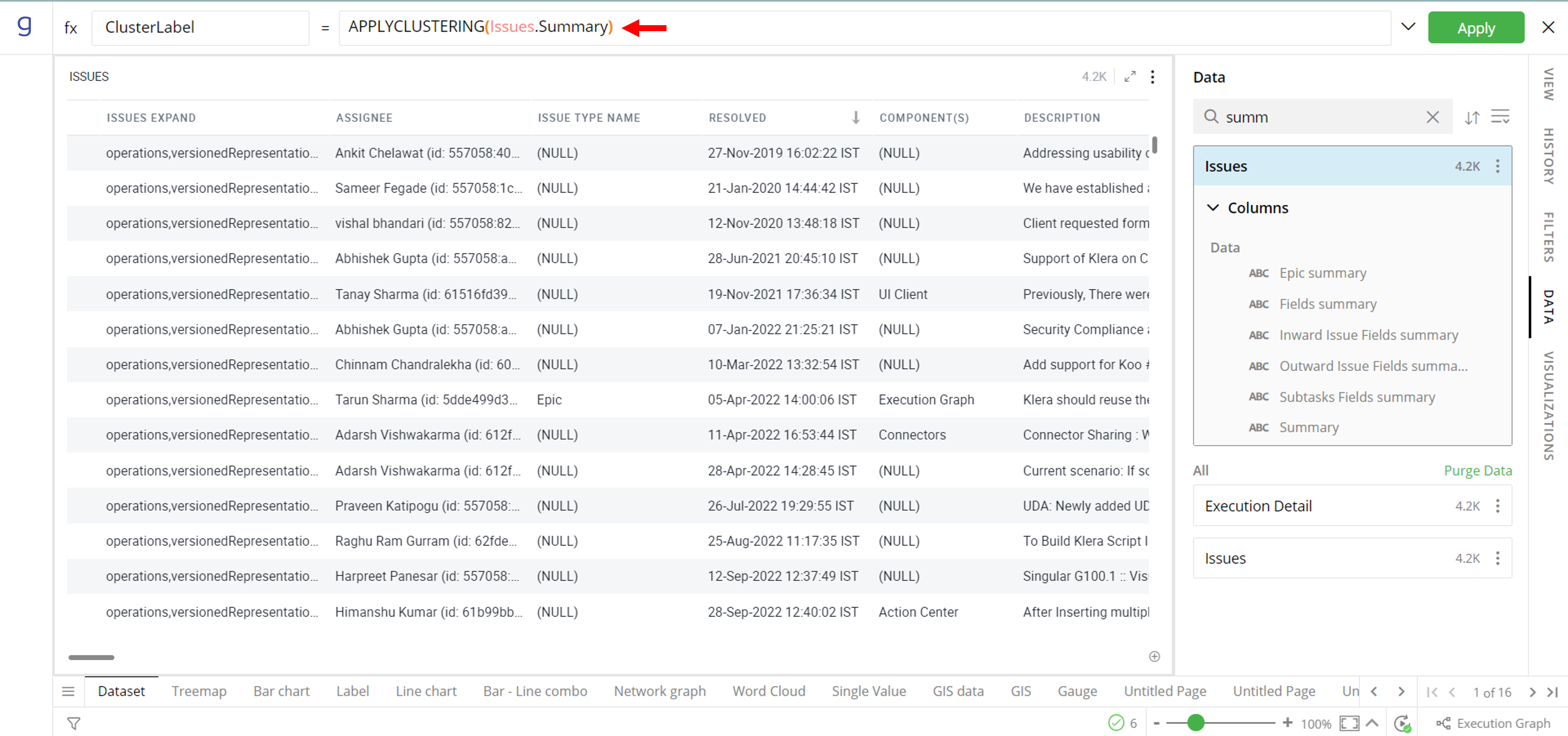
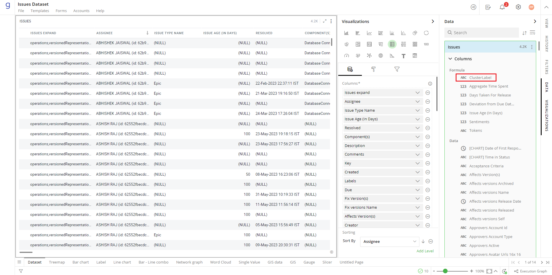
Type “APPLYCLUSTERING” formula and provide the name of the column on which you want to identify themes through clustering.
- Add a Word Cloud visualization on the newly created column “Cluster Label”
- Select any Cluster Label in the word cloud to see related records in the grid and other visualizations.
Sentiment Analysis
Sentiment Analysis is the analysis of unstructured text data to assess the sentiments expressed in the text content. Sentiments in the unstructured data are provided as a rating on a scale of -4 to +4. The sentiment rating of -4 represents very negative sentiment, 0 being neutral and +4 being very positive. Sentiment analysis is Language dependent and Gathr Analytics currently supports English, most European languages and some Asian languages like Hindi.
The demonstration of sentiment analysis in this article is based on the incident data from ServiceNow.
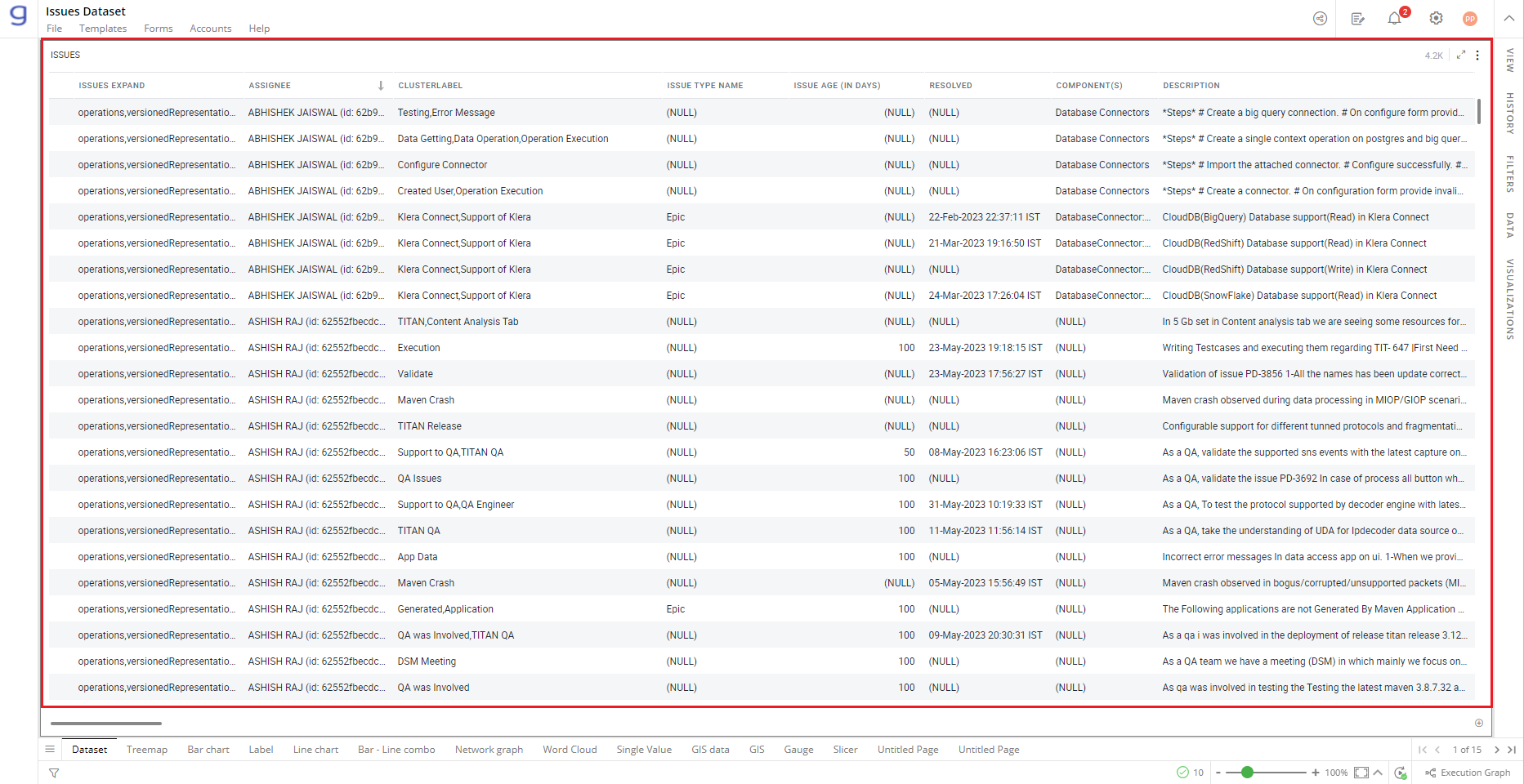
- Fetch incidents data from SNOW.
- Open Data Panel, Click on this
 icon, and select ‘Add Formula’.
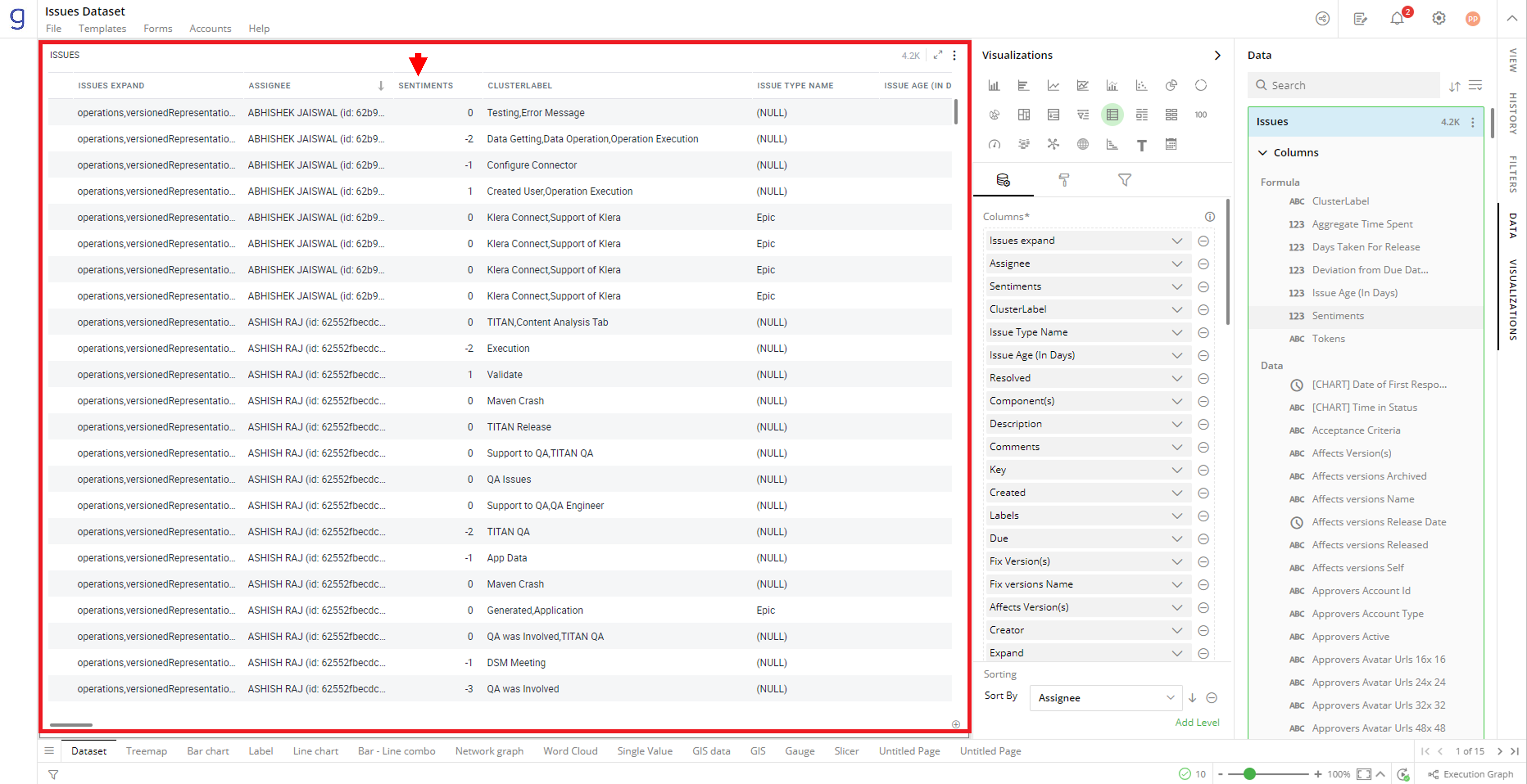
- Apply formula “SENTIMENT” to compute the sentiment score of the description column.

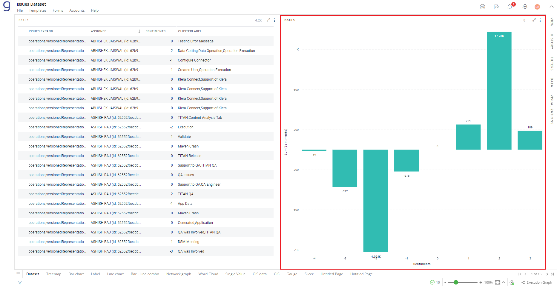
- Add the newly created column to the ‘Incidents’ grid. Please notice the sentiment score in the range of -4 to +4
- You can create various visualizations to gain powerful insights from the sentiment scores. e.g. the bar chart shows the positive, negative, and neutral sentiments, intuitively
If you have any feedback on Gathr documentation, please email us!