Visualization
- How to edit text on an Editable App?
- Hi, Im trying to use conditional formatting using the shape piece. Is there a way NOT to have the circles be different sizes based on score?
- Hi. Is there a way to color the background in the headers for Matrix View?
- I have several gauges that are filtered by teams in the visualization scope filters. I am putting state messages for when there is no data for that team, No data available for blah blah team. I also have pivot chart filters that allow you to filter at a higher level org for those teams.
- In a bar/line graph, is there a way to turn off the label of the line but leave the label of the bar on?
- Is there a way to move the data label off of the marker in a line graph. Currently I only have one value, so maybe it looks different once there are more, but right now it’s hard to see.
- How to work on interactive mode with database Get data?
- How can I enable labels in Network Graph?
- How can I view data quarterly/monthly/weekly on X-axis?
- How is Matrix View useful over normal Grid view?
- How to enable filtering across Dataset for Slicer?
- How to ensure that any selection leads to filtering, and not highlighting, of other related view from same dataset?
- Can I place a blank container to manage the tab area (real estate) of the dashboard?
- How to change background color of a container?
- Difference between Grid View and Pivot View?
- Can I control numeric value’s representation in views like Single Value?
- What is the difference between Bar options – Grouped or Stacked?
- How can I shift decimals places for precisions or rounding off the value?
- How can I add or remove columns in visualization – data configuration?
- How to enable Drill In/Out Breadcrumbs for a view?
- How to enable/disable the ‘Select All’ option in Slicer view?
- How to run a container in interactive mode?
- How to run the existing dataset in Replace mode?
- How can I filter my data on Gathr Analytics?
- What all type of graphs/charts does Gathr Analytics Support?
- Can I put more than 1 KPI in a single chart?
- Does Gathr Analytics support multiple column sorting?
- How to control/alter/change the formatting in a visualization chart/graph?
- How to make charts interactive? (Clicking on one should highlight or filter the other charts)
- How to show filtered chart?
- I don’t have minimum and maximum values in any column but I know what there values are. Can I create a Gauge View by putting those values?
- Can I use any image in my visualizations?
- Can I write any Text only in a visualization?
- Can I copy any visualization?
- How to delete a visualization?
- Can I copy an exploration?
- How to create a similar dashboard for other set of similar data?
- Does Gathr Analytics support conditional formatting for tabular visuals?
- Can I render the content of a website instead of just showing the URL?
- Can I change the column names in the visualization as per my need?
- Can I have interaction between visuals across different tabs/pages in a way that clicking on one in a Page/Tab should filter the other on other Page/Tab?
- What is a Gantt Chart? When to use it?
- Does Gathr Analytics support Scatter Plot Chart?
- Few of my visualizations don’t interact at all if I select any of their values for interactive highlighting or filtration?
- Is there a marketplace where I can get more visualization options to choose from for my dashboarding purpose on Gathr Analytics?
- Can I filter my data across datasets?
- What do the different warning signs mean on containers?
- What are different ways to make the dashboard look more appealing?
- What kind of buttons can I design on Gathr Analytics?
In this article
- How to edit text on an Editable App?
- Hi, Im trying to use conditional formatting using the shape piece. Is there a way NOT to have the circles be different sizes based on score?
- Hi. Is there a way to color the background in the headers for Matrix View?
- I have several gauges that are filtered by teams in the visualization scope filters. I am putting state messages for when there is no data for that team, No data available for blah blah team. I also have pivot chart filters that allow you to filter at a higher level org for those teams.
- In a bar/line graph, is there a way to turn off the label of the line but leave the label of the bar on?
- Is there a way to move the data label off of the marker in a line graph. Currently I only have one value, so maybe it looks different once there are more, but right now it’s hard to see.
- How to work on interactive mode with database Get data?
- How can I enable labels in Network Graph?
- How can I view data quarterly/monthly/weekly on X-axis?
- How is Matrix View useful over normal Grid view?
- How to enable filtering across Dataset for Slicer?
- How to ensure that any selection leads to filtering, and not highlighting, of other related view from same dataset?
- Can I place a blank container to manage the tab area (real estate) of the dashboard?
- How to change background color of a container?
- Difference between Grid View and Pivot View?
- Can I control numeric value’s representation in views like Single Value?
- What is the difference between Bar options – Grouped or Stacked?
- How can I shift decimals places for precisions or rounding off the value?
- How can I add or remove columns in visualization – data configuration?
- How to enable Drill In/Out Breadcrumbs for a view?
- How to enable/disable the ‘Select All’ option in Slicer view?
- How to run a container in interactive mode?
- How to run the existing dataset in Replace mode?
- How can I filter my data on Gathr Analytics?
- What all type of graphs/charts does Gathr Analytics Support?
- Can I put more than 1 KPI in a single chart?
- Does Gathr Analytics support multiple column sorting?
- How to control/alter/change the formatting in a visualization chart/graph?
- How to make charts interactive? (Clicking on one should highlight or filter the other charts)
- How to show filtered chart?
- I don’t have minimum and maximum values in any column but I know what there values are. Can I create a Gauge View by putting those values?
- Can I use any image in my visualizations?
- Can I write any Text only in a visualization?
- Can I copy any visualization?
- How to delete a visualization?
- Can I copy an exploration?
- How to create a similar dashboard for other set of similar data?
- Does Gathr Analytics support conditional formatting for tabular visuals?
- Can I render the content of a website instead of just showing the URL?
- Can I change the column names in the visualization as per my need?
- Can I have interaction between visuals across different tabs/pages in a way that clicking on one in a Page/Tab should filter the other on other Page/Tab?
- What is a Gantt Chart? When to use it?
- Does Gathr Analytics support Scatter Plot Chart?
- Few of my visualizations don’t interact at all if I select any of their values for interactive highlighting or filtration?
- Is there a marketplace where I can get more visualization options to choose from for my dashboarding purpose on Gathr Analytics?
- Can I filter my data across datasets?
- What do the different warning signs mean on containers?
- What are different ways to make the dashboard look more appealing?
- What kind of buttons can I design on Gathr Analytics?
How to edit text on an Editable App?
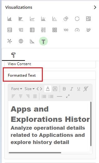
Please follow the below steps to edit text of a container on an Editable app.
- Select the container to be edited
- Click on ‘Visualization’ on the right panel
- Under ‘Visual Configuration’ –> In Formatted Text, user can edit the text as desired.
Hi, Im trying to use conditional formatting using the shape piece. Is there a way NOT to have the circles be different sizes based on score?
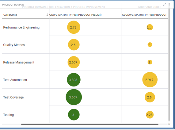
Please note this is the expected behavior of Gathr Analytics for conditional formatting, where the size of the bubble is defined by the value allocated.
Hi. Is there a way to color the background in the headers for Matrix View?
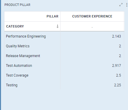
Currently in Gathr Analytics, we do not have the feature to color the background of column headers in Matrix view.
I have several gauges that are filtered by teams in the visualization scope filters. I am putting state messages for when there is no data for that team, No data available for blah blah team. I also have pivot chart filters that allow you to filter at a higher level org for those teams.
When I click on an org level in the pivot chart it then filters team gauges based on that org level. Those teams that do not belong to that org level then turn from a gauge to an empty container with the same error state message No data available for blah blah team. I’d like context filter state error message from the pivot filter to be different (like Data has been filtered out) than the state error message given when the scope filter has no data. I dont think there is a way to differentiate these filtering differences. Any suggestions? and if not can I suggest 2 different state messages for the 2 different types of filtering context and scope.
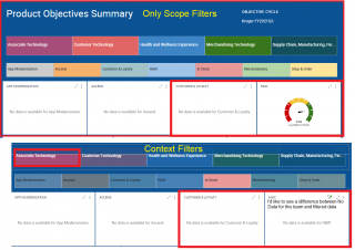
In Gathr Analytics, state messages are shown at the container level and are not filter driven therefore it is not possible to show two different state messages for context and data scope filtering.
In a bar/line graph, is there a way to turn off the label of the line but leave the label of the bar on?
Gathr Analytics does not have the feature to turn off the label individually for Bar/Line graphical representations in the same container.
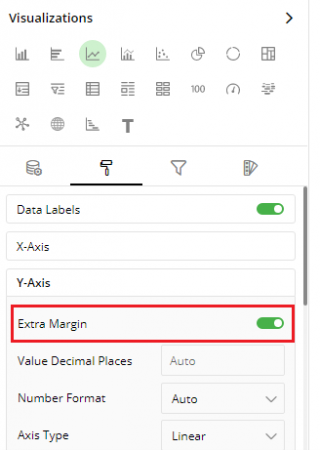
Is there a way to move the data label off of the marker in a line graph. Currently I only have one value, so maybe it looks different once there are more, but right now it’s hard to see.
We can see in the image shared that container does not have space to represent the data labels clearly. We would suggest to enable “Extra Margin” available under Visual Configuration –> Y-axis. Kindly refer to the screenshot attached.
How to work on interactive mode with database Get data?
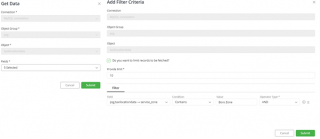
User can fetch the data from database using Gathr Analytics generic Get data operation.
- On successful execution, user will get a view, bring it on the floor.
- Click on 3 dots menu of container and enable interactive mode. Now, if the container/exploration is re-executed, user will get database’s ‘Get Data form’ as we observe in given snippet.
- Object Group: Database
- Object: Table in the given database
- Fields: Table’s column.
- User can add/remove columns by selecting and removing in multi select drop-down.
- User will get another form to filter the criteria. Checkmark the box if we want to limit records to fetched. Also, user can define criteria/condition.
The below Add filter criteria means, Select [5 table columns] from psg.taxilocationdata where service_zone = ‘Boro Zone’ limit 10; Please see, with interactive mode enabled, user cannot change the database and table, they can only select/remove the fields and update the criteria.
How can I enable labels in Network Graph?
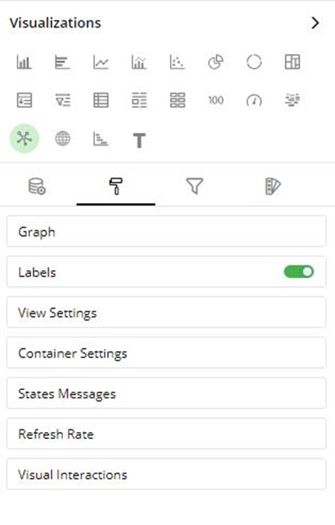
Please select network graph view and go to visualization tab. Click on visual configuration > Go to Labels section and enable the toggle.
How can I view data quarterly/monthly/weekly on X-axis?
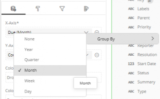
We can configure bar view to show X-axis data as quarterly/monthly/weekly as- Select the container->Data Configuration->click down arrow on X-axis-> Group By-> Month/Week/Year etc.
How is Matrix View useful over normal Grid view?
A matrix chart is a type of tabular visualization that contains aggregated values instead of simple tabular data with duplicate records.
It summarizes a large amount of data on multiple dimensions arranged in rows and columns. Various aggregates can be shown on the intersection of each row and column. This helps you create a cross tabular report, that draws attention to key values.
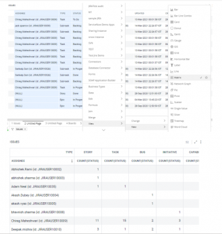
In this example, a Matrix chart is created to analyze assignees and types of issues assigned to them in Jira.
To create a Matrix chart:
- Select the ‘Assignee’, ‘Type’ and ‘Status’ columns while holding the Ctrl key and right-click > Select View> New> Matrix.
How to enable filtering across Dataset for Slicer?
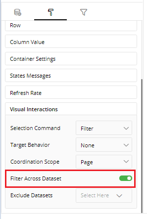
We can enable filtering across datasets in Slicer through Visual Configuration->Visual Interactions-> Enable ‘Filter Across Dataset’.
We can also exclude datasets that we want to exclude getting filtered.
Please refer to the attachment.
How to ensure that any selection leads to filtering, and not highlighting, of other related view from same dataset?
When you select a view element in one visualization, the corresponding data in all the other visualizations either gets filtered or highlighted. This is known as Coordinated Visualization.
It enables you to visually analyze correlated, complex information.
How a visualization should react when selection is done on any other visualization:
Select the visualization on the page.
Open Visualizations Panel, click Visual configuration and scroll down to ‘Visual Interactions’ section.
Open the drop-down list ‘Target Behavior’ to choose one of the following:
a. Highlight: This visualization gets highlighted when other visualizations are selected. b. Filter: It gets filtered when other visualizations are selected. c. None: No action when other visualizations are selected.
How other visualizations should react when you select a visualization:
In Visualizations Panel, click on the drop-down list for ‘Selection Command’ to choose one of the following:
a. Highlight: On the selection of this visualization, other visualizations will get highlighted. b. Filter: On the selection of this visualization, other visualizations will get filtered. c. None: On the selection of this visualization, other visualizations will not react.
Can I place a blank container to manage the tab area (real estate) of the dashboard?
- Select any view > Right-click on it > View > New > Label view.
- You will get a new view, please bring it on the floor.
- Select label view > Go to Visualization tab
- Please go to Text settings, select the font color same as the background you have set for Gathr Analytics
Next, go to container settings, select Header. From drop-down select Hidden.
How to change background color of a container?
- Select the container. Go to the visualization > Visual configurations.
- Please go to container settings > Background.
- You can choose the desire color you want to update.
Difference between Grid View and Pivot View?
Grid visualization is the most basic visualization for displaying data in Gathr Analytics. It is a simple arrangement of rows and columns. It can have duplicate values.
Pivot view is same as a grid view, but it shows only the unique values of all the non-summarized columns.
Consider, we are working in JIRA issue data set and there are columns ‘Assignee’ and ‘Type’ then all unique values of Assignee and Type columns will be shown on the Pivot chart.
Can I control numeric value’s representation in views like Single Value?
A Single value visualization is a single numeric value displaying some key information. This View is particularly helpful when you want to emphasize key data points like maximum sales, total open issues, average resolution time, etc.
- Select the view > Click on visualization tab > Go to visual configuration.
- Select the value option. You can select the number format and choose ‘None’ to see the exact number.
You can also control the numeric value by selecting Auto, Thousands, Millions, Billions, Trillions
What is the difference between Bar options – Grouped or Stacked?
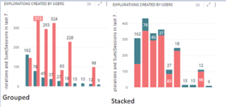
When you more than 1 column in Y-axis, you may to want to get more insight of the data.
If the goal is to show sizes between individual categories, use bar option type grouped. If the goal is to show the total sizes of categories, use a regular stacked bar chart.
Select the view/container and clicking on visualizations tab. Click on visual configurations.
- Bar options > Type
How can I shift decimals places for precisions or rounding off the value?
You can change the decimal precisions by selecting the view/container and clicking on visualizations tab. Click on Visual configurations. Based on your view, flow is as follows: –
- Bar, Horizontal bar, Line, Bar-line combo Date Labels > Value decimal places
- Pie, Donut, Tree Map Label style > Value decimal places
- Pivot, Slicer, Grid Column value > Value decimal places
- Card Column configuration > Value decimal places
- Single Value Value option > Value decimal places
- Gauge Decimal Precision > Value decimal places
How can I add or remove columns in visualization – data configuration?
- Select the required Container, and click on visualizations tab.
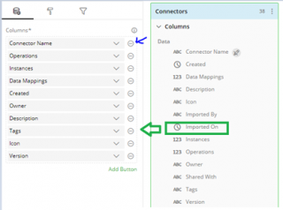
- To remove a column, click on minus icon, highlighted by blue arrow.
- We see that list does not have ‘Imported On’ column.
- To add, drag the ‘Imported On’ from dataset highlighted in green box, and drop it in columns field.
- You can maximum add up to 70 columns.
Please refer the below attachment,
How to enable Drill In/Out Breadcrumbs for a view?
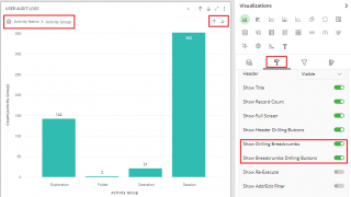
To enable Drill In/Out Breadcrumbs for a view, please select the container. Expand the Visualization Panel> Visual Configuration>Container Settings and enable ‘Show Drilling Breadcrumbs’ option as shown in the attached image.
Also, with ‘Show Breadcrumbs Drilling Buttons’ option, you can show/hide drilling buttons on the view. This option is useful when you have more than one column on the X-axis.
How to enable/disable the ‘Select All’ option in Slicer view?
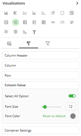
Please follow below steps to enable/disable ‘Select All’ option in Slicer view
- Select the Slicer view container.
- Click on Visualizations panel on the left side.
- Go to Visual Configuration–>Column Value–>Select All Option
How to run a container in interactive mode?
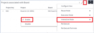
Let’s consider an example, we have a container “Projects associated with Board” of Jira.
When a container is enabled with interactive mode, and re-executed, we get an interactive wizard to select input (Boards in this case) and get associated Projects of selected Boards. We can enable/disable interactive mode for a container as – Click on container’s three dots menu–>Interactive Mode–>Enable/Disable
PFA When interactive mode is enabled, please note:
When Projects container is re-executed, it opens a pop-up window to select Boards for which you want to fetch associated Projects.
When re-execute is done from ‘File’ menu, it re-executes the whole exploration, we get a pop-up window to select Boards to get the associated Projects.
If the exploration is scheduled to run, then while execution it won’t open a pop-up window for user input instead it will execute the operation with the previous input selections.
How to run the existing dataset in Replace mode?
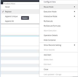
Let’s consider an example, we have an Issues dataset of Jira connector which we want to replace using the new JQL.
- Right-Click on floor–>Jira Instance–>Search issues–>JQL
- It will open a JQL form. Please bring it on the floor.
- Enter your JQL query to fetch Jira issues. Bring the Issues dataset on the floor.
- Click on three dots menu of the Issues container and enable Reuse mode to Replace as shown in attachment.
- Now, if we modify the JQL and hit submit, data in Issues container’s will be replaced by the new data generated by modified JQL.
We can follow same steps for non-form based operations as well.
Consider we have two JIRA datasets Projects and Issues.
- Set reuse mode to Replace for Issues dataset.
- Now, right-click on any project–>Jira instance–>Projects–>Issues
- It will replace data in Issues container with the data of selected project.
How can I filter my data on Gathr Analytics?
- Visualization Level Filters:
Visualization level filters reduce the data of a specific visualization only. Other visualizations, even if they are created on the same dataset, don’t get impacted by the Visualization level filters.
Let’s take an example of a dashboard created to analyze Jira issues with visualization like Work Status (Bar Chart).
Apply Visualization Level Filters
To show the issues where status is “Open” in a Bar chart, you can apply Visualization level filters as shown below.
- Select the Bar chart ‘Work Status’, and open ‘Visualizations’ Panel (Data Panel opens automatically with it.)
- Click on the filter icon to go to “Visualization Level Filters” tab.
- Drag the “Status” column from Data Panel and drop it on the Visualizations Panel’s “Data Scope Filters” section.
- Select the filter criteria “Is equal to” from the drop-down list.
- Type-in “Open” in the next field.
- You can specify multiple values (comma separated) in this field. For example, if you type-in “Open, In Progress” then rows where status is equal to “Open” or “In Progress” will be shown in the Bar chart.
- Dataset Level Filters
A dataset level filter is applied to the entire Exploration, i.e. across all pages and visualizations. It reduces the underlying data. And, thus impacts all the visualizations created on that dataset, even if they are spread across multiple pages.
Dataset level filters can be applied in two ways:
- Keep Only and Exclude
- Filters Panel
Keep Only and Exclude
When you select view elements (e.g. Slices of a Pie chart or point on a Line chart etc.), a pop-up menu will appear, to Keep Only or Exclude the selected values. If you click on Keep Only then the selected values will be retained in the dataset (all the other values will be filtered out). When you click on Exclude then the selected values will be filtered out. Visualizations will get updated with the values remaining in the dataset.
Filters Panel
The Filters Panel will list all the fields of datasets present on the current page, irrespective of the visualizations on that page. Hence, you can apply filters on the fields that are not even shown in any visualization on that page.
You can apply filters according to the data type of the fields:
Text fields: You can perform free-text filters by providing comma-separated values and Gathr Analytics will apply the “Contains” filter for all these values.
Number & Date-Time fields: You can filter by a range of values by providing the minimum and maximum values.
What all type of graphs/charts does Gathr Analytics Support?
Currently, Gathr Analytics supports 21 types of graph/chart. More and more types are added based on requests. Following are there types:
- Vertical Bar
- Horizontal Bar
- Line
- Bar and Line
- Scatter
- Pie
- Donut
- Tree Map
- Pivot
- Normal Grid
- Card
- Single Value
- Gauge
- Word Cloud
- Network Graph
- GIS
- Gantt
- Label
- Matrix
- Button
- Slicer
To know more about the creation of graphs/charts, kindly click here
Can I put more than 1 KPI in a single chart?
- Add a Computed Column
Suppose that you have a sample dataset that contains all the sales data for a chain of stores. This dataset has a column called Price, which is the purchase price to the retailer. To calculate the sales prices with 15% profit for each product, you can create a computed column called ‘Selling Price’ that contains the following formula:
- Selling Price=Price + Price * 0.15
The value of price will be taken from the corresponding row of the ‘Price’ column. To add this new computed column based on the above formula, follow the steps mentioned below.
Step 1: Open Data Panel. Under ‘Current Page’, click on the Overflow Menu for your dataset. Select ‘Add Formula’.
Step 2: Write the expression in the formula editor.
In the formula editor, on the left of ‘=’ sign, you can name new computed column. Type Selling Price.
To the right of ‘=’ sign, you can write your formula. Type the name of the dataset or column in the expression (price- in this example). As you start typing, you will be suggested the available datasets and columns in this format “.”. Select the appropriate column from the list.
Alternatively, you can also select the column from Data Panel by clicking on the column name. Complete the expression using mathematical operations.
Step 3: When finished, click on right.png icon to add a computed column to your dataset. You might get errors for any incomplete arithmetic expressions. Correct the errors and click right.png icon.
Step 4: Add business type to the newly created column. if business types are defined on the columns present in the formula/function, Gathr Analytics will provide the suggestions. Select business type(s) from the suggested options and click Ok.
The new computed column “Selling Price” is saved to your dataset and can be used to create more calculated columns and visualizations.
Step 5: Add this column to your visualization
Does Gathr Analytics support multiple column sorting?
Yes, multiple column sorting is supported on Gathr Analytics with the logic of nesting sorted columns in the order of hierarchy decided by the author. It can be understood to be same as that in Excel. The option is at the bottom of Visualization Panel while a container is selected. You may add and re-arrange the columns for sorting in that container.
How to control/alter/change the formatting in a visualization chart/graph?
- Container Level Configurations
Click on three dots menu icon at the top-right corner of a container, for overflow menu.
- Configure View
Click to configure the visualization (e.g. Pie, Bar, Line etc.) of this container.
- Reuse Mode
Reuse mode of a container defines if this container can receive the data generated by another operation.
Different reuse modes are:
Never: In Never mode, the container will not store the data generated by the new operation.
Replace: In Replace mode, container’s data will be replaced by the new data generated by any operation. New Data must be of the same DST (Data Set Type)
Append Unique: This mode will ensure that the new data will get Appended to the existing records
Append All: This mode will ensure that the new data will get Appended to the existing records e.g. if a new record with the primary key of an existing record is inserted then both old and new records are retained.
Execution Mode
The execution mode of a container defines when operation(s) in this container should be re-run, depending upon the previous operation in the series.
- On Operation Complete: The operation(s) of the container will be re-run only when the previous operation is complete.
- On Data Update: The operation(s) of the container are re-run on every data update of the previous operation.
- On Interval: The operation(s) of the container are re-run on a regular interval. Re-Execute
Use this option to manually re-run the operations of the container. It will re-run the complete chain of operations, starting from this container onwards.
- Re-Execute Interactively
When you want to change the values of input parameters at the time of re-run, then click on “Re-Execute Interactively” option.
- Operation Details
Shows the details of the operation(s) of this container. Details include Operation Name, User who ran the operation, Parameters etc.
- Add/Edit/Delete Alert
You can raise an alert when a certain data threshold is breached.
- Close
This will permanently delete the container and its visualization(s). Please note that this option does not delete the data and its associated operations from the Exploration.
How to make charts interactive? (Clicking on one should highlight or filter the other charts)
- Customize Coordinated Visualization
When you select a view element in one visualization, the corresponding data in all the other visualizations either gets filtered or highlighted. This is known as Coordinated Visualization.
Each visualization has a default reaction (Highlighting or Filtering) when selection is done on other visualizations. Similarly, each visualization, on its own selection, sends a default command to other visualizations to react (Highlight or Filter) accordingly.
How a visualization should react when selection is done on any other visualization:
- Select the visualization on the page.
- Open Visualizations Panel, go to Visual Configuration and scroll down to ‘Visual Interactions’ section.
- Open the drop-down list ‘Target Behavior’ to choose one of the following: a. Highlight: This visualization gets highlighted when other visualizations are selected. b. Filter: It gets filtered when other visualizations are selected. c. None: No action when other visualizations are selected.
How other visualizations should react when you select a visualization:
In Visualizations Panel, click on the drop-down list for ‘Selection Command’ to choose one of the following:
a. Highlight: On the selection of this visualization, other visualizations will get highlighted. b. Filter: On the selection of this visualization, other visualizations will get filtered. c. None: On the selection of this visualization, other visualizations will not react.
Coordination Scope
- Click on the drop-down list for ‘Coordination Scope’ and choose one of the following: a. Page: On the selection of this visualization, the other visualizations on the current page will show coordinated highlighting/filtering. b. Exploration: On the selection of this visualization, all the visualizations in the Exploration will show coordinated highlighting/filtering.
How to show filtered chart?
Filtering is the method of reducing your data while analyzing it. To filter, you need to specify the criteria for eliminating or retaining data. As data is filtered, all the visualizations created on it get updated immediately.
Let us look at the various types of filters available in Gathr Analytics:
- Visualization level filter Visualization level filters allow you to filter data only in a specific visualization. These filters don’t reduce the underlying data. Hence, other visualizations created on the same dataset do not get impacted. When you select a view element in one visualization, the corresponding data in all the other visualizations either gets filtered or highlighted. It enables you to visually analyze correlated, complex information. Consider, you have pie chart. Select any part of the sector, its associated data/view will be filtered out.
You can apply more than 1 filter, by clicking on sector of Pie chart of container A, press and hold CTRL key and select Bar graph of container B.
- Data scope filter
Select the Bar view, and open ‘Visualizations’ Panel (Data Panel opens automatically with it.)
- Click on the funnel icon to go to “Visualization Level Filters” tab.
- Drag the column from Data Panel and drop it on the Visualizations Panel’s “Data Scope Filters” section.
- Select the filter criteria from the drop-down list.
- You can specify multiple values (comma separated) in this field. For example, if you type-in “Open, In Progress” then rows where status is equal to “Open” or “In Progress” will be shown in the view.
- Dataset Level Filters: Keep only / Exclude filter
When you select view elements (e.g. Slices of a Pie chart or point on a Line chart etc.), a pop-up menu will appear, to Keep Only or Exclude the selected values.
If you click on Keep Only then the selected values will be retained in the dataset (all the other values will be filtered out).
When you click on Exclude then the selected values will be filtered out. Visualizations will get updated with the values remaining in the dataset.
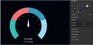
I don’t have minimum and maximum values in any column but I know what there values are. Can I create a Gauge View by putting those values?
Yes, This could be done by going to the Visual Configuration .
- Select the view > Visualization > Visual configuration.
- Chose Gauge Axis, enter Minimum and Maximum values manually to be used in Gauge View. Shown in the attachment.
Can I use any image in my visualizations?
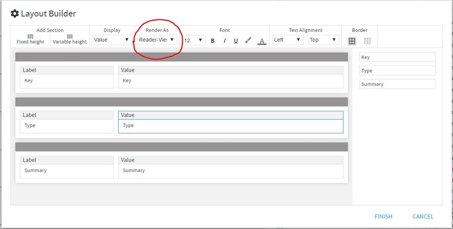
Yes, images can be used in visualization, but, not in all visualizations. “Label View”, “Card View” and “Button View” can make use of image. For Card View, we can use Image URLs and render those as Reader View in the Layout Builder.
Can I write any Text only in a visualization?
Yes, Texts can be added in “Label” & “Button” views.
Can I copy any visualization?
Visualization can be copied the same way by which a New Visualization is created from an existing visualization.
The only point is, create the same visualization/chart as the existing one and the New View would be the same as previous view with same formatting and scope filter.
The 3 methods to create new visualizations are as follows:
Method 1: Create a new visualization from an existing one.
- Right-click on an existing visualization.
- From context menu go to View > New option. You will see a list of available visualizations.
- Select the visualization from the list.
- This will create a new visualization, which will be available in the View Panel.
- You can bring it either on the same page or a new page from the View Panel.
Method 2: Create a new visualization from the data available in the Data Panel.
- Open the ‘Data’ Panel.
- Select the columns in the dataset you want to create a visualization on.
- Select the desired columns. You can select multiple columns by holding the Shift key. To select non-adjacent columns, hold the Ctrl key.
- Drag and drop the selected columns on the page.
- A new Grid will be created.
Method 3:
- Right-click on the visualization and go to View > Change.
- Select the desired visualization from the menu options.
How to delete a visualization?
A visualization/chart can be deleted by either of the 2 ways:
- Go to Container Menu Option and select – Close
- Select the container and hit the Delete Key on your key board
Can I copy an exploration?
With new nomenclature Exploration is now called as an ‘Editable App’. Editable App can be copied in 2 ways:-
- Go to File Menu of the Editable App which you want to Copy and select “Create Copy”. This method is useful in copying the exploration in the same Gathr Analytics Instance.
- Go to File Menu of the Editable App which you want to Copy, navigate to “Download As” and Select “Editable App(.expl)” This downloads the Editable App on your system, and it can be then uploaded from Gathr Analytics home. Go to “Upload icon” and select Editable App to browse, and chose Editable App.
Please note, the uploaded Editable App will show data points similar to the Editable App when it was downloaded. If you now need to refresh the Editable App, then make sure the connectors for the connected systems are same/have same operations as used in the original Editable App and configured correctly.
Best practice to reuse an exploration for your set of similar data is by creating and using templates.
How to create a similar dashboard for other set of similar data?
The best way to do is by creating and making use of Templates.
A template is like a MACRO which is the complete operations saved chronologically to render the same result (operations+data+formula+visualizations) when run on similar data set.
To learn how to create and use templates. You can save your Dashboard in the form of a reusable Template.
- In the menu bar, click on Templates > New Template. A form will pop-up on your screen
You need to provide the following inputs:
- Template Name- Provide a name for your Template.
- Description- A summary about the purpose, and business value of the Template.
- Tags – Add relevant tags. These tags can be used to search for a Template.
- Pages to save: Select the pages of your Exploration to be included in the Template:
- All
- Current Page
- Specify the page numbers to be included in the Template. (Press Shift key to select range of pages). You can include only continuous pages.
- Discovery On: Each Exploration has an execution graph which is a series of operations that generate a series of datasets. The datasets from where the execution graph starts are called root datasets. You can choose any one of the root datasets for Discovery On field.
How is it useful: After creating a Template with this setting, whenever an operation generates the same type of data, Gathr Analytics will discover this Template as a result, in the View Panel. You can run this Template from the View Panel. Refer here to learn more about how to run a Template.
- Register as Operation:
Select “Register as Operation” option to create a Template that can be run from the “Explore Here” box in the product header. You can also run this Template from the context-sensitive menu under the “Template” option.
- Include Story
Select the “Include Story” option to save the Story along with the Template. All the Story Points present on selected pages will be included in the Template. 3. Click on Save and your Dashboard will be saved as a Template.
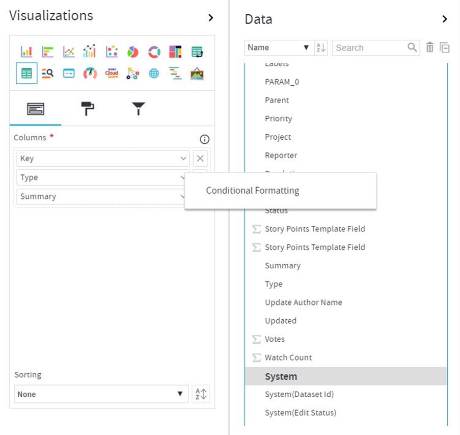
Does Gathr Analytics support conditional formatting for tabular visuals?
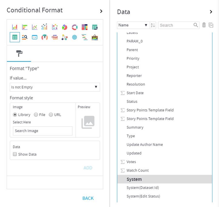
Yes, Gathr Analytics provides conditional formatting options in its Grid View (Tabular View).
You can select the container, go to Visualization Panel and see which columns have been used in it. Just beside the column names, you get a drop-down arrow which, if clicked, shows Conditional Formatting.
Once clicked, you get options to put certain images (Use Default or Upload through your system/URL). Refer to the images below
Can I render the content of a website instead of just showing the URL?
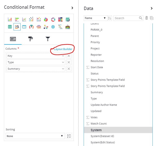
It can be achieved in the “Card View.” You can create a card view of the desired columns. Now select the Layout Builder as shown in image. Once clicked, it opens up a Pop-Up form of Layout builder where hover to the column which contains the URL of the images.
Select Render As – Reader View. The image/video will come up as seen in the web browser. You can even play videos from here.
Images below:
Can I change the column names in the visualization as per my need?
Yes, you may change the column names as per your wish by simply moving to Visualization Panel while a container is selected and clicking on the column name there which you want to change. Rename it and it will render as the new name in the container selected. To know which is the actual name of the column used in a container, just hover the mouse pointer over the column name in the Visualization Panel and the actual name will show up in tool-tip.
Can I have interaction between visuals across different tabs/pages in a way that clicking on one in a Page/Tab should filter the other on other Page/Tab?
Yes, this can be achieved through coordinated visuals (which should either be from same data set or the columns used in the same axis should be of same Business Type). When you select a view element in one visualization, the corresponding data in all the other visualizations either gets filtered or highlighted. This is known as Coordinated Visualization. It enables you to visually analyze correlated, complex information. Each visualization has a default reaction (Highlighting or Filtering) when selection is done on other visualizations. Similarly, each visualization, on its own selection, sends a default command to other visualizations to react (Highlight or Filter) accordingly. You can customize this default behavior of a visualization.
How a visualization should react when selection is done on any other visualization:
- Select the visualization on the page.
- Open Visualizations Panel, click on Visual Configuration and scroll down to ‘Visual Interactions’ section.
- Open the drop-down list ‘Target Behavior’ to choose one of the following: a. Highlight: This visualization gets highlighted when other visualizations are selected. b. Filter: It gets filtered when other visualizations are selected. c. None: No action when other visualizations are selected.
How other visualizations should react when you select a visualization:
In Visualizations Panel, click on the drop-down list for ‘Selection Command’ to choose one of the following: a. Highlight: On the selection of this visualization, other visualizations will get highlighted. b. Filter: On the selection of this visualization, other visualizations will get filtered. c. None: On the selection of this visualization, other visualizations will not react.
- Coordination Scope
Click on the drop-down list for ‘Coordination Scope’ and choose one of the following: a. Page: On the selection of this visualization, the other visualizations on the current page will show coordinated highlighting/filtering. b. Exploration: On the selection of this visualization, all the visualizations in the Exploration will show coordinated highlighting/filtering
What is a Gantt Chart? When to use it?
It is type of bar chart with schedules/time periods upon the identified parameters.
For Example, You can trace the schedules of the Issues within a Project to see their progress.
You need to put in the elements for which time is to be seen in the Task pane of Visualization and then provide Start Time/End Time/Duration Columns in the other panes. You may also Color By for another KPI.
Its best used to see the progress of your work items and get alarmed whether things seem to be completing in time or not.
Does Gathr Analytics support Scatter Plot Chart?
Yes, it’s available.
Few of my visualizations don’t interact at all if I select any of their values for interactive highlighting or filtration?
Visuals only interact in either of the 2 conditions:
- If they are from the same data set
- If the visuals make use of data of the same Business type
Each column of a DST has a property that defines what type of data (Number, Text, Date etc.) can be stored in the column. This is called the ‘Basic Type’ of the column. Gathr Analytics user can assign an additional Business Type (BST) to a column. The BST of a column defines the business meaning of the column. Gathr Analytics understands that though the columns are different, yet their business meaning is the same.
For example, “Assignee” and “Reporter” columns in “Issues” dataset, are different columns but can have a common business type to indicate that both are Jira User Ids.
Note: Context Sensitive Menu shows the operations based on both business type as well as basic type of the selected columns
In a nutshell, each Exploration can have multiple operations. Each operation generates datasets. Each dataset may be visualized in a variety of ways. And, these visualizations may be placed across multiple pages.
Is there a marketplace where I can get more visualization options to choose from for my dashboarding purpose on Gathr Analytics?
Currently, the visualization options available on UI are the only visuals supported by Gathr Analytics.
Can I filter my data across datasets?
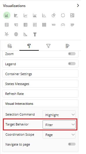
Yes, you can enable filtering across datasets with the below steps:
- Select the required container and navigate to Visual Configuration->Visual Interactions.
- Select ‘Target Behavior’ to Filter.
Please refer to the attachment.
What do the different warning signs mean on containers?
- If an operation fails on Gathr Analytics, you will find the below error icons on the top right corner of the container.

- Also, you can select the history tab and type “Fail” to get all the operations which are failing. When you expand that operation and hover over (!) you will the get the error message.
- We can also click on the three dots menu to get the operation details and the error description.
What are different ways to make the dashboard look more appealing?
There are multiple features provided by Gathr Analytics using which you can make your dashboards look more appealing
- Gathr Analytics Theme and Background Color of Gathr Analytics – At the top right of Gathr Analytics Screen
- Play with Container Colors, Background Color, Headers Visibility withing Containers using the Container Settings inside Visualization Panel
- Using Images, Text, or Formatted Text in the Label View
- Conditional Formatting of the values in the visualization panel by clicking on the extreme right dropdown of the data field and selecting Conditional Formatting
There can be other features for different views which are found in the Visualization Panel. These features can be used to enhance the look of the dashboards.
What kind of buttons can I design on Gathr Analytics?
Gathr Analytics supports Button functionality from version Gathr Analytics-SDLC 4.4.x. This is a very power feature where you can perform various tasks in an automated way and can help to you builds apps and templates which will navigate users from tab to tab.You can create button in followings ways:
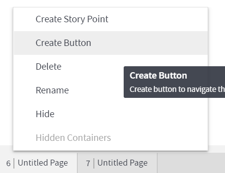
- Tab navigation buttons : You can create a button to navigate to a specific tab. These buttons are helpful for you to build a dashboard from where user can navigate directly to the tab having their data. Right click on any tab, choose Create button.
- Dataset Re-execute button
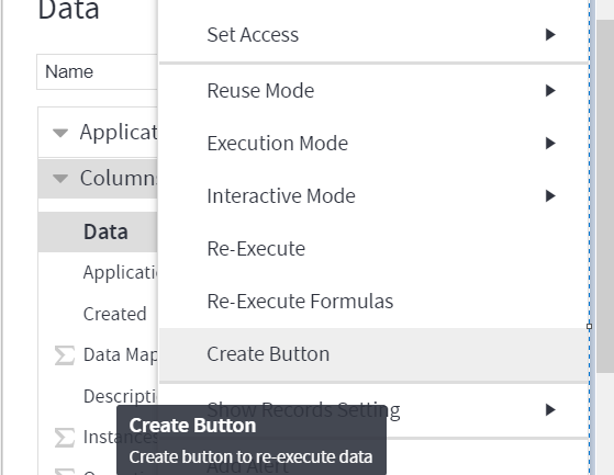
These buttons will allow user to create an app where they want end-users to click on a button and re-execute any specific dataset. These buttons are helpful where you want app user to reload any specific dataset instead of complete App re-execution. Expand the Data Panel, click on the 3 dots of dataset and choose Create Button.
- Operation Level Button.
These buttons allows authors to execute any specific operation on a button click. You can create a button for any operation either Floor or Contextual. For the contextual button, you can also add button against each record in the Grid view and that operation will execute only for that row.
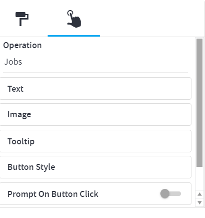
Below example show the process of creating button for Jenkins -> Jobs floor level operation.

Please note that, you can create button for Column Level, Container Level or Row Level. Once you have button created on Gathr Analytics, you can design the Font color, background color etc by selecting the button container and open the Data Panel and design button as per requirement.
If you have any feedback on Gathr documentation, please email us!