Card Visualization
Card visualization is the most versatile data visualization Gathr Analytics offers for visualizing non-aggregated data. It lets you render multimedia data as well as text in a variety of customized formats.
Card visualization represents records as a sequence of cards, hence each card represents a record. Cards are custom designed by the author. The author can design the look, feel, behavior, position, and layout of each field within the card.
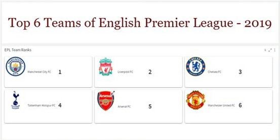

The example below demonstrates the analysis of Issuesdata with Card visualization.
To create Card visualization:
- Select the desired field(s) and right-click > Select View > Change > Card.
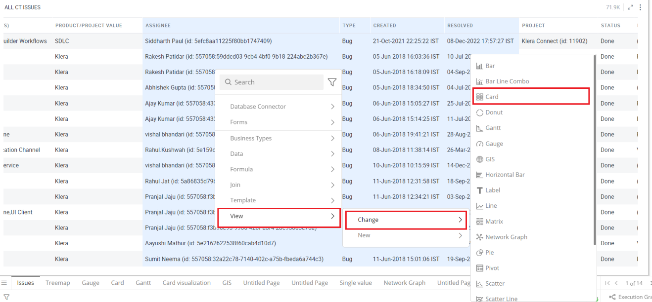
Refer here to learn more about creating a visualization.
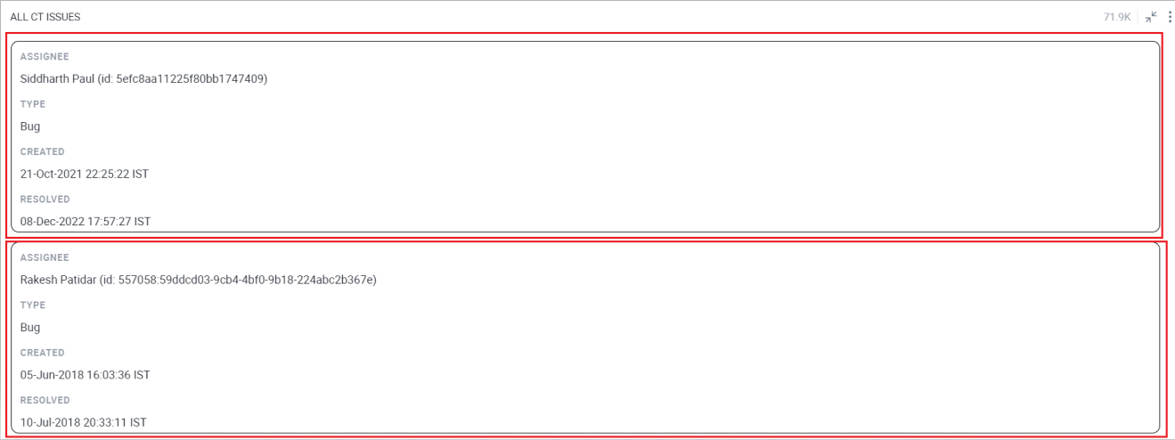
The following image shows the resulting Card visualization.
Configure Card Visualization
To configure:
- Select your Card Visualization and open the Visualizations Panel.
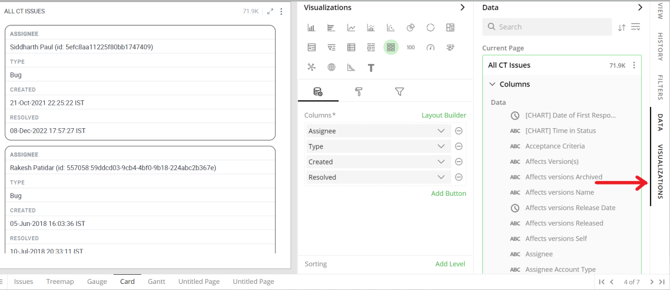
The following configuration options are available for Card visualization:
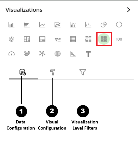
Data Configuration
 : It lets you choose columns for the following settings:
Visual Configuration
 : It lets you configure the visual appearances and interactions of the Card Visualization.
Visualization Level Filters
 : They let you filter the data in the visualization without impacting other visualizations on the same dataset.
Refer here to learn more about Visualization Level Filters.
Data Configuration
- Click on the
 icon for data configuration options.
Columns
You can perform the following operations on columns.
Add Column
- Drag the desired column from the Data Panel and drop it onto the Visualizations Panel’s “Columns” section.
Note: You can type the column name in the Data Panel to find it quickly.
Edit Column Name
- Click on the column name or the pencil
 icon and type in the new column name.
Remove Column
- Click on the
 icon to remove a column from the Card.
Reorder Columns
- Select the column and drag it to the desired position and drop it.
Conditional Formatting
This allows you to show an image with your data by applying certain conditions. You can also combine multiple conditions.
To apply conditional formatting:
Click on the
 icon next to the column and select ‘Conditional Formatting’.
Format Column dialog box opens, you can Upload Image from any of the following ways:
Choose Library and click on Search Image to select an image pre-bundled with Gathr Analytics.
Choose File and click on Upload File to select a file from your system.
Choose URL and Enter Image URL.
To Set the image Layout:
Select the Show Data with image checkbox to display data as well as the image.
Select a radio button to show data before/after the image.
Define the conditional formatting rule:
Select the criteria from the drop-down.
Provide threshold value.
An example of a conditional formatting rule is: If any value in the column is greater than 10, then place an icon next to the value. By applying this rule, you’d be able to see the values that meet this condition.
Go to Text and apply the Text on the following:
- Select a radio button to apply the text on a Cell or Row.
Select a Text Style as per your requirements.
Enter text to be displayed in the Card chart, click on ‘Apply’ and close the Format Column dialog box . This
 icon shows that the conditional formatting applies to the column.
Update Conditional Formatting:
To update the condition for a column:
Click on the
 icon and select Conditional Formatting.
Change the criterion or Format style as per your requirement.
Go to Text and click ‘Apply’.
Remove Conditional Formatting
To remove a condition:
Click on
 icon select Conditional Formatting for the desired column. Format column dialog opens. You will see the criteria listed at the bottom.
Hover over the criteria below Applied Rules and click on the
 icon to remove the condition.
To learn more about conditional formatting, refer to the following GIF.
Note: Steps for conditional formatting are the same for Grid and Card visualizations.

Sorting
Sorting allows you to change the order of data, making it easier to find what you’re looking for. You can do a multi-column sort on the Card.
Add Sorting Levels
In the ‘Sorting’ section, click on ’ Add Level’.
Select the column to sort on from the drop-down.
Note: You can only sort on the columns present in the Card.
Click on the Sort Oder ascending
 , descending
  icon to toggle the sorting order.
Repeat the above steps to add multi-column sorting.
Reorder Sorting Levels
The order of columns in the Sorting section defines the order of sorting in the Card.
- Drag and drop columns in the sorting section to change the sort order.
Remove Sorting Levels
- Click on
 icon to remove the sorting level.
To learn more about sorting, refer to the following GIF.
Note: Steps for sorting are the same for Grid and Card visualizations.

Sorting GIF HERE
Layout Builder
A default layout is created for each card view. The default layout shows all the fields present in the “Columns” section sequentially with column header and column value.
Layout builder lets you visually customize the look and feel of each field of Card. You can configure to render HTML pages, video and audio content as well.
- Click on Layout Builder.
In Layout Builder, the list of columns appears on the right side.
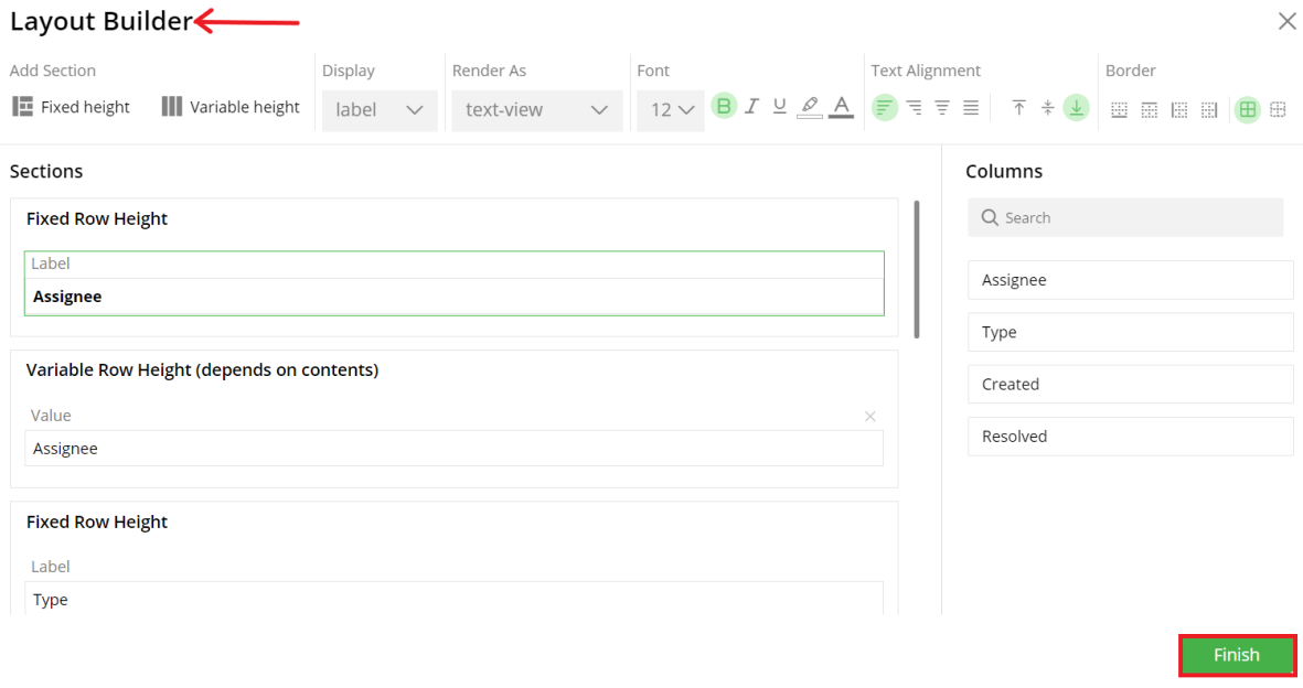
You can see the following configuration options with Layout Builder.
Add Section
Fixed Height: The content is shown in a single line. If the content doesn’t fit into a single line then ellipsis (…) is shown at the end of the line. You can mouse over to see the complete content in the tooltip.
Variable Height: The content is shown as a multi-line text with text wrap. Section’s height adjusts automatically with content length.
Note: In the default layout, all the sections are of variable height.
Display-
Value- Content of the field will be displayed.
Label- Name of the field will be displayed.
Empty- Empty space will be created.
Render As-
Text View: The content is displayed as is with no transformations.
Reader View- This applies to the URL type content. It fetches the content of the URL from the Internet. It removes all the advertisements, plugins, background images, and other unnecessary content (scripts, etc.) and shows only the readable content to give a clean reading experience for URL type content.
Link: You can also render URL type content as a hyperlink. When the user clicks on the link it will open the content in a new browser window from the Internet.
Font
- You can style labels and value fields by choosing the font style and color.

Text Alignment
Left, Right, Center, Justify
Top Bottom, Middle
Border
- You can choose the border (or no border) option for the field.
The following GIF demonstrates the effects of the following operations with Layout Builder:
Add a new section.
Drag and drop the columns to the sections.
Adjust the field width by dragging the edges.
Select the appropriate ‘Display’ option for the field.
Change the order of the sections by using the up
 and down
 arrow keys.
Remove the section/field by clicking on the
 icon.
icon.Choose the ‘No border’ option for the field.

GIF here for all the above settings
The following GIF demonstrates how you can apply text formatting options to create custom designs for cards.
Select the font style for the Label and Value fields.
Select the horizontal and vertical alignment of the text.

GIF here for all the above settings
Steps to Render Markdown Content
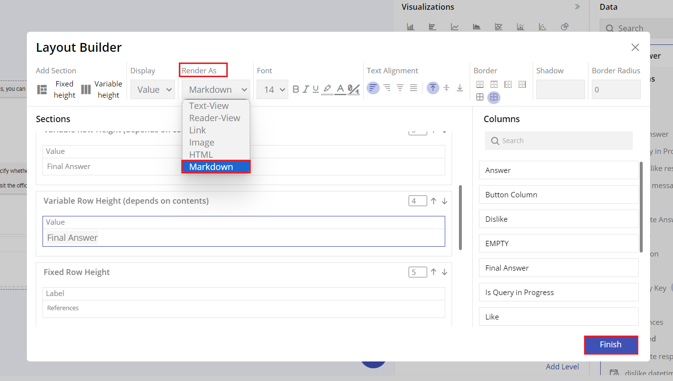
Open Layout Builder:
- Navigate to the Layout Builder tool in your application.
- Ensure you have access to create or edit a card visualization.
Select the Render Method:
- Within the card settings, locate the “Render As” dropdown menu.
- Click on the dropdown menu to reveal the available options.
Choose Markdown Rendering:
- From the dropdown options, select Markdown as the rendering method.
- This selection enables the card to interpret and display Markdown-formatted content.
- Click on Finish.
View the Rendered Card:
- Navigate back to your dashboard or the section where the card is displayed.
- The card should now display the formatted Markdown content as intended.
Visual Configuration
- Click on the
 icon for visual configuration settings.
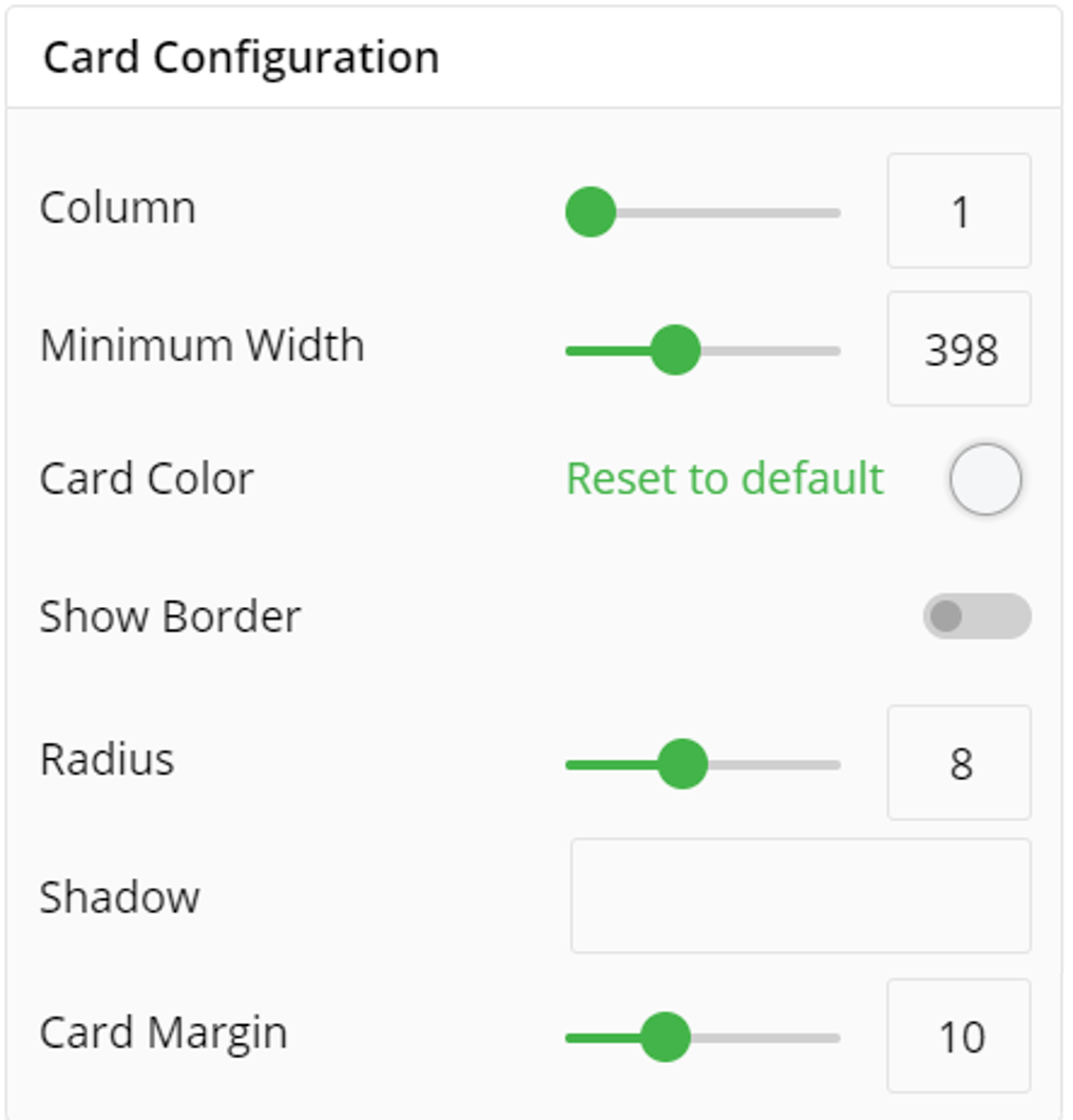
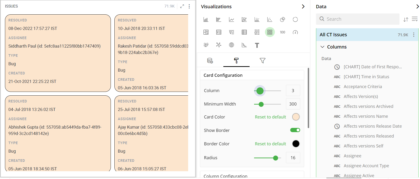
Card Configuration
You can arrange the cards in multiple columns using Grid configuration.
Provide the number of columns.
Provide minimum width.
Select Card Color
Show Border Line and Border Color
Set the Radius
You can create shadow for card visualization
You set the card margin between two cards
The following image shows the arrangement of cards in two columns.
Column Configuration
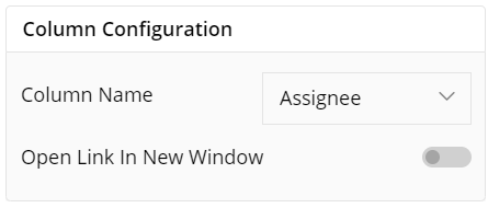
To configure select the column Name as per your requirement.
You can enable Open Link in New Window
Container Information
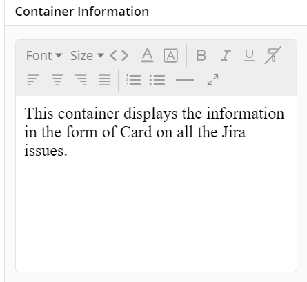
- You can enter the details of a container in the Container information and change its Font, Size, Color, etc.
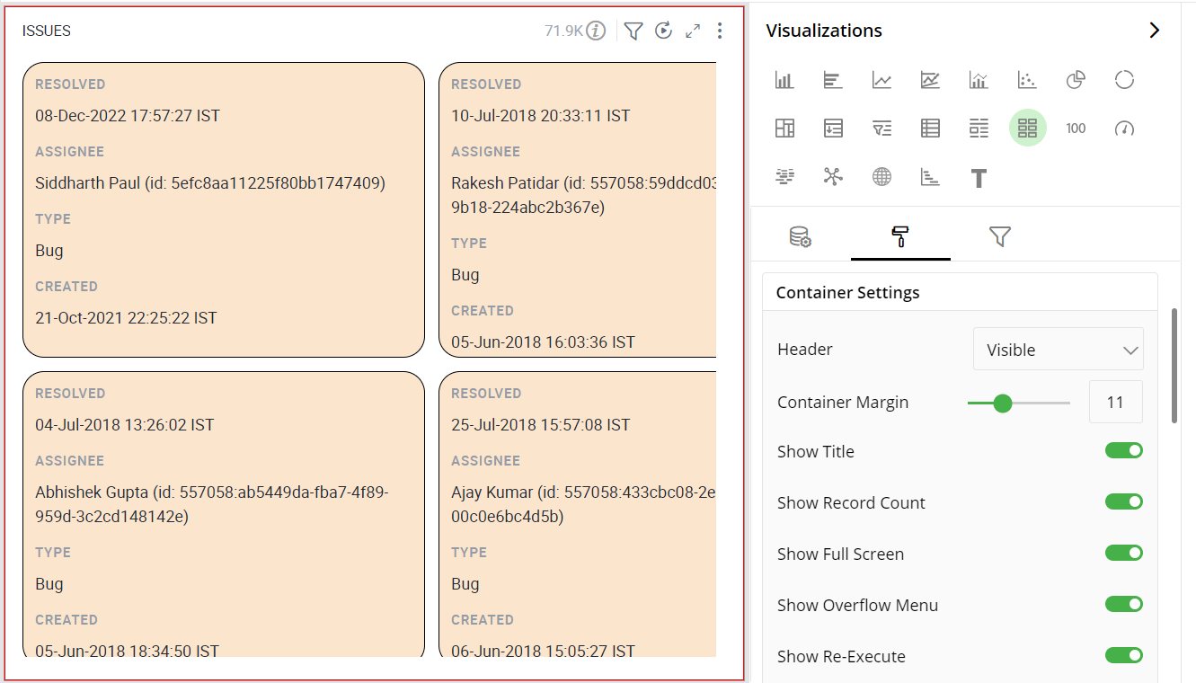
Container Settings
To show/hide the header and border, click the toggle switch.
Turn on the toggle switch to show the border for the container. Change the border color, style and width as shown below:
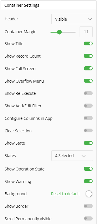
The following image shows the effect of various container settings.
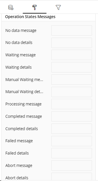
Operation States Messages
- Add/edit the Operation States Messages such as Waiting message, Waiting details, Processing message, etc. to provide a concise information about operation states.
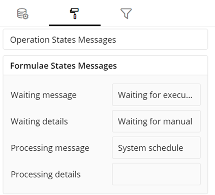
Formulae States Messages
- Add/edit the States Messages such as Waiting message, Waiting details, Processing message, etc. to provide a concise information about Formulae states.
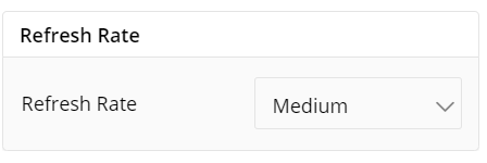
Refresh Rate
- Change the Refresh Rate such as Low, Medium, High resolution to display updates in your application.
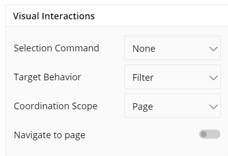
Visual Interactions
Select the Command, target behavior and scope for the coordinated visualization from the below settings.
To navigate to another page, click the toggle switch.
To learn more, refer to section- ‘Configure Coordinated Visualization’.
If you have any feedback on Gathr documentation, please email us!