Gantt Chart
Gantt charts are widely used in project management to help teams plan and schedule projects, track progress, identify dependencies, and manage resources. They provide a clear and concise visual representation of project timelines, which makes it easier for managers to communicate with stakeholders and team members, and to make informed decisions about project scheduling and resource allocation.
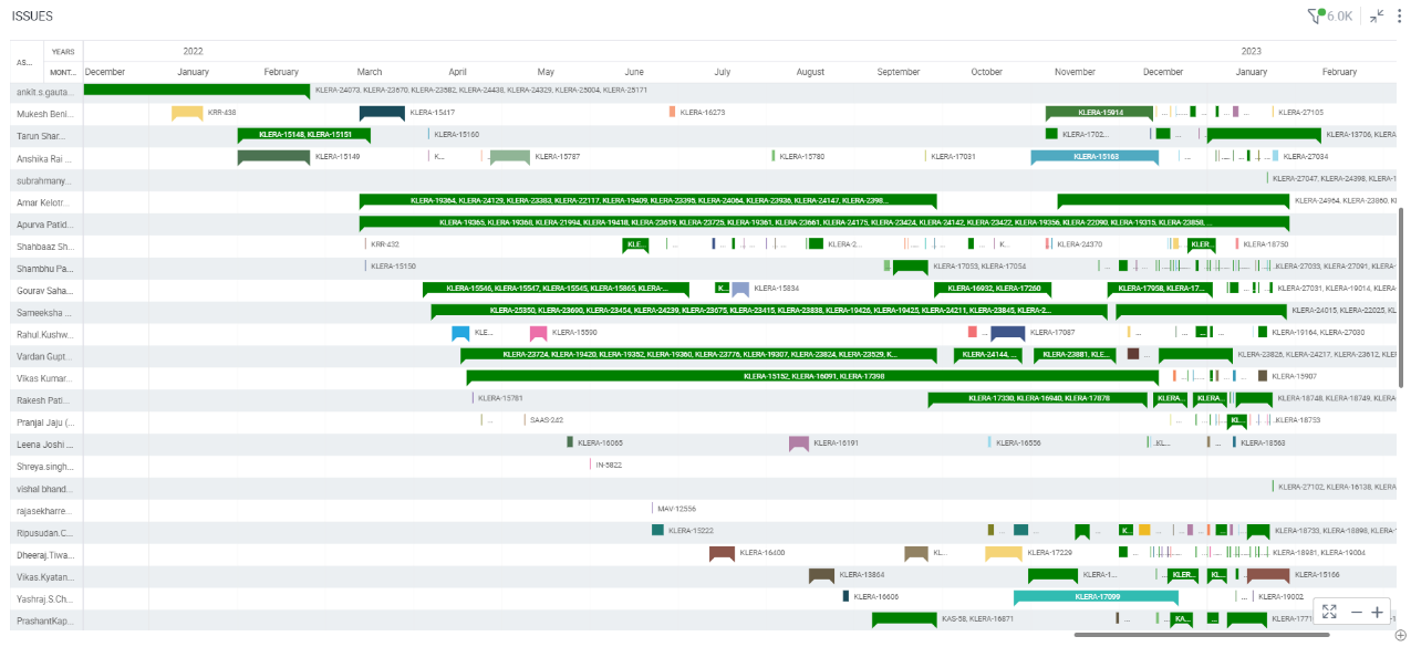
In the example below, a Gantt chart is created to visualize project timelines and task dependencies, allowing for a comprehensive comparison of task durations and progress across assignees.
To create a Gantt chart:
- Right-click on the Assignee column > Select View> Change> Gantt Chart.
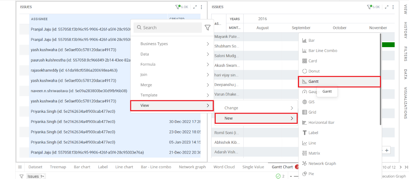
Refer here to learn more about creating a visualization.
The following figure shows the resulting Gantt Chart.
Configure Gantt Chart
- Select your Gantt chart and open the Visualizations Panel.
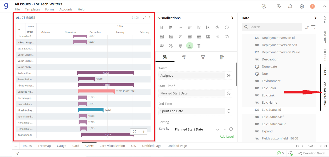
The following configuration options are available for Gantt chart:
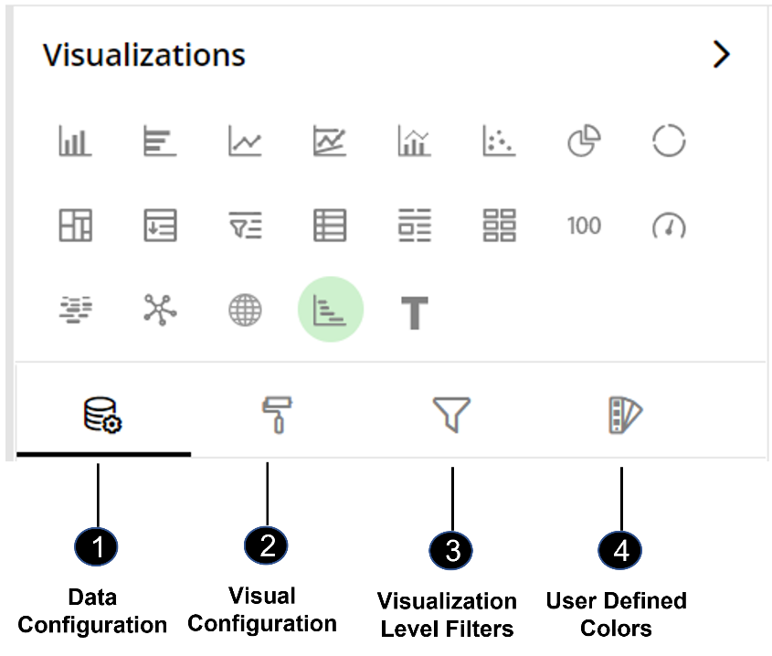
Data Configuration
 : It lets you choose columns for the following settings:
Task
Start Time
End Time
Duration
Color By
Dependencies
Sort Field
Sort By
View Configuration
 : It lets you configure the visual appearances and interactions of the Gantt chart.
View options
Gantt Header
Tasks
Task Label
View Settings
Container Information
Container Settings
Operation States Messages
Formulae States Messages
Refresh Rate
Visual Interactions
Visualization Level Filters
 : It lets you filter the data in the visualization without impacting other visualizations on the same data set.
Refer here to learn more about Visualization Level Filters.
User-Defined Colors
 : It lets you add meaning to a data point by associating a specific color to it or, differentiate a data point from the rest.
Colors of Individual Data Item
Color Saturation
Data Configuration
Click  icon for data configuration options.
Task
Assigns a label to each individual activity in the chart, usually representing the project task or milestone.
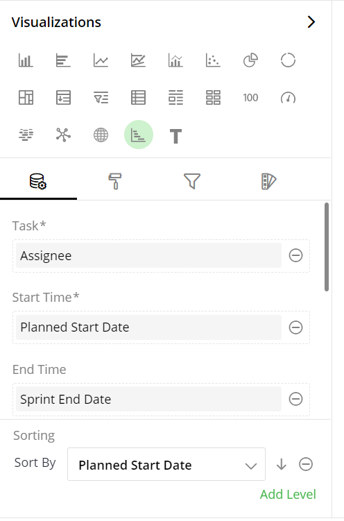
To change the column:
Click on
 to remove the existing column.
From the Data Panel, drag the desired column and drop it onto the Visualizations Panel’s “Task” section.
Note: You can also search the column name in the Data Panel to quickly find it.
Start Time
Specifies the beginning date or time for each task, determining the initial placement on the chart.
To change the column:
- Follow the same steps as shown above for “Task”.
End Time
Indicates the expected completion date or time for each task, defining the task’s duration on the chart.
To change the column on End Time:
Click on
 to remove the existing column.
From the Data Panel, drag the desired column and drop it onto the Visualizations Panel’s “End Time” section.
Duration
Represents the length of time required for each task, calculated as the difference between start and end times.
To change the column on Duration:
Click on
 to remove the existing column.
From the Data Panel, drag the desired column and drop it onto the Visualizations Panel’s “Duration” section.
Color By
Allows customization of task bar colors based on specific attribute, such as project phase or assignee.
To change the column on Color By:
Click on
 to remove the existing column.
From the Data Panel, drag the desired column and drop it onto the Visualizations Panel’s “Color By” section.
Description
The description serves as a narrative or detailed explanation associated with each task or data point, enhancing the understanding and context of the project timeline. You can select column from your dataset and drop in Description.
Milestone
The ‘Milestone’ signifies significant project achievements or events, providing a visual representation of key points in the timeline. You can select column from your dataset and drop in Milestone.
Dependencies
Highlights the relationships and dependencies between tasks, illustrating how one task’s completion affects others.
To change the column on Dependencies:
Click on
 to remove the existing column.
From the Data Panel, drag the desired column and drop it onto the Visualizations Panel’s “Dependencies” section.
Sort field
Determines the sorting attribute, organizing tasks by a specific column or property (e.g., priority, deadline).
To change the column on Sort Field:
Click on
 to remove the existing column.
From the Data Panel, drag the desired column and drop it onto the Visualizations Panel’s “Sort Field” section.
Sort By
Specifies the sorting order for tasks, either ascending or descending, based on the selected fields in above data configuration settings.
To change the column on Sort By:
Click on
 to remove the existing column.
You can select the Sort By fields using drop down fields .
Visual Configuration
- Click the
 icon for visual configuration settings.
View options
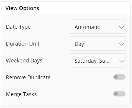
This setting in the Gantt chart’s visual configuration allows you to customize how the chart is displayed and how the data is represented. It includes options for setting the Date Type, Duration Unit, defining Weekend Days and managing duplicate tasks. These options help to tailor the chart to suit the specifics of your project and working norms of your organization.
Under view option you can modify following settings mentioned below:
Date Type: This setting allows you to select the granularity of the time scale on the Gantt Chart, with options ranging from as detailed as a quarter of a day to as broad as a year. The “Automatic” option will adjust this granularity based on the range and distribution of your task durations.
Duration Unit: This setting defines the unit of time that the task durations are represented in on the Gantt Chart. Options range from seconds to years, allowing for flexibility depending on the length and complexity of the project.
Weekend: This setting allows you to specify which days of the week are considered non-working days in your organization. The Gantt chart will visually distinguish these days, and they can be excluded from duration calculations, if desired.
Remove Duplicates: This toggle switch enables or disables the removal of duplicate tasks from the Gantt Chart, helping to maintain clarity and avoid redundancy.
Merge Tasks: This toggle switch allows for the consolidation of identical tasks on the Gantt Chart. When enabled, tasks with the same name and timeline are merged into a single bar, simplifying the chart and making it easier to read.
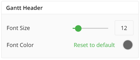
Gantt Header
This setting refers to the title or heading at the top of the Gantt Chart, providing a summary or overview of the chart’s content.
You can configure below settings:
Font Size: This setting determines the size of the text in the Gantt Chart header, ensuring its prominence and visibility as the title of the chart.
Font Color: This setting adjusts the color of the text in the Gantt Chart header, enhancing its standout quality against the background and contributing to the overall aesthetics of the chart.
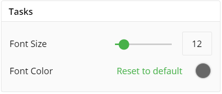
Tasks
This setting pertains to visual representation of the tasks on the Gantt Chart, including the task bars and labels.
You can configure below settings:
Font Size: This setting controls the size of the text within the task bars, enhancing legibility and ensuring that task details are clearly visible.
Font Color: This setting modifies the color of the text within task bars, improving contrast and readability, particularly against the color of the task bars themselves.
Show Hyperlink: This option allows users to toggle the visibility of hyperlinks associated with data points in the visualization, providing flexibility in displaying or hiding linked information.
Open Link in New Window: This setting enables users to launch hyperlinks associated with data points in a Gantt chart visualization in a separate window, ensuring a seamless and uninterrupted browsing experience.
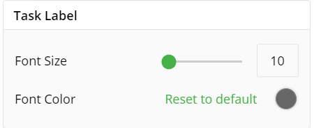
Task Label
This setting allows for the customization of the text that identifies each task on the Gantt Chart, typically representing the task name or description.
You can configure below settings:
Font Size: This setting adjusts the size of the task label text, enabling better visibility and legibility of the task information on the chart.
This setting changes the color of the task label text, enhancing contrast with the background or task bars, and improving readability.
View Settings
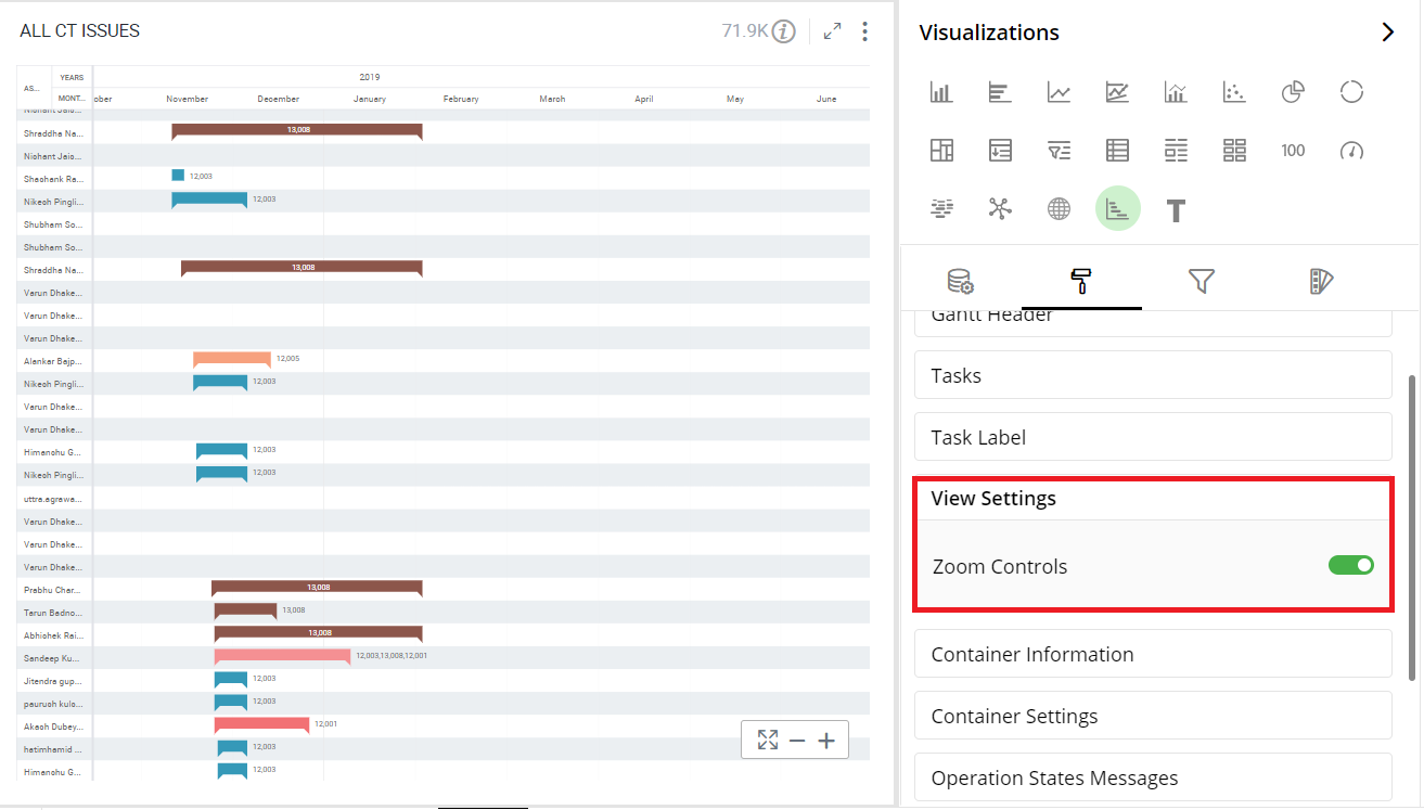
This option enables you to clearly understand specific data in your Gantt chart by zooming it.
- Keep the Zoom Option ‘On’ by selecting the toggle switch.
Here is an illustration.
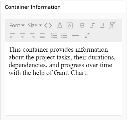
Container Information
You can enter the details of a container in the Container information and change its Font, Size, Color, etc.
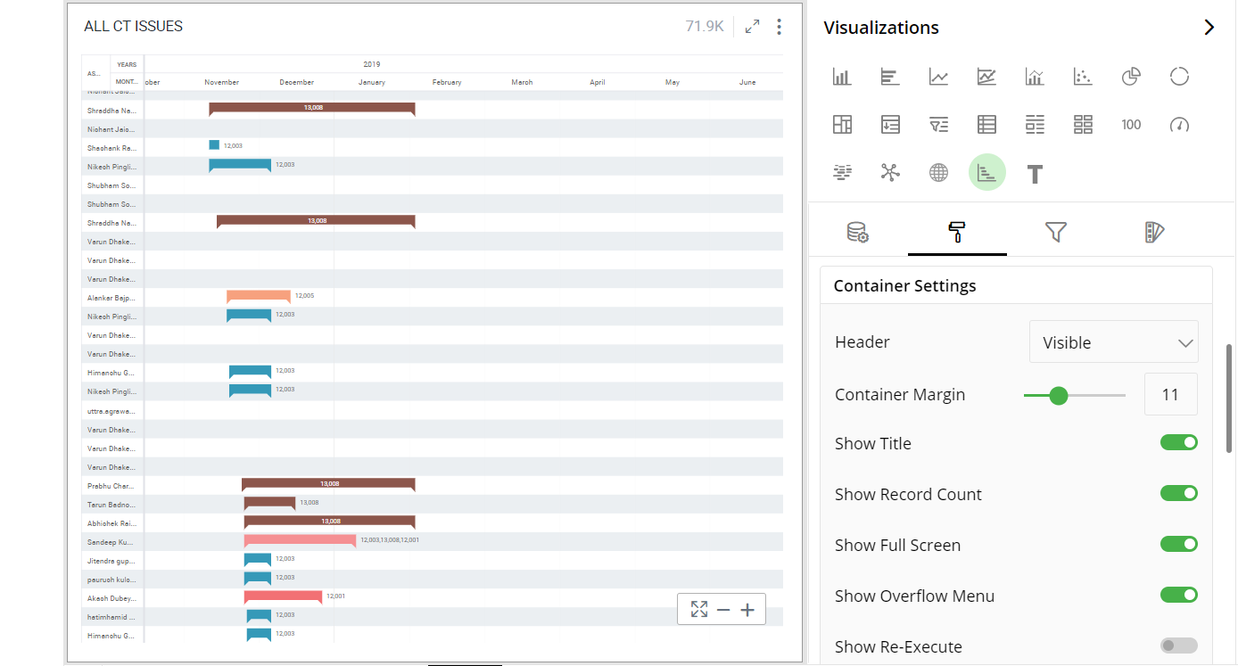
Container Settings
- Change the container Settings for the following fields such as Header, Container Margin, Show Title, etc. as per your requirements.
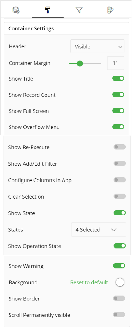
The following figure displays the effect of various container settings for your Gantt chart.
Operation States Messages
Add/edit the Operation States Messages such as Waiting message, Waiting details, Processing message, etc. to provide a concise information about operation states.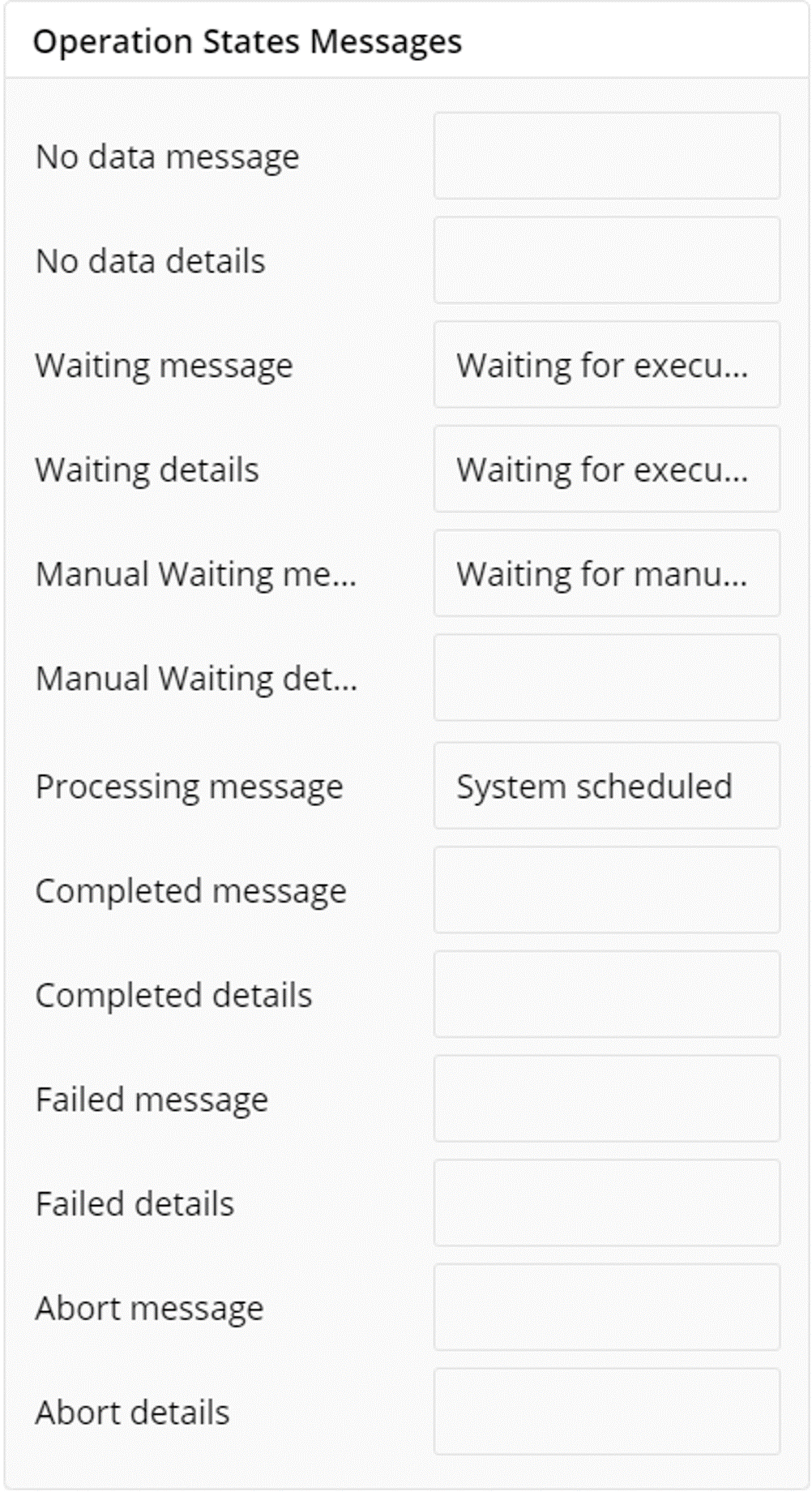
Formulae States Messages
Add/edit the States Messages such as Waiting message, Waiting details, Processing message, etc. to provide a concise information about Formulae states.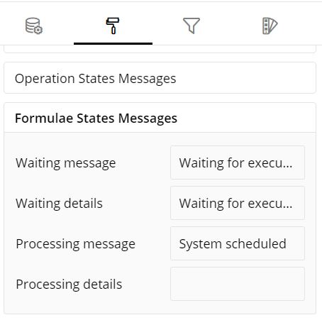
Refresh Rate
Change the Refresh Rate such as Low, Medium, High resolution to display updates in your application.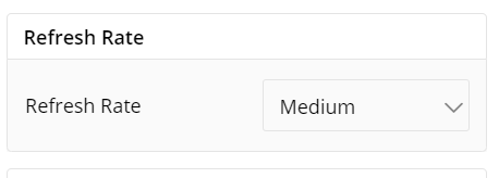
Visual Interactions
- Select the target behavior and coordinated visualization scope from the below settings.
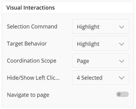
*To learn more, refer to section- ‘Configure Coordinated Visualization’.
User-Defined Colors
- Click on the
 icon for user-defined colors.
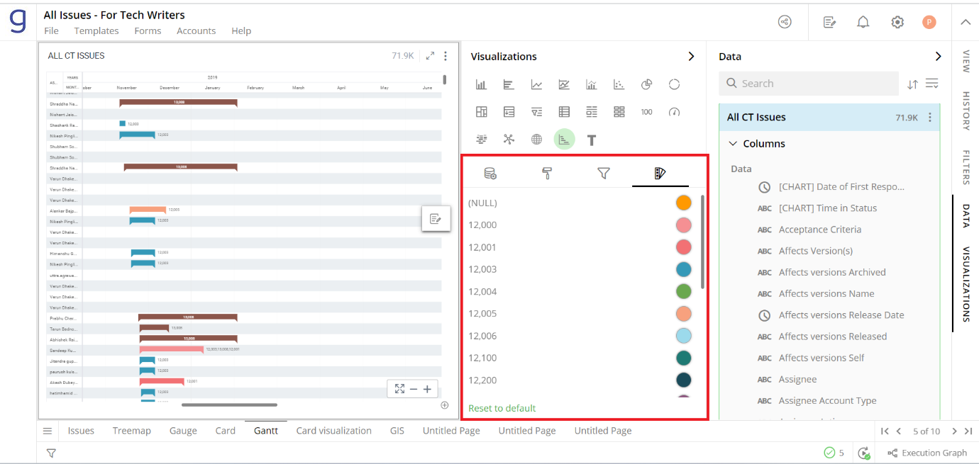
Colors for Individual Data Item
It lets you add meaning to a data item by associating a specific color to it and differentiate some data items from the rest.
For example, the red and green color may be used to represent “Off Track” and “On Track” issues, respectively. Whereas orange color may be used for the “Bugs” type of issues to draw attention.
To change the colors:
Click on the color picker next to the data item for which you want to change the color.
Select the color from the available color grid or click ‘More Colors’ to choose a color from the spectrum.
To restore default settings, click on ‘Reset to default’.
As shown below, orange color has been added to differentiate that data item from the rest.
If ‘Color Saturation’ is not selected, you can choose the color for your visualization as shown in the following figure:
Configuration Options in Full-Screen Mode
Visualization can be seen in full-screen mode by clicking on  icon.
icon.
Note: Visualizations Panel is not accessible in full-screen mode.
Click on the
 icon at the top-right corner of the container.
Select ‘Configure View’ from the overflow menu.
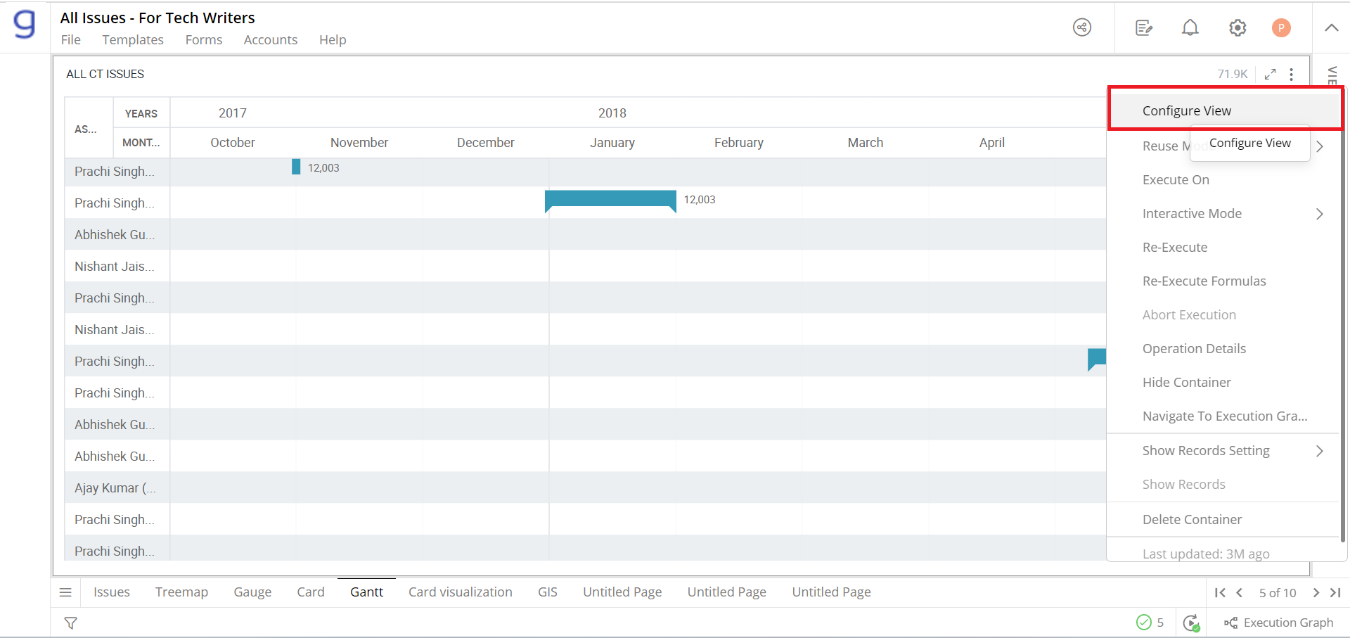
A pop-up form with all the relevant configuration options will appear on the screen.
Configure your Visualization and click on ‘Apply’.
If you have any feedback on Gathr documentation, please email us!