Gauze Chart
Gauge chart is used to display a numeric value that lies within a range of specified minimum and maximum values. Additionally, you can also define the color sectors to get more clarity if this value is within the acceptable range or not.
In the example below, a Gauge chart is created to analyze issues in Jira.
To create a Gauge chart:
- Right-click on the ‘Key’ column and Select View> Change> Gauge.
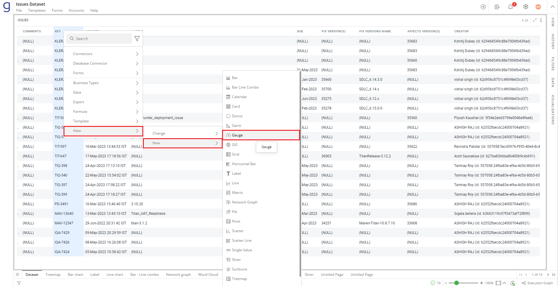
Refer here to learn more about creating a visualization.
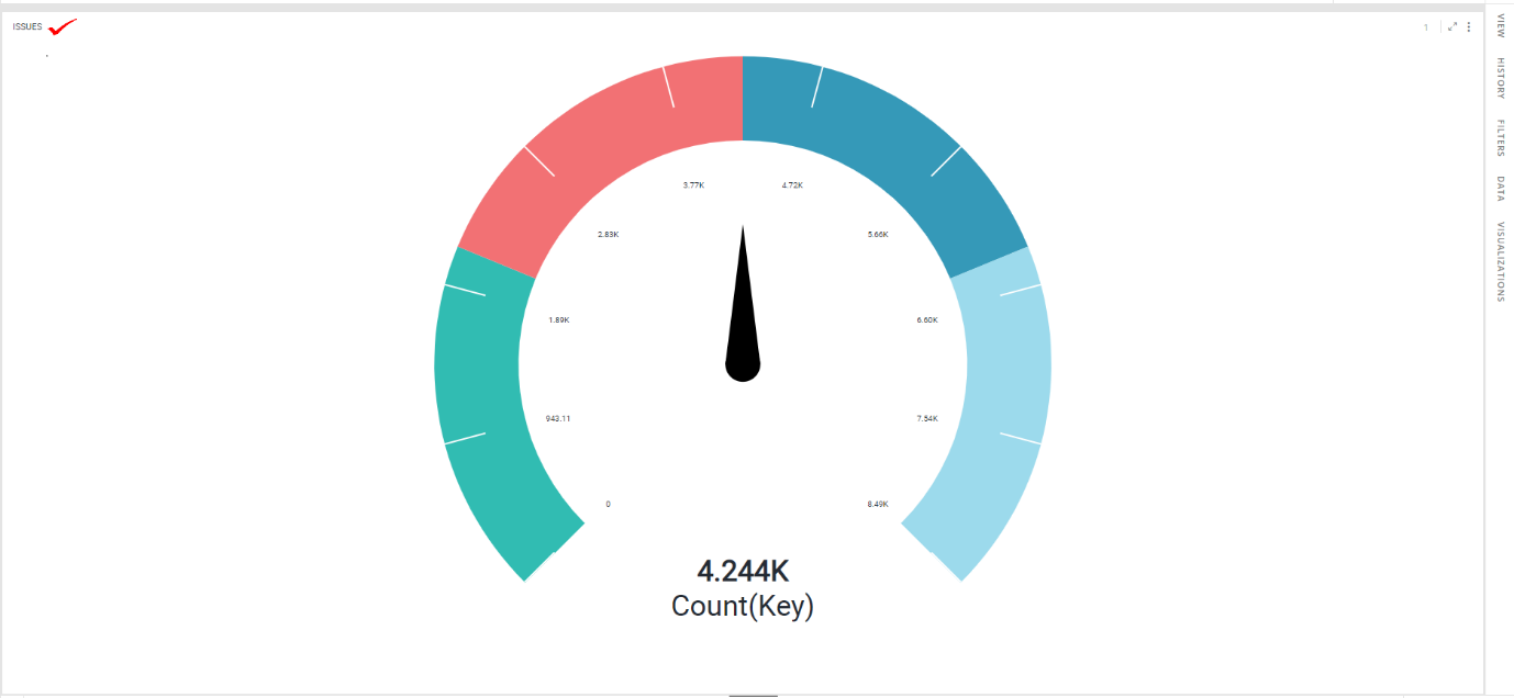
The following figure shows the resulting Gauge chart.
Configure Gauge Chart
- Select your Gauge chart and open the Visualizations Panel.
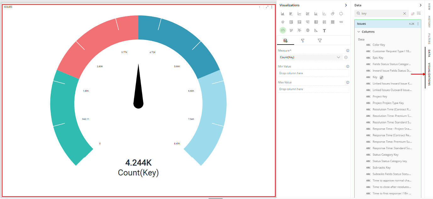
The following configuration options are available for Gauge chart:
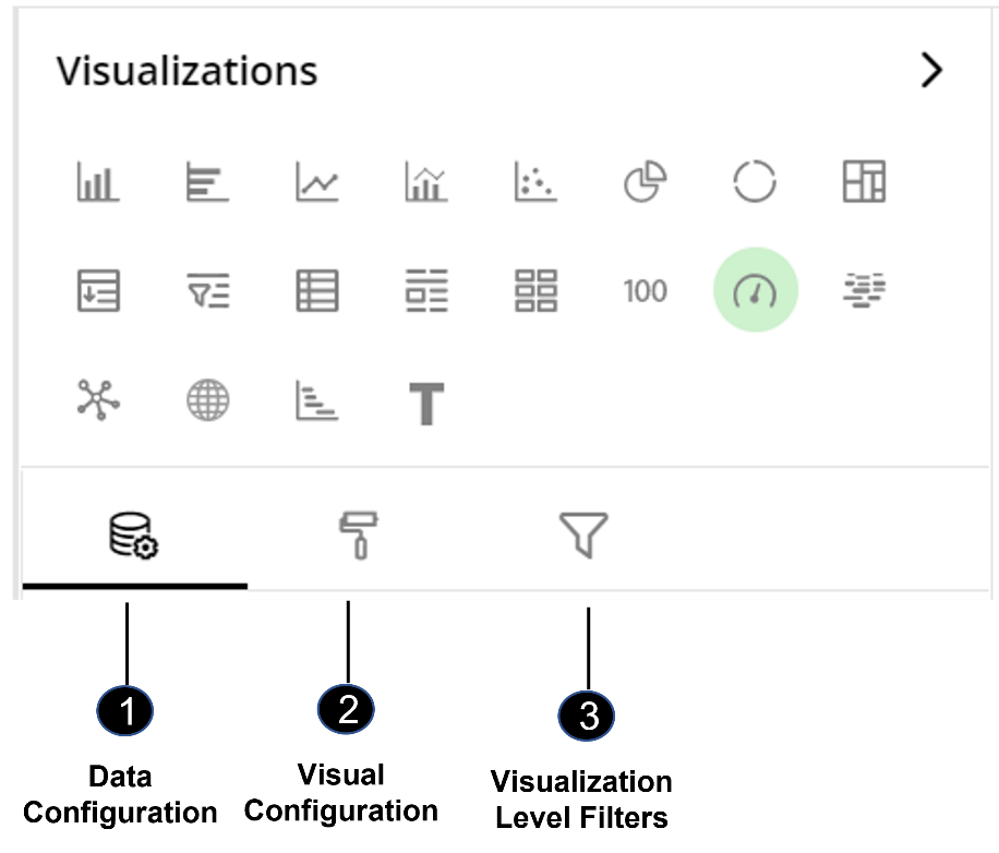
Data Configuration
 : It lets you choose columns for the following settings:
Visual Configuration
 : It lets you configure the appearance and interactions of the Gauge chart.
Visualization Level Filters
 : It lets you filter the data in the specific visualization without impacting the data shown in other visualizations.
Refer here to learn more about Visualization Level Filters.
Data Configuration
- Click on
 icon for data configuration options.
Measure
Measures are aggregated numerical data such as the sum of time spent, average cost, the total number of assignees etc.
You can specify the column to be aggregated and shown as the value on the Gauge chart.
To change the column:
Click on
 to remove the existing column.
From the Data Panel, drag the desired column and drop it onto the Visualizations Panel’s “Measure” section.
Note: You can also type the column name in the Data Panel to quickly find it.
Click on the
 icon to select the aggregate function from the drop-down.
Aggregate functions for textual data: Count, Unique Count
Aggregate functions for numerical data: Count, Unique Count, Sum, Min, Max, Avg
In this example, ‘Deviation from Due Date(in days)’ column is selected as ‘Measure’, and aggregate function ‘Avg’ will calculate the value to be displayed in the Gauge View.
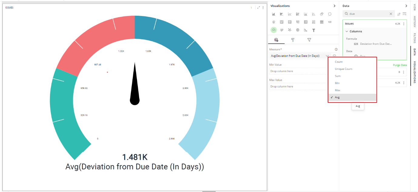
Note: The current value of the measure, at the time of configuration, is taken as the halfway mark and minimum and maximum values are configured accordingly. These can be customized as explained in the following sections.
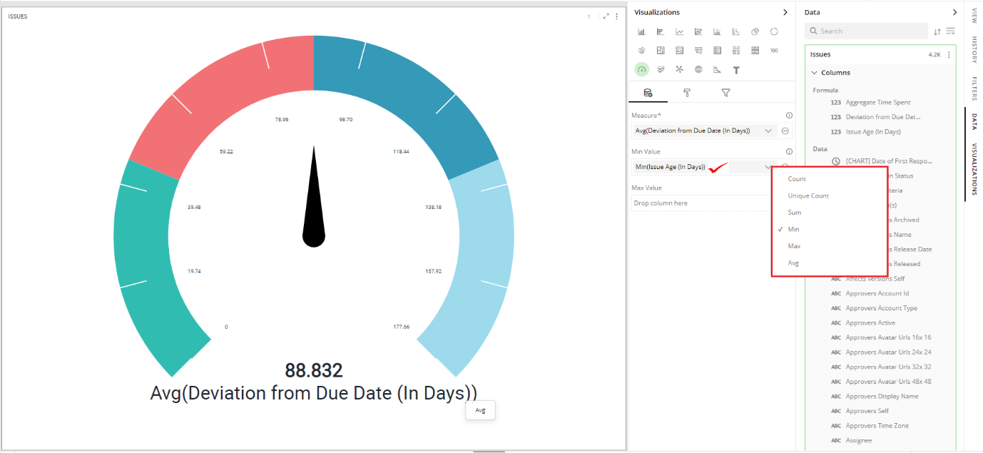
Min Value
To set the minimum value of the measure:
Drag the desired column from the Data Panel and drop it on the Visualizations Panel’s “Min Value” section.
Click on the
 icon to select the aggregate function.
Max Value
- To set the maximum value from a column, follow the same steps shown in “Min Value”.
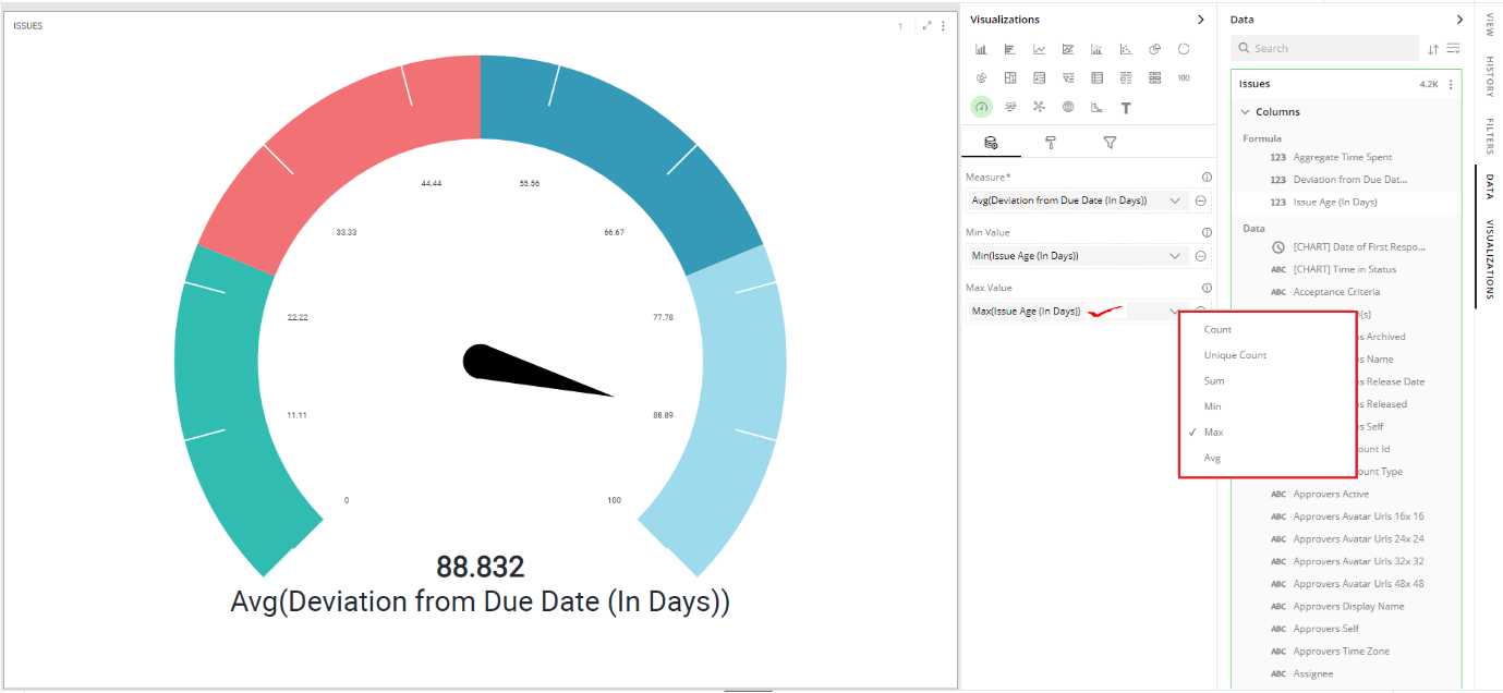
Note: You can also specify Min and Max value manually.
Visual Configuration
- Click the
 icon for visual configuration settings.
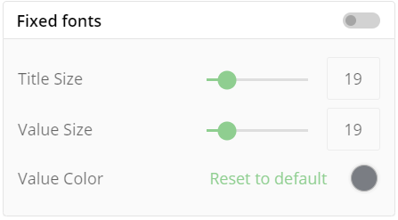
Fixed Font
When this is turned off, the font sizes for the label and value will be adjusted according to the container size of the visualization. But with fixed font size, once you set the sizes for the label and value, they will remain fixed irrespective of any change in the container size.
To define the fixed font size:
Turn on the Fixed Font toggle.
Provide the font sizes for the title and value alongwith this you can choose color for ‘Value’.
Decimal Precision
- Choose the number of decimal places you want to display your value with.

Gauge Axis
The Gauge’s minimum and maximum values can be determined by the columns configured in Min and Max values as explained here.
Alternatively, you can override this by providing fixed values for min and max limit of Gauge.
- Provide Min Value and Max Value for the Gauge Axis.
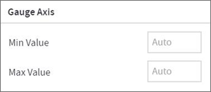
The effect of providing the min and max values is shown in the image below.

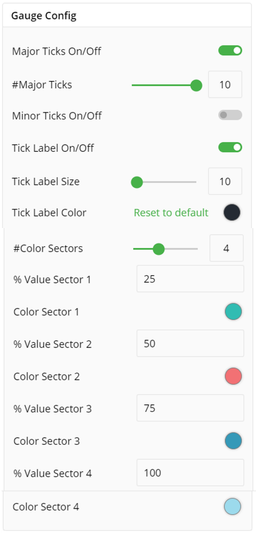
Gauge Configuration
Tick marks are calibration marks on the Gauge scale for ease of reading. There are two tick marks:
Major Tick Marks – The larger marks on the Gauge radial
Minor Tick Marks – The smaller marks spread evenly between major ticks
You can toggle to turn on/off for tick labels.
You can set Tick Label Size and color.
To set Major and Minor Ticks:
Turn on the toggle switch.
Give the value either through the slider or type in the text box.
To show the tick labels, turn on the toggle switch.
You can apply color ranges to your gauge to assess its state. First, define the number of sectors you want for your Gauge chart and then enter the sector size you want to set for them.
To set the color sectors:
Give the value either through the slider or type in the text box.
Type in the value in the text box to set the % value for sectors.
Click on the color picker and select the color from the available color grid or click ‘More Colors’.
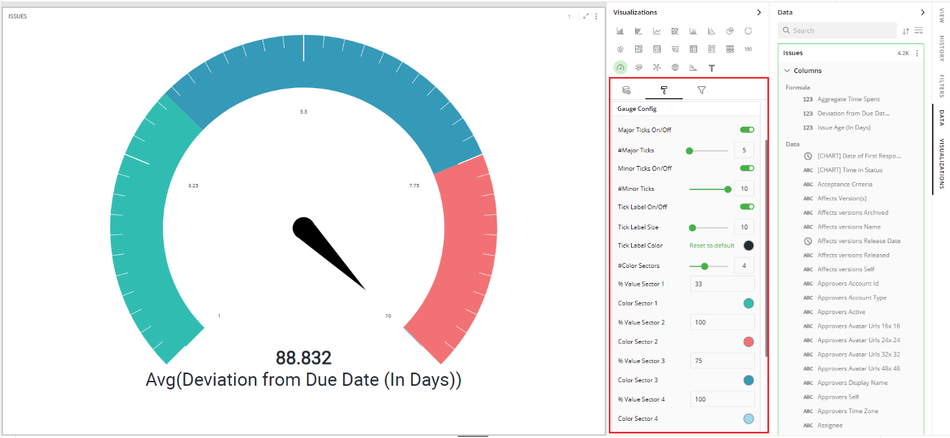
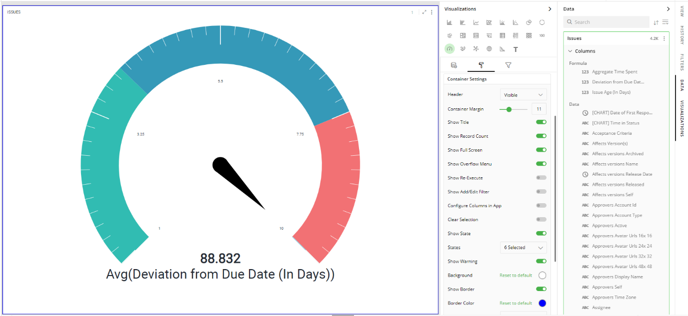
In the following figure, you can see that minor and major ticks are set to 5, 10 respectively along with two color sectors (green and red) to show the acceptable value for ‘Avg Deviation from Due Date(in days)'
Container Settings
To show/hide the header and border, click the toggle switch.
Turn on the toggle switch to show the border for the container. Change the border color, style and width as shown below:
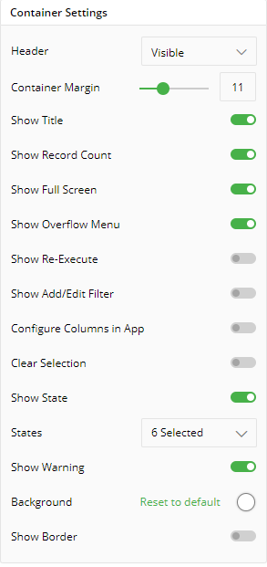
The following figure displays the effect of various settings for your Gauge chart.
Visual Interactions
- Select the target behavior and scope for the coordinated visualization from the below settings.
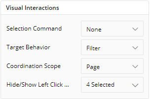
To learn more, refer to section- ‘Configure Coordinated Visualization’.
Configuration Options in Full-Screen Mode
Visualization can be seen in full-screen mode by clicking on  icon.
icon.
Note: Visualizations Panel is not accessible in full-screen mode.
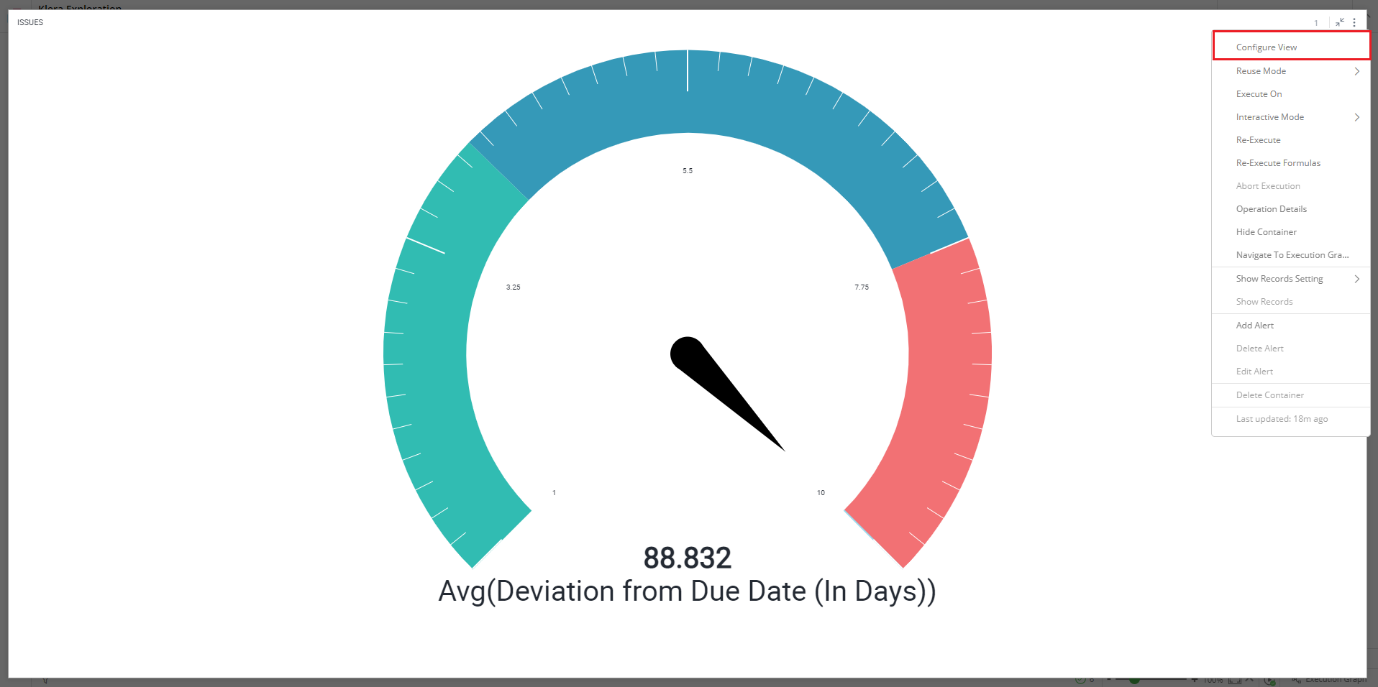
Click on
 icon at the top-right corner of the container.
Click on ‘Configure View’ from the overflow menu.
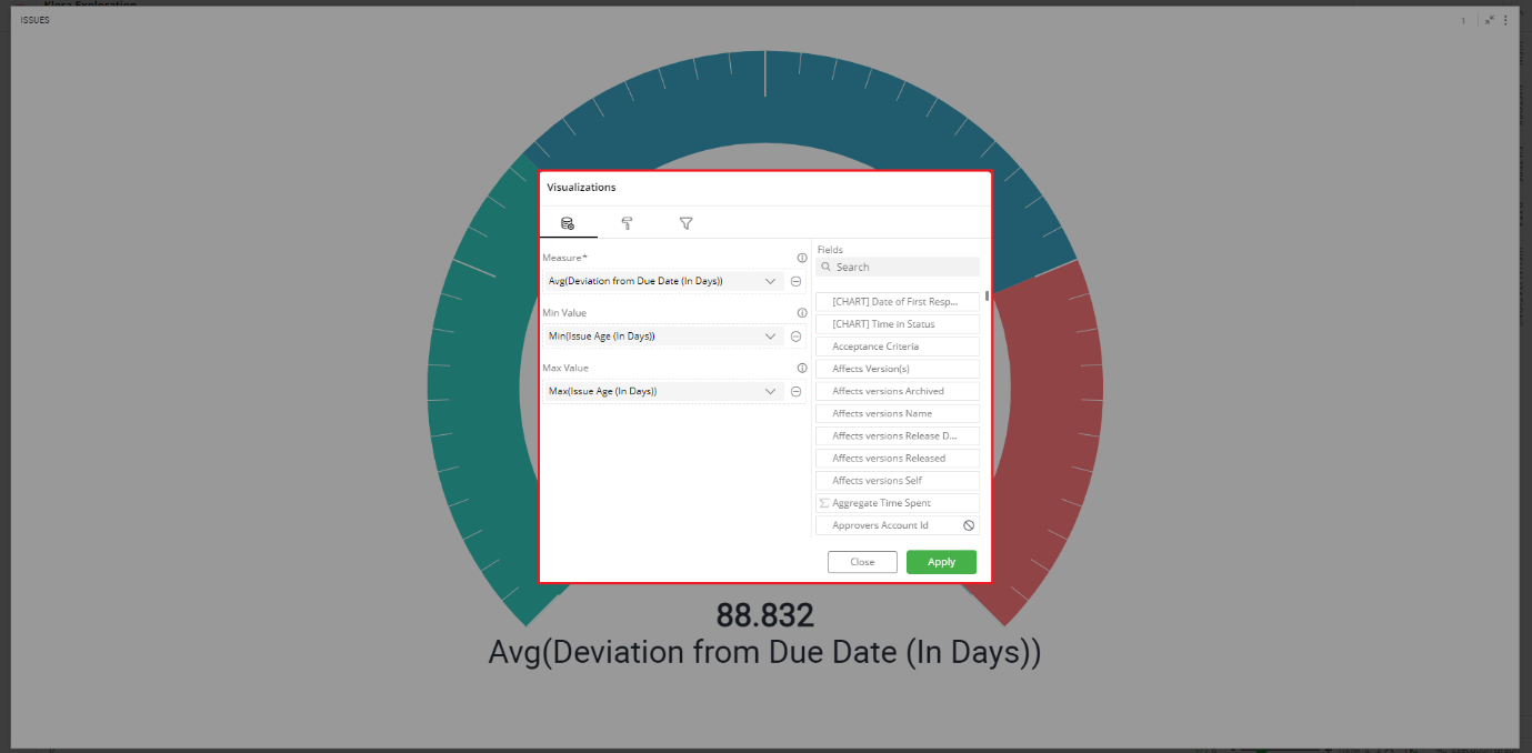
A pop-up form with all the relevant configuration options will appear.
Configure your visualization and click on ‘APPLY’.
If you have any feedback on Gathr documentation, please email us!
