Network Graph
Network graph visualization shows the relationship between entities. Entities are displayed as round nodes and the lines connecting the nodes show the relationships between them. The lines connecting the nodes are called Edges. The edges may have arrowheads indicating the direction of the relationship between the nodes in a directed graph. The vivid display of network nodes can show even those data similarities or discrepancies that may otherwise be overlooked.
Each row of the data represents one relationship in the graph.
For example, a table and Network Graph about Assignee and Type of issue assigned to them might look like:
| Assignee | Issue Type |
| Pushpendra Garg | Epic |
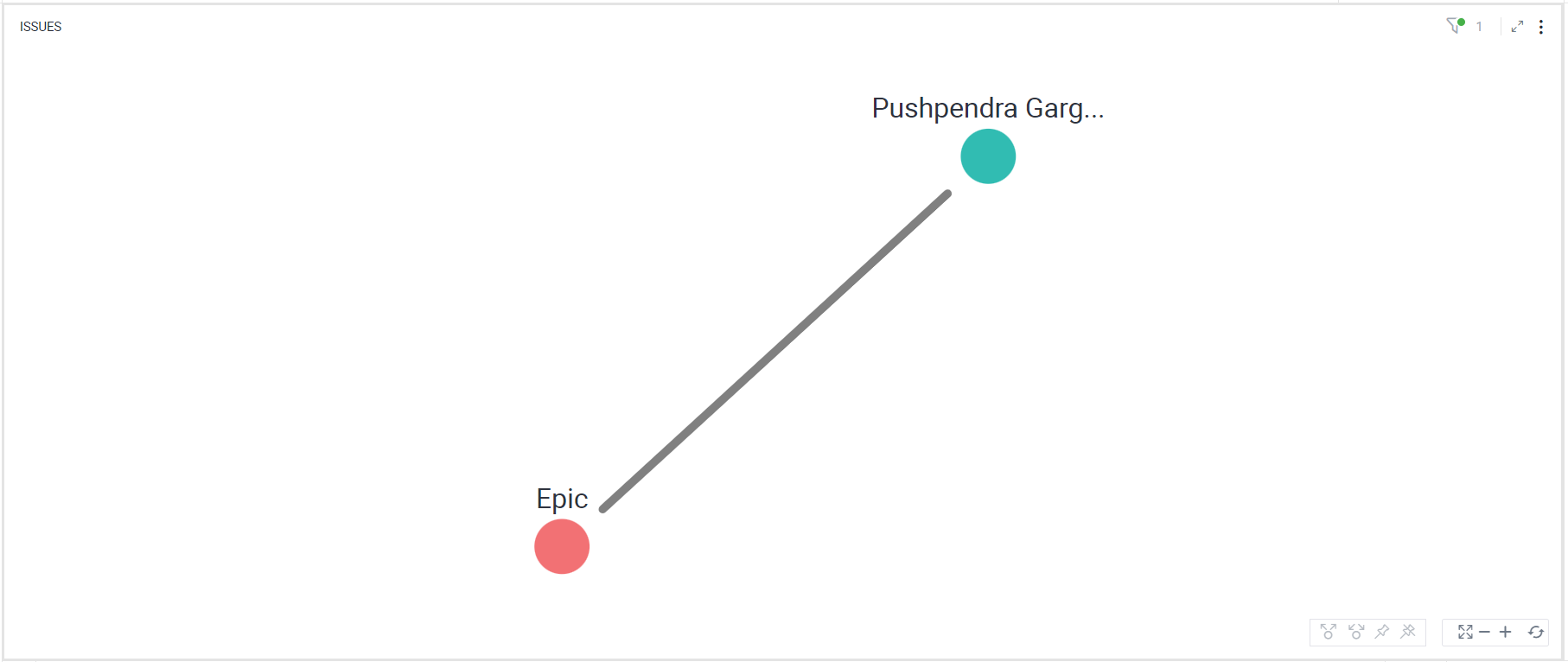
In the following example, a Network Graph is created to show the relationship between assignees and the type of issues assigned to them in Jira.
To create a Network Graph:
- Select the ‘Assignee’ and ‘Type’ columns while holding the Ctrl key and right-click > Select View > Change > Network Graph.
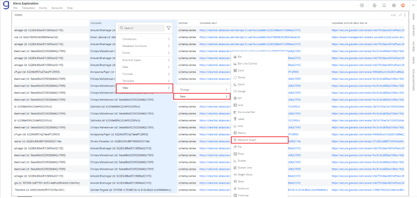
To learn how to create a visualization, click here.
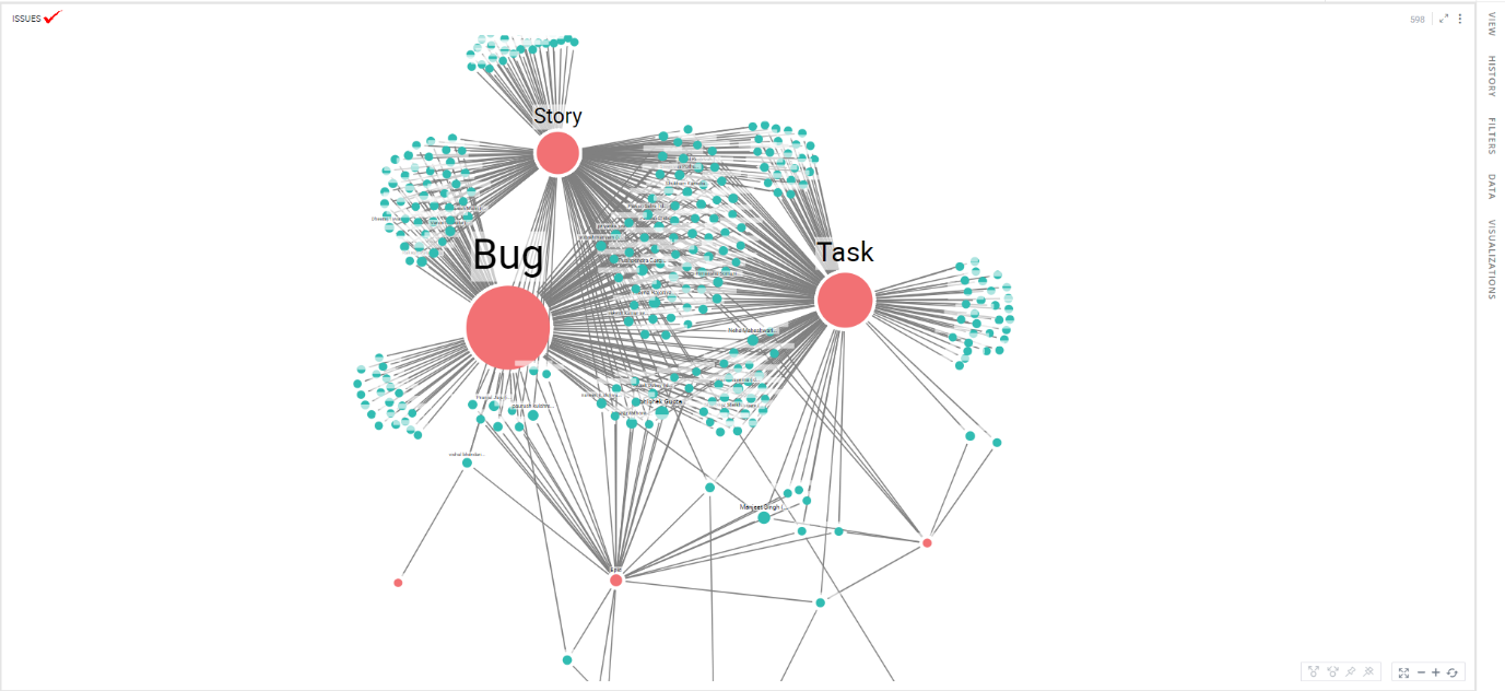
The resulting Network Graph shows each row as a line connecting an assignee and the corresponding issue type.
Configure Network Graph
To configure:
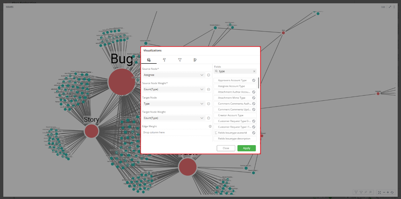
- Select your Network Graph and open the Visualizations Panel.
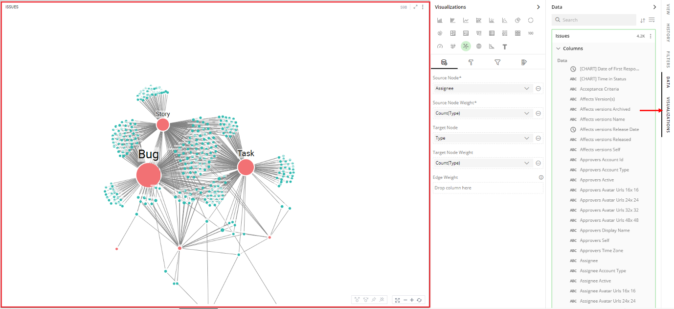
The following configuration options are available for Network Graph:
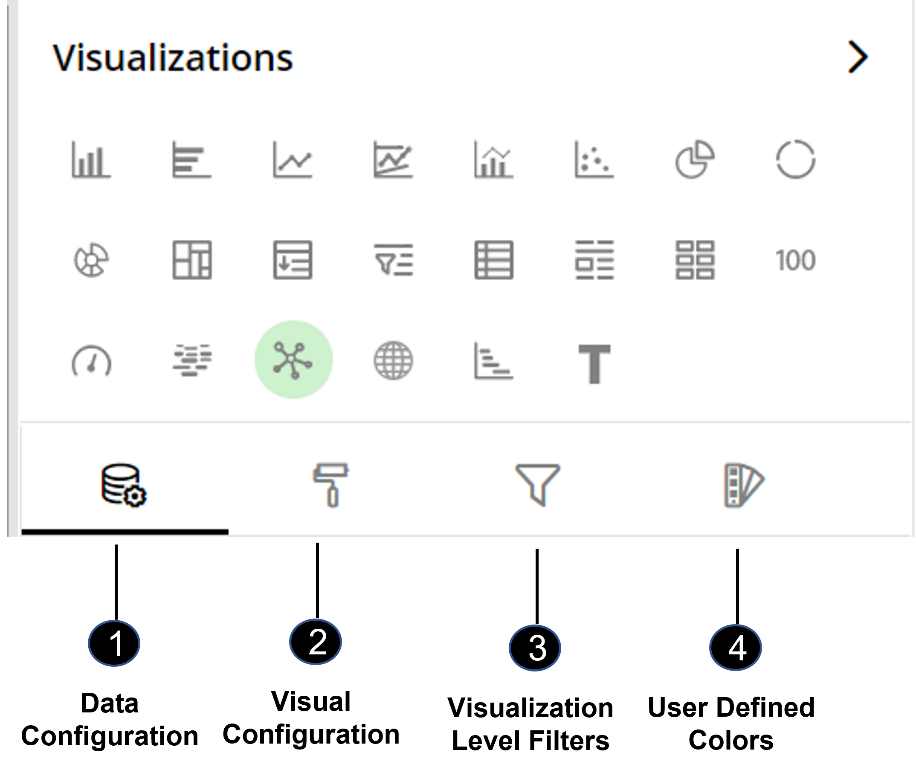
Data Configuration
 : It lets you choose columns for the following settings:
Visual Configuration
 : It lets you configure the visual appearances and interactions of the Network Graph.
Visualization Level Filters
 : It lets you filter the data in the visualization without impacting other visualizations on the same data set.
Refer here to learn more about Visualization Level Filters.
User-Defined Colors
 : It lets you add meaning to a data point by associating a specific color to it or, differentiate a data point from the rest.
Data Configuration
- Click on
 icon for data configuration options.
Source Node
Specify the column whose values should be displayed as nodes of the network graph.
The source node signifies the direction of the relationship in the case of a directed graph.
To change the column:
Click on
 to remove the existing column.
From the Data Panel, drag the desired column and drop it onto the Visualizations Panel’s “Source” section.
Note: You can also type the column name in the Data Panel to quickly find it.
Conditional Formatting
This allows you to show an image with your data by applying certain conditions. Multiple conditions can be combined as well.
To apply conditional formatting:
- Click on the
 icon next to the column name and select ‘Conditional Formatting’.
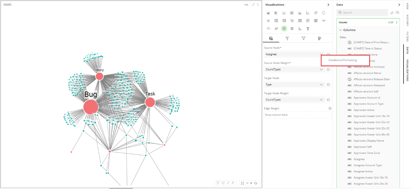
Define the conditional formatting rule:
Select the criteria from the drop-down.
Provide a threshold value.
Set the format style to choose an image to be shown when the above criterion is true. You can provide the image in the following ways:
Select Library and click on Search Image to select an image pre-bundled with Gathr Analytics.
Select File and click on Upload File to choose one from your machine.
Select URL and Type In the URL of your image
Select Show Data checkbox to display data as well as the image
- Select the radio button to show data before/after the image
Click on ‘Add’.
To update the condition for a column:
Click on the conditional formatting
 icon.
icon.Change the criterion or format style.
Click ‘UPDATE’.
To remove Conditional Formatting
Click on the
 icon for the desired column. You will see the criteria listed at the bottom.
Click on the
 icon to remove the condition.
To learn more about conditional formatting, refer to the following GIF.
Note: Steps for conditional formatting are the same for Grid and Network Graph.

Conditional Formatting GIF
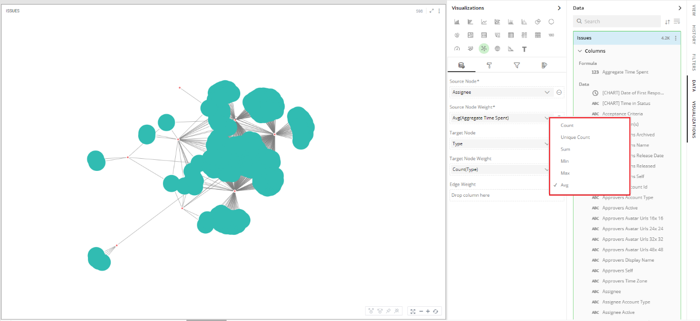
Source Node Weight
The size of the source node will be calculated based on the values in the selected columns.
To set source weight:
Follow the same steps shown in ‘Source’ to change the column.
Click on the
 icon to choose the aggregate function from the drop-down.
Aggregate functions for textual data: Count, Unique Count
Aggregate functions for numerical data: Count, Unique Count, Sum, Min, Max, Avg
Target Node
Specify the column whose values should be displayed as nodes of the Network Graph.
In the case of a directed graph, the direction of the relationship is from source to target nodes.
To change the column:
- Follow the same steps as shown in the ‘Source Node’.
To apply conditional formatting:
- Follow the same steps as shown in the ‘Source Node’.
Target Node Weight
The size of the target nodes will be calculated by the aggregate functions.
To set the target node weight:
- Follow the same steps as shown in the ‘Source Weight’.
Visual Configuration
- Click on the
 icon for visual configuration settings.
Graph
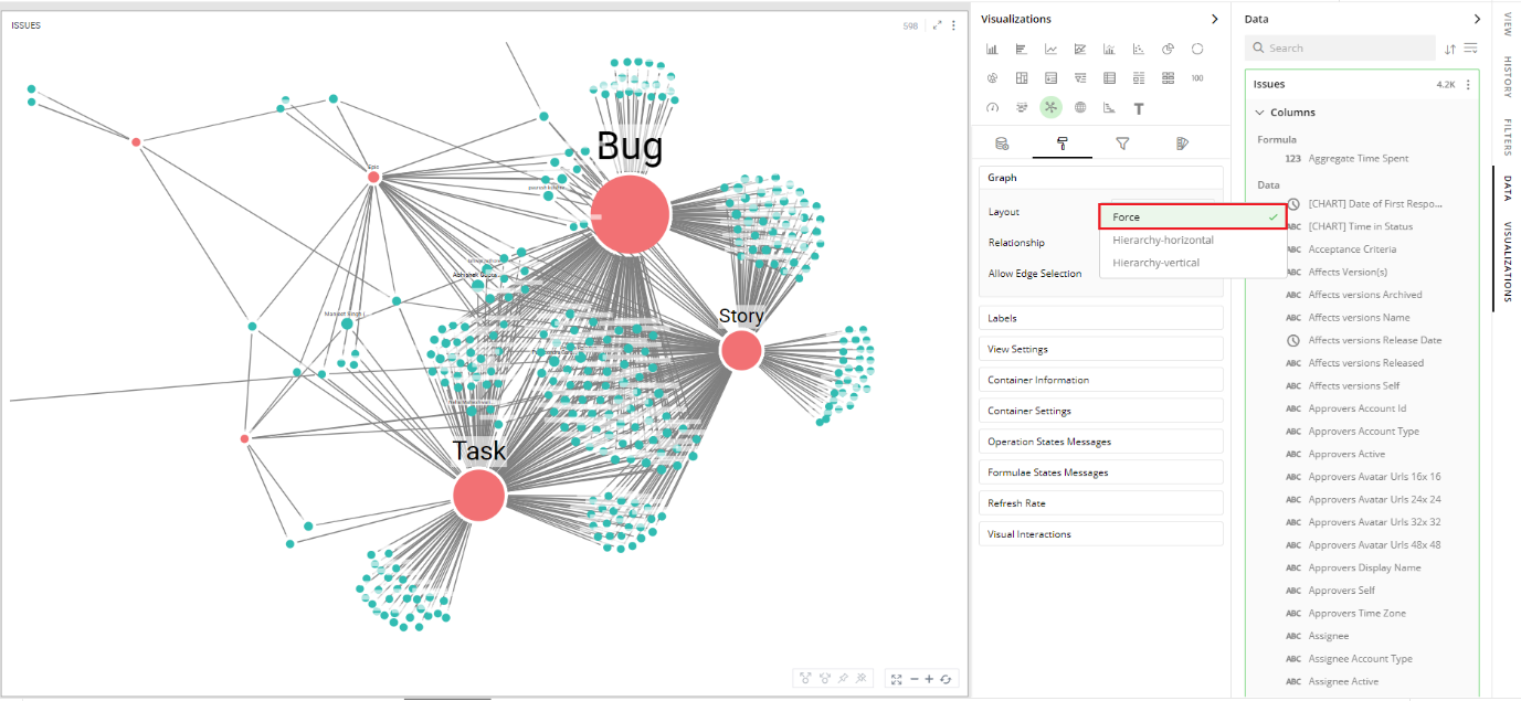
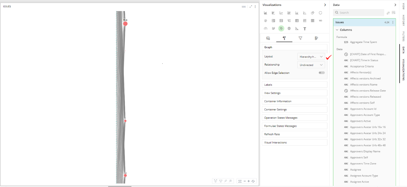
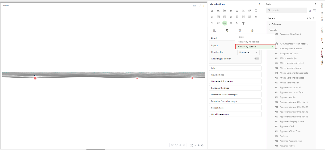
The nodes of a network graph can be arranged in a variety of layout patterns such as Force, Hierarchy-horizontal, Hierarchy-vertical.
You can choose the direction of the edges with relationship options to undirected, uni-directional and bi-directional.
You can also toggle to allow edge selection.
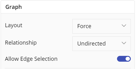
Layout
- Click on the arrow
 next to the Layout to see options in the drop-down.
- Force-The force-directed algorithm applies repulsive forces on non-adjacent nodes and attractive forces on adjacent nodes. By choosing this option, you get a clear, stable and aesthetically pleasing arrangement of nodes. You are easily able to identify complex relationships, outliers, and symmetrical patterns in your network graph which are otherwise not easily discoverable.
- Hierarchy Horizontal: The nodes of a graph are placed in layers arranged from left to right.
- Hierarchy Vertical: The nodes of a graph are placed in layers from top to bottom.
Relationship
- Click on the arrow
 next to the Relationship to see options in the drop-down.
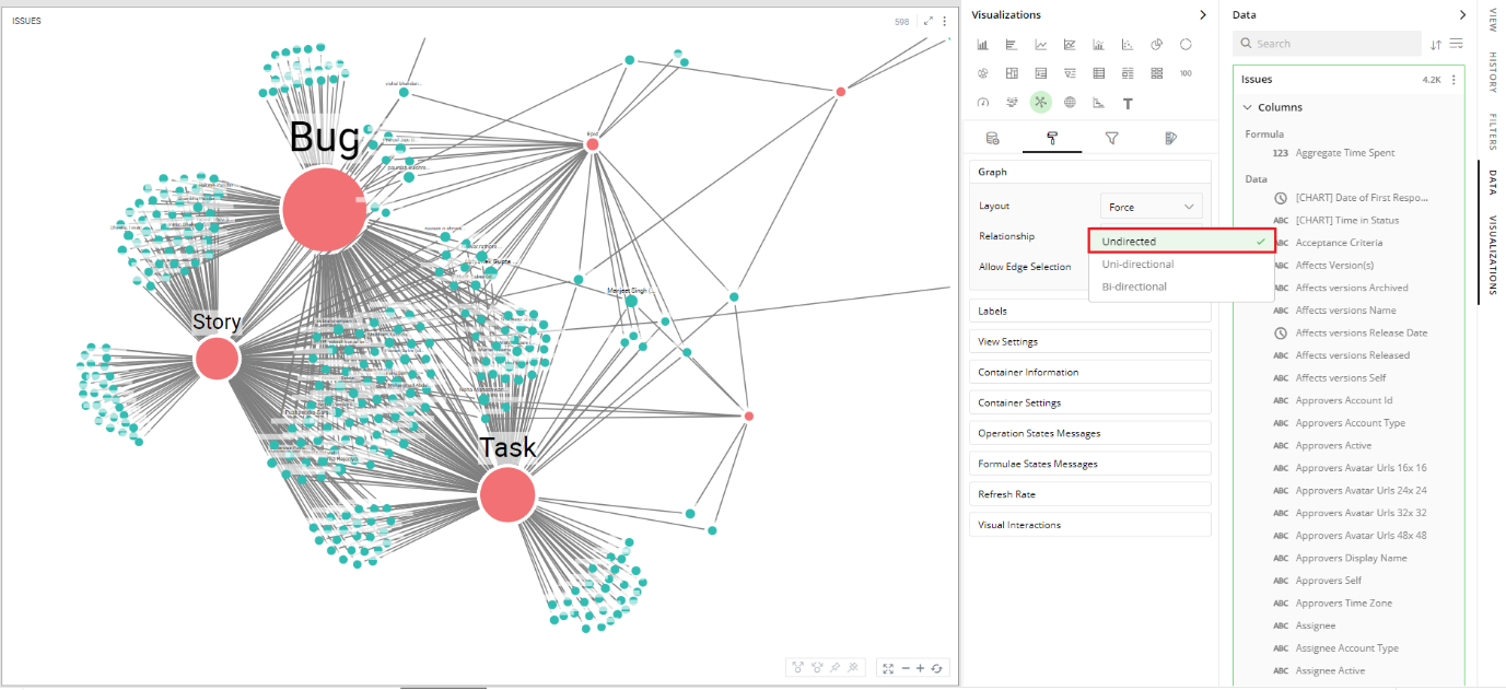
Undirected: Undirected graphs depict the relationship between entities but not the direction of the relationship. An edge, without a directional arrow, is used to indicate the relationship.
Uni-directional: A directed graph where the edges have a directional arrow depictis the direction of relationship from the source node to the target node.
Bi-directional: A directed graph where the edges have directional arrows in both directions, depict the bi-directional relationships between entities.
Labels
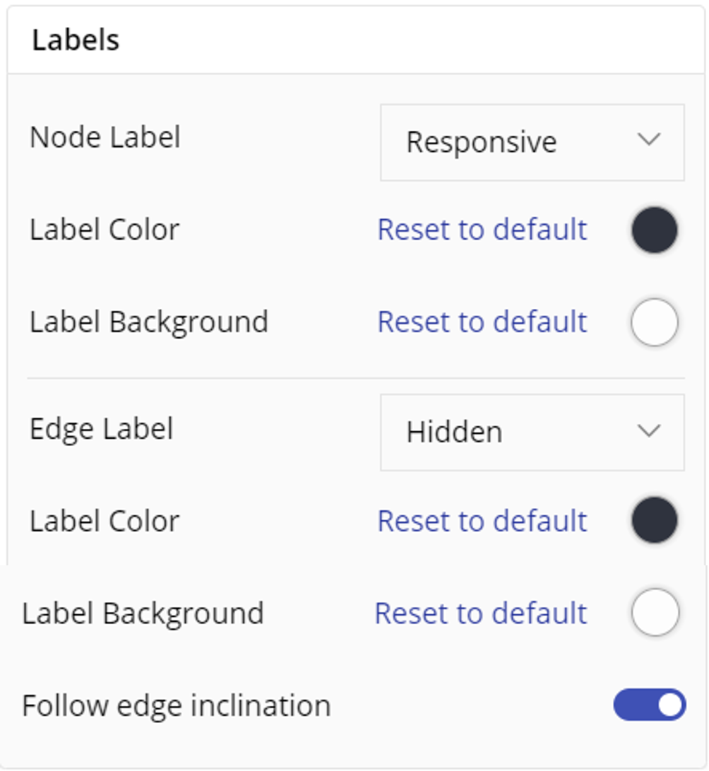
Properly setting Label configurations can significantly enhance the readability of your network graph.
Node Label: They are crucial for identifying the various nodes within your network graph. You can customize these labels based on visibility where you can select visibility options such as, Responsive, Visible and Hidden, then you can select Label color options and background color options.
Edge Label: They provide information about the connections between nodes. Similar to node labels, you can customize edge labels based on visibility, color and background color.
Additionally, you can enable a toggle to align the labels with the edge inclination.
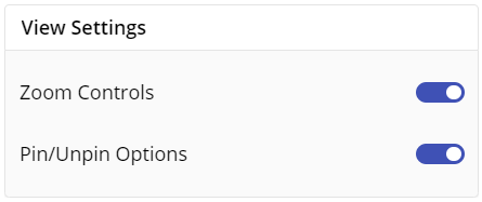
View Settings
You can use toggle to enable zoom controls and pin/unpin options in view settings.
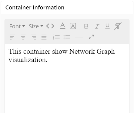
Container Information
You can enter the details of a container in the Container information and change its Font, Size, Color, etc of entered text.
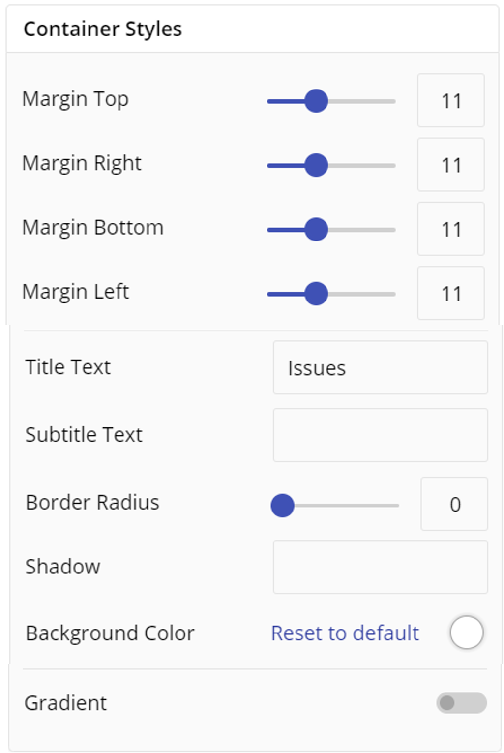
Container Styles
You can customize your container styling using below settings:
- Select margin top, right, bottom, left.
- Enter contatiner title text and sub-text.
- Choose border radius, Shadow, and background color.
- You can now style your container using gradient option by clicking on toggle, it further allows to set degree, minimum and maximum color, minimum and maximum value.
Container Settings
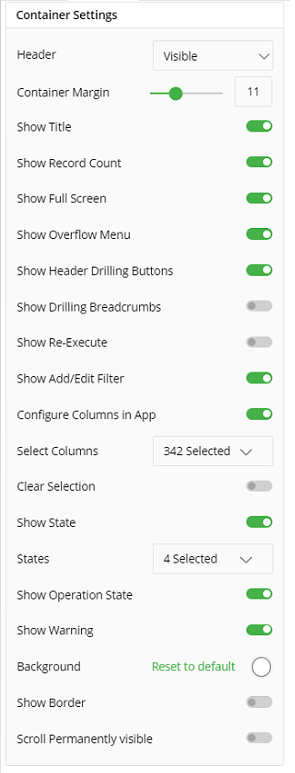
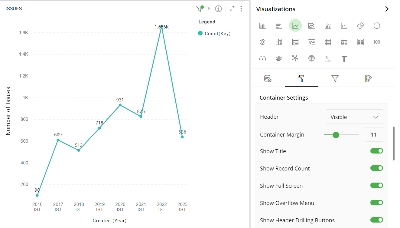
To show/hide the header, Show Title, Show Record Count, Show Full Screen and Show Overflow Menu, click the toggle switch.
To show/hide the Show Header Drilling Buttons, Show Drilling Breadcrumbs, Show Re-execute, Show Add/Edit filter, Configure Columns in App, Clear Selection, Show State, click the toggle switch.
You can choose states such as Aborted, Failed, Processing etc.
To show/hide Show Warning, Scroll Permanently Visible and export data click on the toggle switch.
Turn on the toggle switch to show the border for the container. Change the border color, style and width as shown below:
- Choose selection outline to Auto, Visible or Hidden. The following figure displays the effect of various container settings for your Line chart.
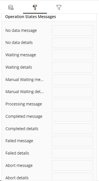
Operation States Messages
Add/edit the Operation States Messages such as No Data message, No Data details, Waiting message, Waiting details, Manual Waiting message, Manual Waiting details, Processing message, Completed Message, Completed details, Failed Message, Failed details, Abort message and Abort details to provide a concise information about operation states.
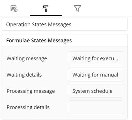
Formulae States Messages
- Add/edit the States Messages such as Waiting message, Waiting details, Processing message and Processing details to provide a concise information about Formulae states.
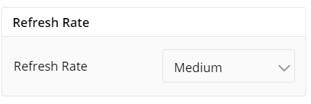
Refresh Rate
- Change the Refresh Rate such as Low, Medium, High resolution to display updates in your application.
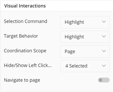
Visual Interactions
- Selection Command settings determines the action taken when users select nodes or edges within the graph. It provides options such as Highlight, Filter and None.
- Target Behavior settings define how the graph responds when elements are selected. It provides options such as Highlight, Filter and None.
- Coordination Scope determines the extent to which selected actions affect the graph, allowing for localized or widespread changes based on user preference. You can limit the scope to single page or entire app.
- Hide/show Left Click Menu allows users to customize the availability of action items in the context menu, which appears upon a left-click on graph elements. You can select various action items such as Favourite, Exclude, Keep Only etc action items to this list.
- Navigate to page enables direct navigation to linked pages or resources associated with graph elements using toggle.
To learn more, refer to section- ‘Configure Coordinated Visualization’.
User-Defined Colors
- Click on the
 icon for user-defined colors.
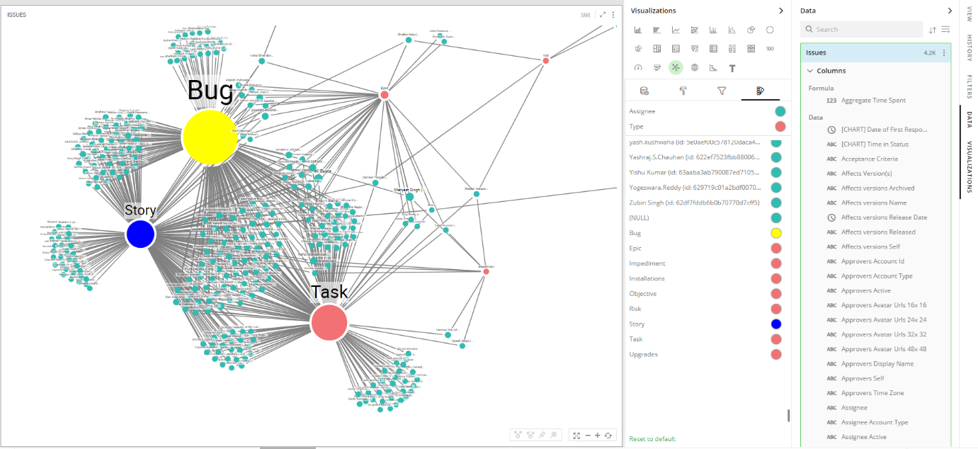
Colors for Individual Data Item
It lets you add meaning to a data item by associating a specific color to it and differentiate some data items from the rest.
For example, the red and green color may be used to represent “Off Track” and “On Track” issues, respectively. Whereas, orange color may be used for the “Bugs” type of issues to draw attention.
To change the colors:
Click on the color picker next to the data item for which you want to change the color.
Select the color from the available color grid or click ‘More Colors’ to choose a color from the spectrum.
To restore default settings, click on ‘Reset to Default’.
User Interactions on Graph
The following interactions allow you to customize the look of your Network Graph nodes and their placement.
Panning
You can pan the graph (move up, down, left and right) within the container to focus on a particular portion of the graph. This is very useful for larger graphs.
- Right-click + drag to pane
Reposition Nodes
You can manually reposition the nodes of a graph.
To move a single node:
- Left-click + drag a node
To move multiple nodes
First select multiple nodes by either of the 2 methods:
Ctrl + left-click each node, or
Draw a rectangular box over desired nodes using left-click+drag
Left-click + drag selected nodes
Zooming
Click on
 and
and  icons in the toolbar to Zoom In and Out of the Network Graph
Mouse wheel scroll and trackpad zoom gesture also lets you Zoom-In/Out.
Center on Graph
- Click on
 icon to place your Network Graph at the center of the container.
Relayout
When you arrange nodes on a graph manually, your graph may change drastically and require a full relayout. A well-organized layout of the graph improves the understanding of the underlying data. This option will change the relative positions of the nodes for optimum arrangement.
- Click on the
 icon to relayout your graph.
Expand and Collapse
You may be only interested in certain well-connected nodes of your Network Graph to visualize the intrinsic relationships. It is useful, especially in large graphs, to be able to hide child leaf nodes of only certain nodes. You can control the visibility of child leaf nodes as explained below:
- Double-click on a node to hide and show its child leaf nodes. Alternatively, you can also select the nodes and click on collapse
 and expand
  icons, to hide and show child nodes.
Pin and Unpin a Node
You can select nodes and click on
 icon to pin them. Once pinned, nodes retain their position even after relayouting the graph. The
  icon is shown on all the pinned nodes.
Click on the
 icon to unpin the selected nodes.
Note: Pinned child nodes will remain visible even when you click on the parent node to collapse its child leaf nodes.

Configuration Options in Full-Screen Mode
Visualization can be seen in full-screen mode by clicking on  icon.
icon.
Note: Visualizations Panel is not accessible in full-screen mode.
Click on
 icon at the top-right corner of the container.
Select ‘Configure View’ from the overflow menu.
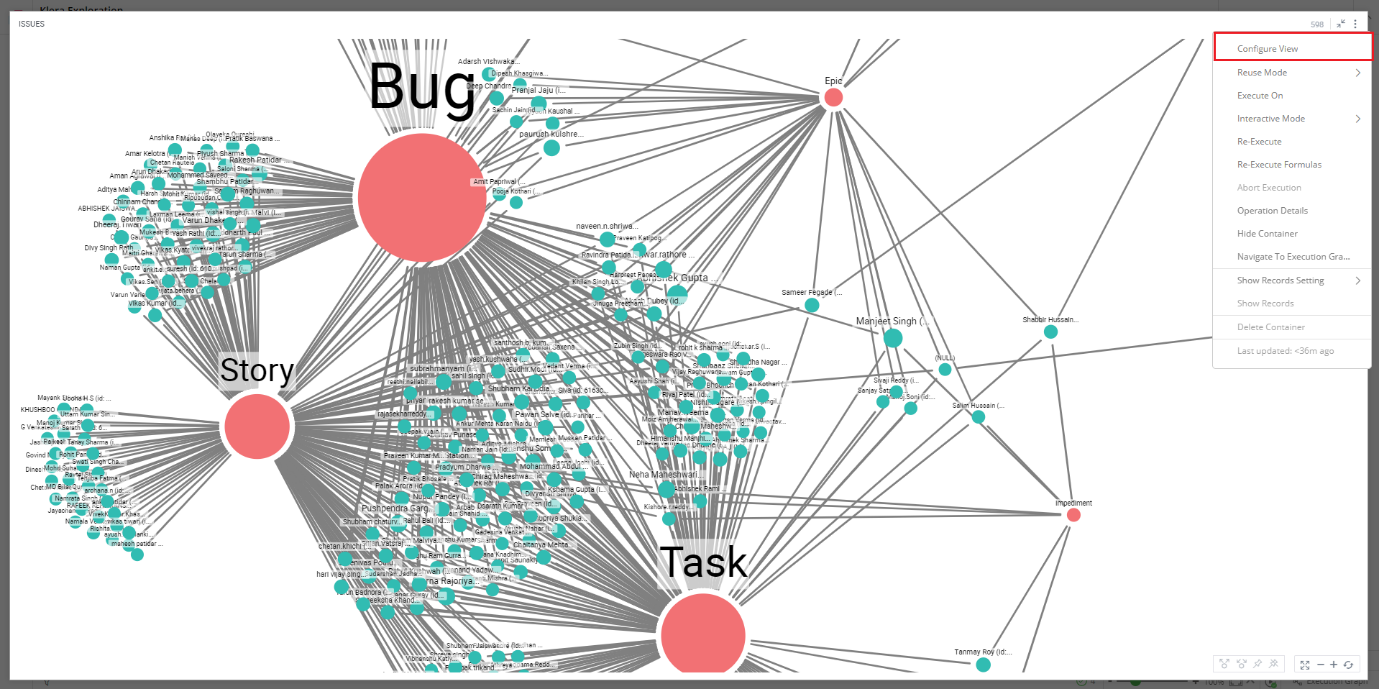
A pop-up form with all the relevant configuration options will appear.
Configure your visualization and click on ‘APPLY’.
If you have any feedback on Gathr documentation, please email us!