Scatter Plot Visualization
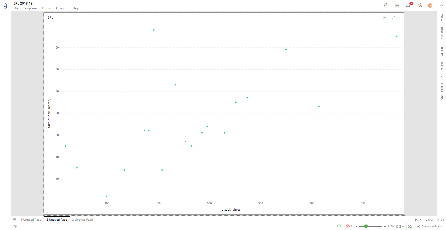
A Scatter plot displays values for two variables for a set of data, one on the horizontal axis (or x-axis) and one on the vertical axis (or y-axis). It displays the data as a collection of points. For every x and y value pair, a single point is plotted on the chart. A Scatter plot helps to determine the correlation between these two variables and find the linear or non-linear trends, clusters, and outliers in your data.
You can also show an additional third measure as ‘Size’. This size dimension replaces data points in the Scatter plot with bubbles. The size of the bubbles is proportionate to the corresponding value.
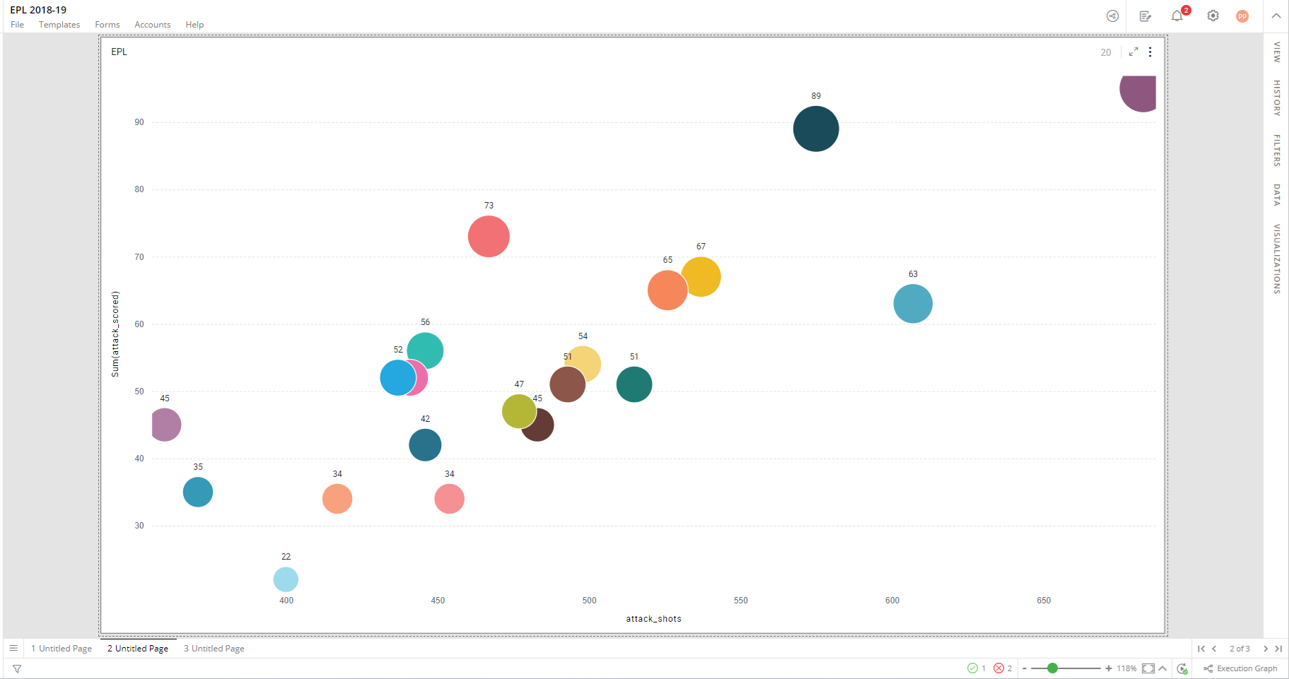
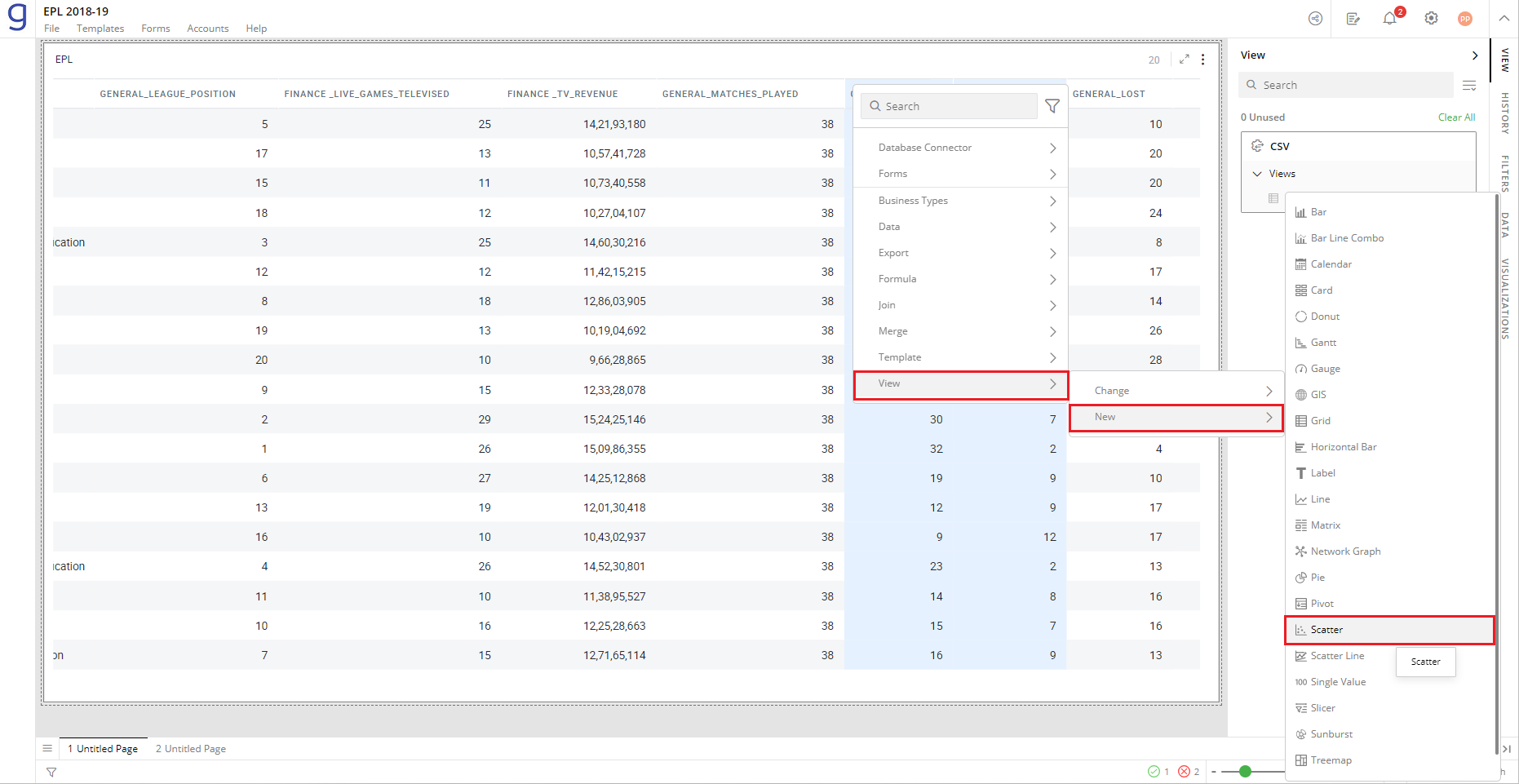
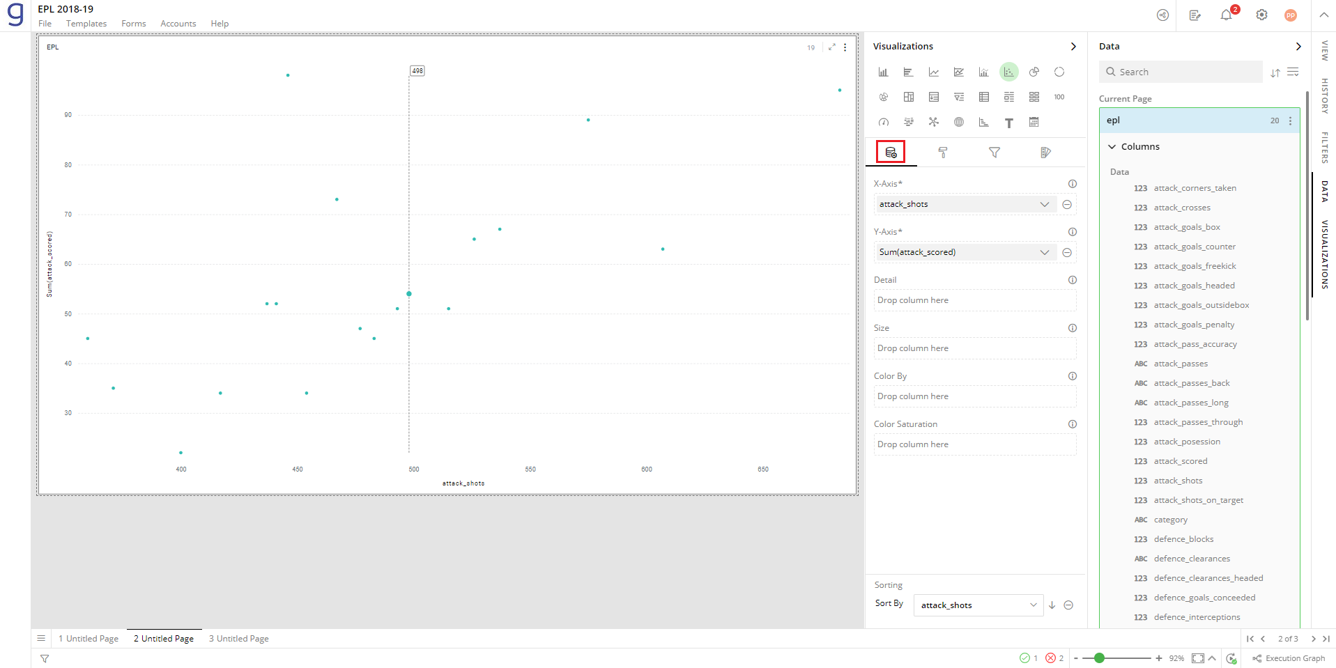
The following example is based on English Premier League (EPL) data for the 2018-19 season. Scatter plot is created to examine the relationship between goals scored and total shots.
To create a Scatter plot:
- In your data, Right-click on the column > Select View> Change> Scatter.
Refer here to learn more about creating a visualization.
The following image shows the resulting Scatter plot.
Configure Scatter plot
To configure:
- Select your Scatter plot and open the Visualizations Panel.
The following configuration options are available for Scatter plot:
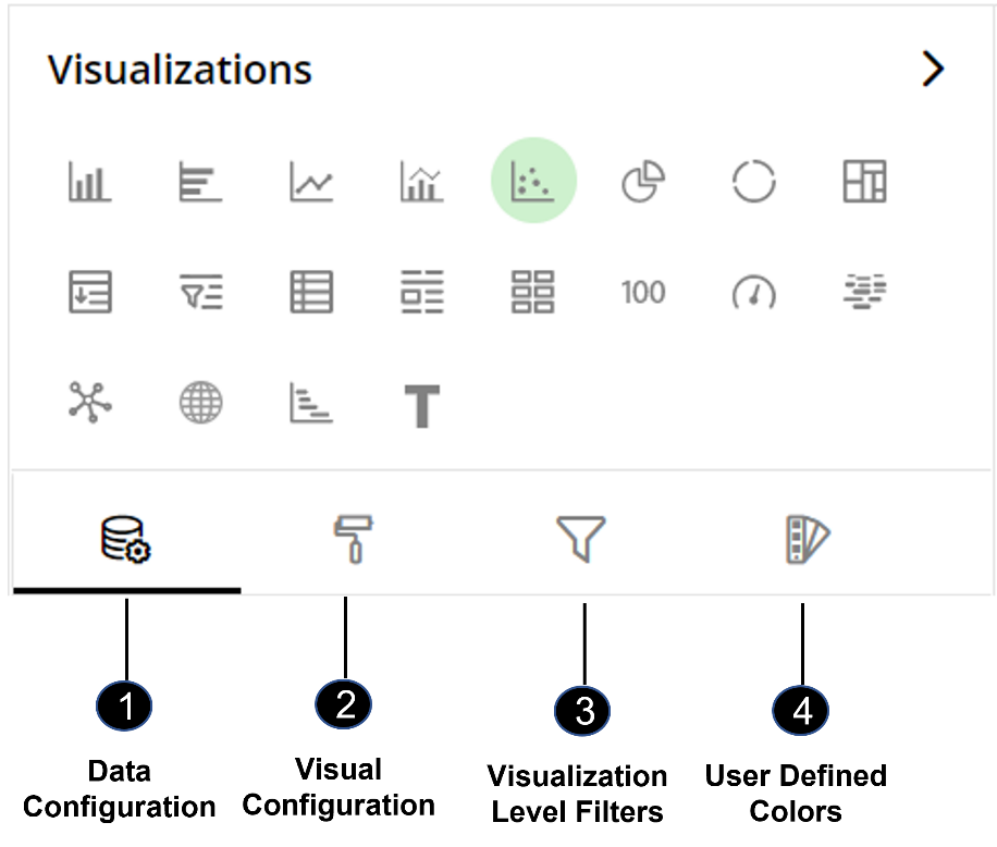
Data Configuration
 : It lets you choose columns for the following settings:
Visual Configuration
 : It lets you configure the visual appearances and interactions of Scatter plot.
Visualization Level Filters
 : It lets you filter the data in the visualization without impacting the other visualizations.
Refer here to learn more about Visualization Level Filters.
User-Defined Colors
 : It lets you add meaning to a data point by associating a specific color to it or differentiate a data point from the rest.
Data Configuration
- Click on the
 icon for data configuration options.
X-Axis
Specify the column whose values you want to plot on horizontal Axis.
To change the column on X-Axis:
Click on
 to remove the existing column.
From the Data Panel, drag the desired column and drop it onto the Visualizations Panel’s “X-Axis” section.
Click on the
 icon to select the aggregate function from the drop-down.
Aggregate functions for textual data: Count, Unique Count
Aggregate functions for numerical data: Count, Unique Count, Sum, Min, Max, Avg
Note: You can also type the column name in the Data Panel to quickly find it.
Date and Time Grouping on X-Axis
You can create points by setting date and time values to X-Axis. When specifying a column with date and time on X-Axis, you can group the dates on Year, Quarter, Month, Week, Day, Hour, and Minutes.
From the Data Panel, drag the Date, DateTime and Time type column and drop it onto the Visualizations Panel’s “X-Axis” section.
Click on the
 icon and select ‘Group By’.
Select the appropriate interval.
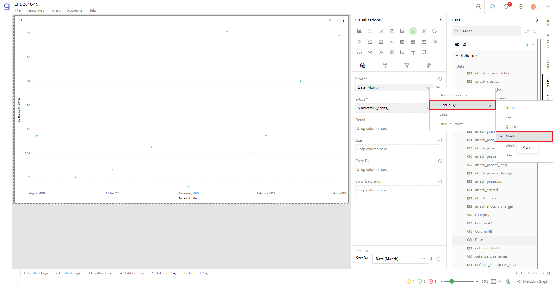
To learn more about Date & Time grouping, refer to the following GIF.
Note: Steps for Date & Time grouping are the same for Bar and Scatter plot.

Y-Axis
Specify the column whose values you want to plot on vertical Axis.
To change the column:
- Follow the same steps as shown above for “X-Axis”.
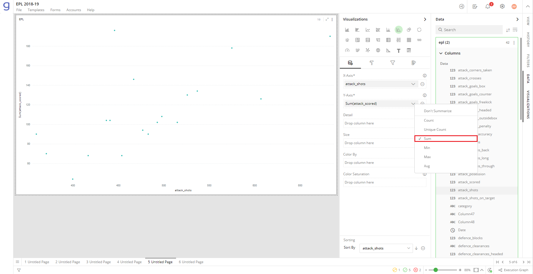
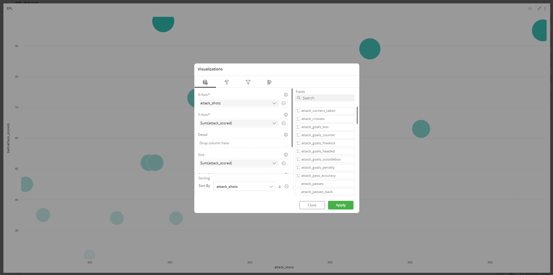
In this example, a Scatter plot is created with “Shots” and “Goals scored” columns on X-Axis and Y-Axis respectively.
Details
You can also add more details to data points.
Specify the column whose values you want to display as additional information.
One dot is plotted for unique values of the column(s) dropped in the details field.
Note: You can select maximum two columns for the “Details’ section.
From the Data Panel, drag the desired column and drop it onto the Visualizations Panel’s “Details” section.
Hover over a data point to see the details.
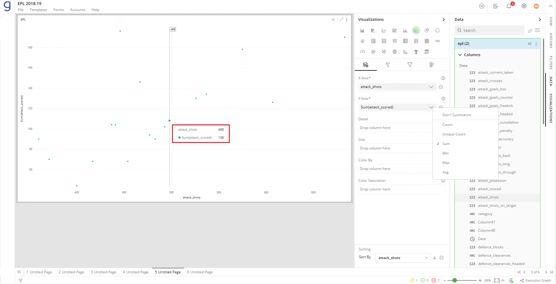
Size
Specify the column to provide additional dimension for the size of the data points. The data points expand to bubbles.
Drag and drop the desired column from the Data Panel onto the visualizations Panel’s ‘Size’ section.
Click on the
 icon to select the aggregate function from the drop-down.
Aggregate functions for textual data: Count, Unique Count
Aggregate functions for numerical data: Count, Unique Count, Sum, Min, Max, Avg
The size of the bubble reflects the value of ‘total points’ for each team.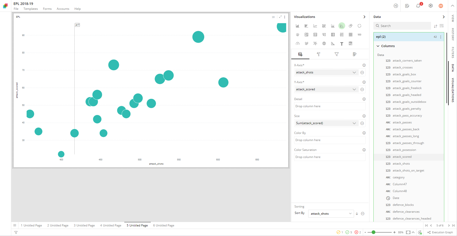
Color By
You can have distinct colors for the Scatter plot points based on values from a column.
- Drag and drop the column from the Data Panel onto the Visualizations Panel’s ‘Color By’ section.
In the following image, the data point colors represent EPL teams.
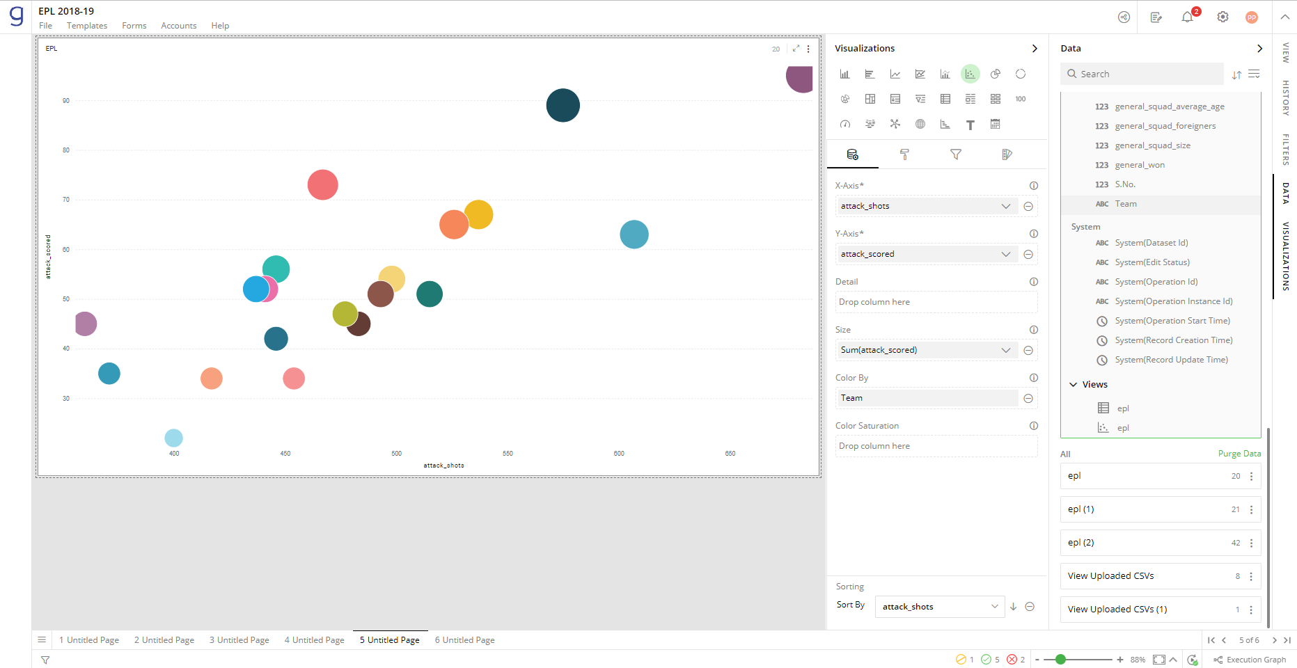
Note: If data in the column contains subcategories, then dragging such column to ‘Color By’ section will result in more points representing subcategories.
You can hover on a point to see all the details of the columns selected in various settings explained above.
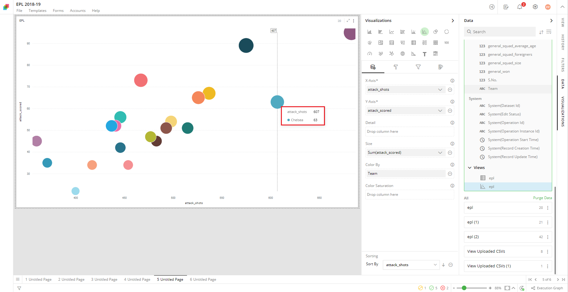
Note: You can add legend to your chart to see what each color represents.
Color Saturation
You can use color gradients to show the progression of data from low to high values. It will color each point on Scatter plot with a shade from the spectrum between the two colors defined as ‘Minimum’ and ‘Maximum’.
To apply color gradients:
Drag the desired column from the Data Panel and drop it on the Visualizations Panel’s “Color Saturation” section.
Select the aggregate function by clicking on the
 icon.
icon.
In this example, the Scatter plot reflects the gradient with light colors for low values and dark colors for high values calculated as Sum (Goals_Scored).
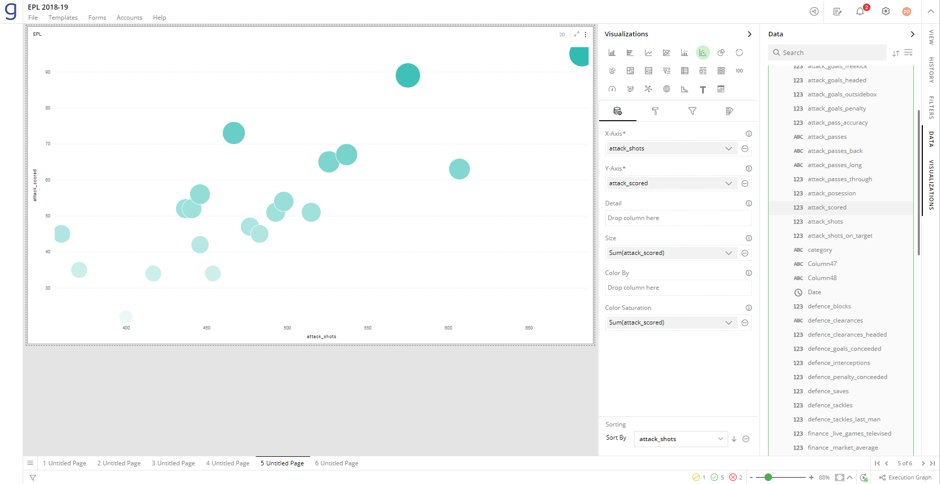
To customize the shades of color saturation, refer to section- ‘Color Saturation Settings’.
Note: Color Saturation cannot be applied if ‘Color By’ is already configured. Remove the ‘Color By’ setting to apply the ‘Color Saturation’ effect.
Sorting
Sorting allows you to change the order of data making it easier to find what you’re looking for.
Note: By default, the Scatter plot is sorted by values on X-Axis.
To change the order of sorting:
- Click on
or
icon to change the sorting order (ascending or descending).
Visual Configuration
- Click the
 icon for visual configuration settings.
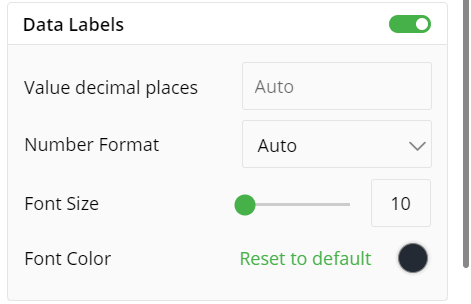
Data Labels
You can hide or show the data labels by this toggle switch.
Choose the number of decimal places you want to display labels with.
Choose the number format from Auto, None, Thousands, Millions, Billions and Trillions.
Provide the font size of data labels.
Click on the color picker and select a font color. To restore the default color setting, click ‘Reset to Default’.
X-Axis
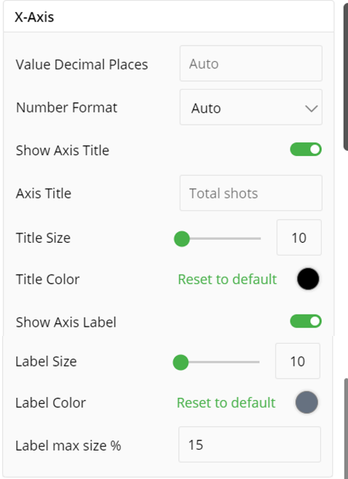
Set values in decimal places
Set number format
Show/hide Axis title
Type in the title for X-Axis
Provide the font size and color of title.
Toggle to show Axis label
Provide the font size and color of labels.
Set the Label Max Size%
Y-Axis
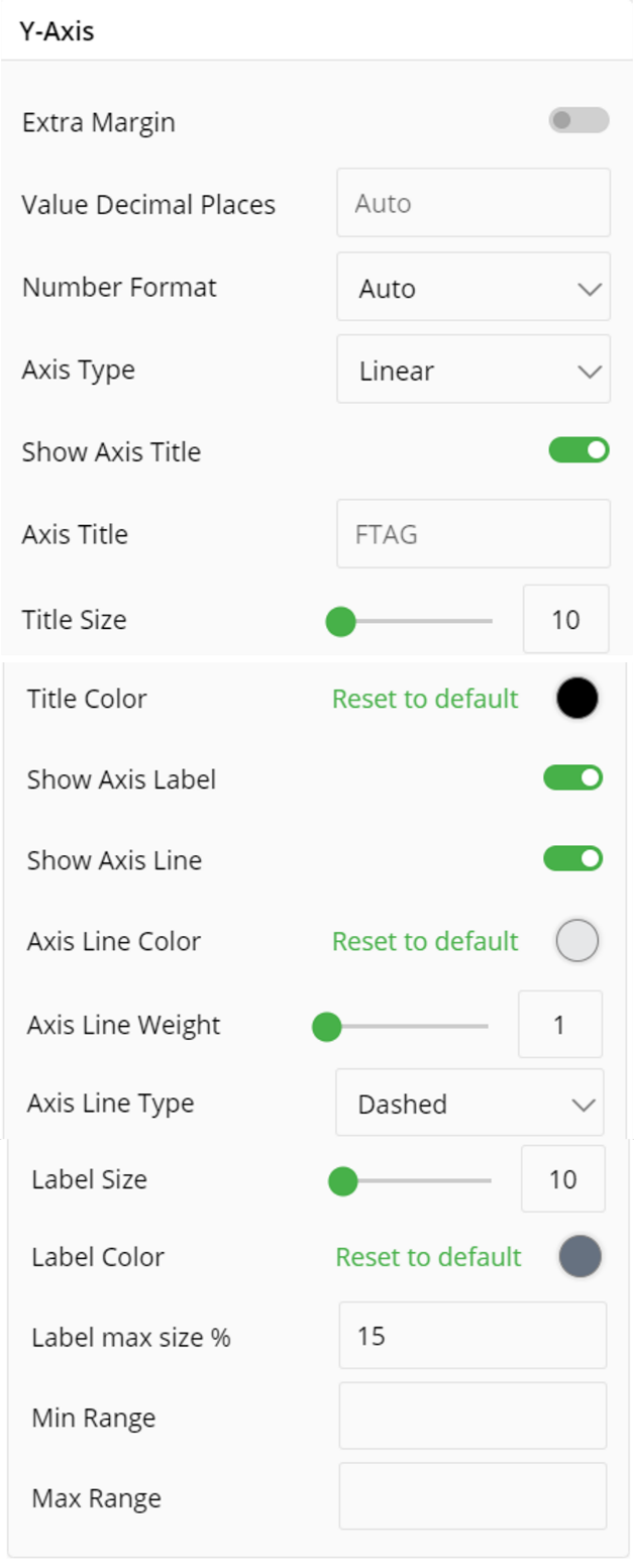
Similarly, you can set various configuration for Y-Axis as well such as:
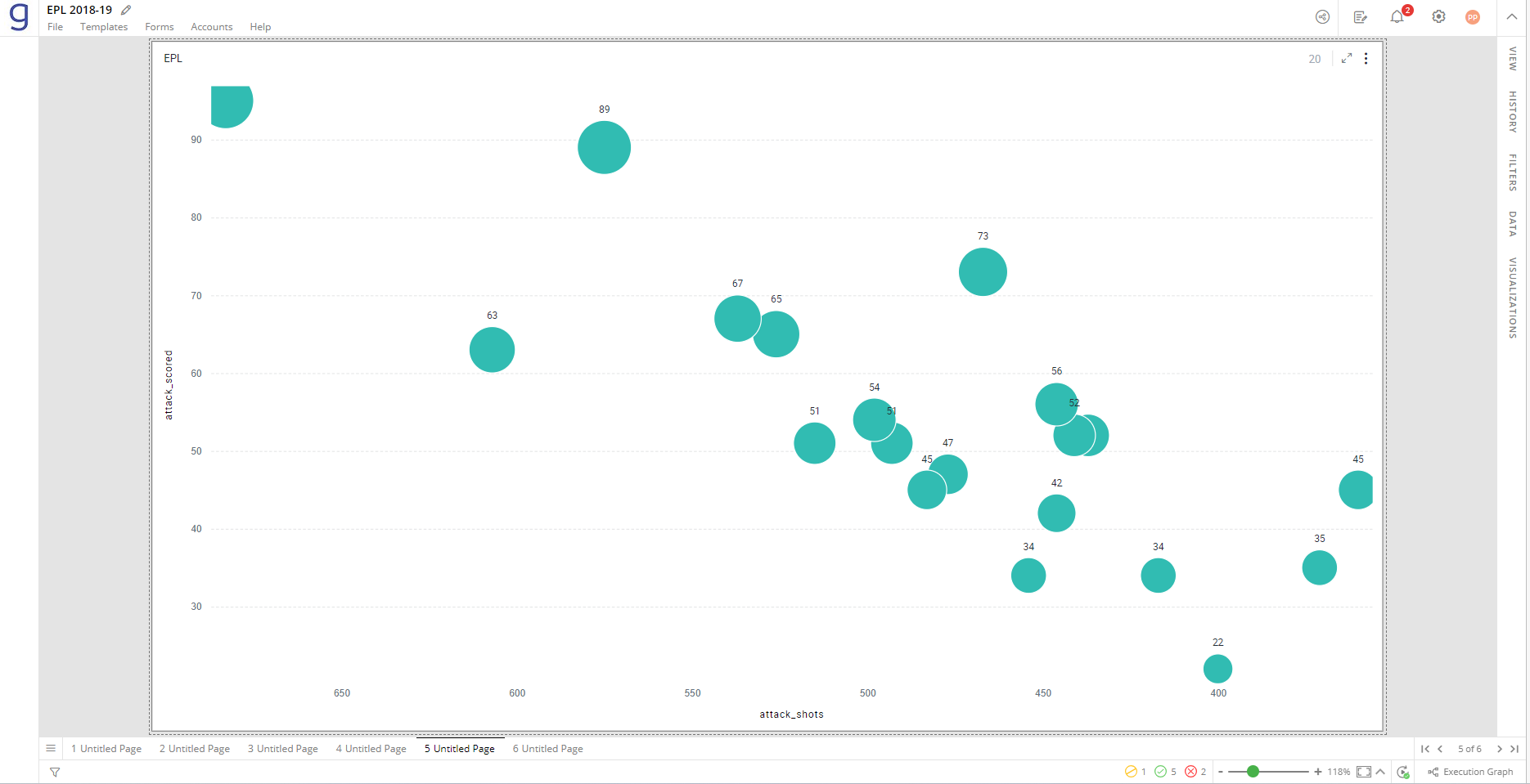
Turn on the toggle switch for extra margins to see full bubbles at the edges of the Scatter plot.
Choose the number of decimal places you want to display values with.
Choose the number format from Auto, None, Thousands, Millions, Billions and Trillions.
Select the Axis type from Linear or Log.
Toggle to Show Axis Title
Type in the Axis title.
Set Title Size and Title Color
Toggle to Show Axis Label and Show Axis Line
You can choose Axis Line Color and set Axis Line Weight
Choose Axis Line Type as Dashed, Solid or Dotted
You can set Label Size, Label Color and Label max size%
You can also set manimum and maximum range for your visualization
The following image shows the full bubbles at the edges with an ‘Extra Margin’ setting selected.
Axis Types
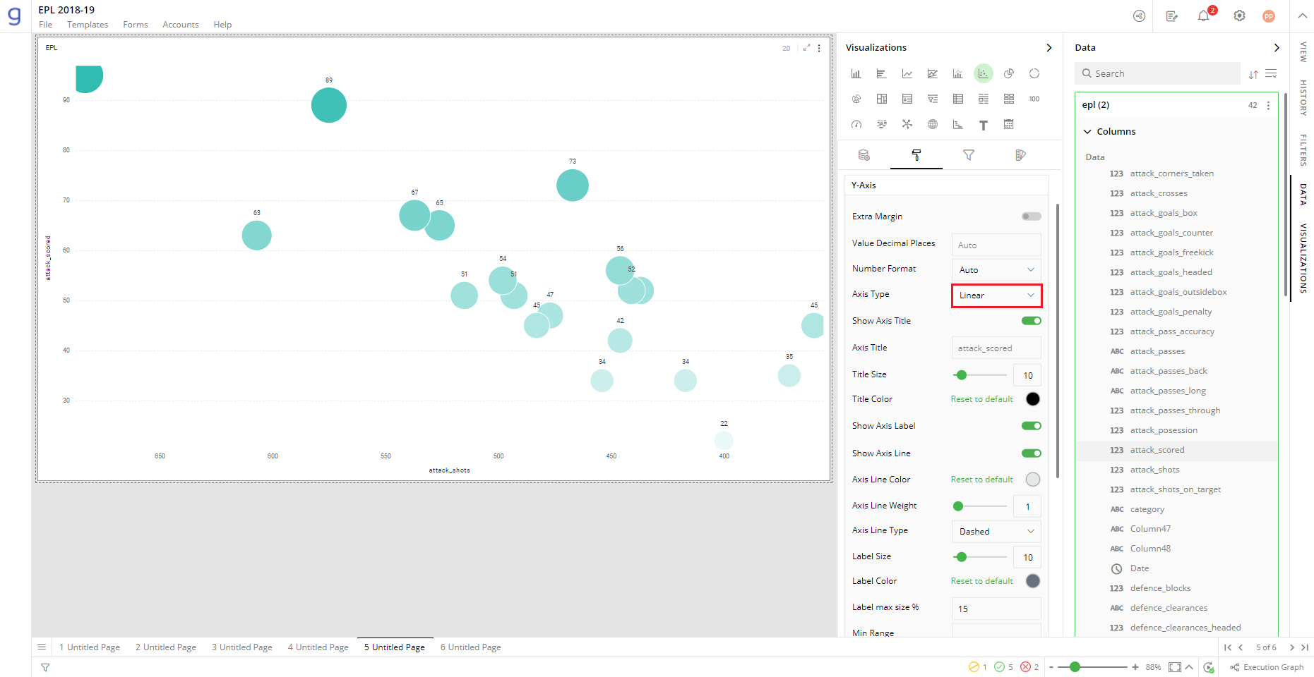
There are two ways to plot values in a Scatter plot - linear and logarithmic.
On a linear scale, a change between two values is perceived on the basis of the difference between the values, whereas, on a logarithmic scale, this change is perceived on the basis of the ratio of the two values.
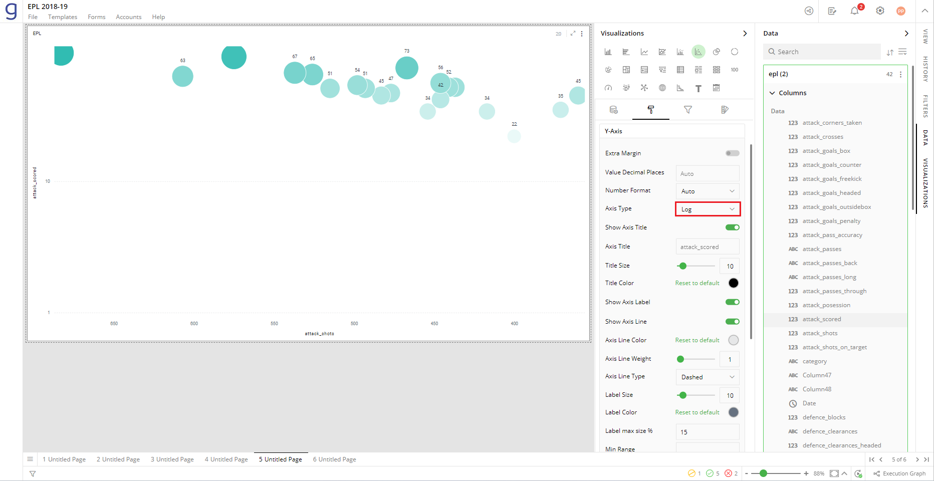
The main reason to use logarithmic scales in charts and graphs is to respond to skewness towards larger values; i.e., cases in which one or a few points are much larger than the bulk of the data.
When plotting disparate data on a linear scale, the smaller values get lesser prominence while the larger ones occupy the entire scale. In such cases, using a logarithmic Axis type is recommended.
The following figure demonstrates the Scatter plots with linear and log axis types, created for the same data.
Scatter plot on the linear axis:
Scatter plot on the logarithmic axis:
When plotting disparate data on a linear scale, the smaller values get lesser prominence while the larger ones occupy the entire scale. In such cases, using a logarithmic Axis type is recommended.
Hair Lines
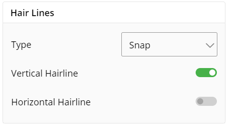
Change type of hair lines, i.e. smooth or snap.
Enable/disable vertical hair line.
Enable/disable horizontal hair line.
Legend
Legend helps you identify and correlate data on your chart. They provide an overview of the different data points involved in the chart along with the colors associated with each of them. Legend consists of Heading and Items.
To turn legends on or off, select the toggle switch next to Legend.
To turn legend title on or off, select the toggle switch next to Show Title.
Select legend position (Left, Right).
To align legend position, choose Top, Center or Bottom options next to Align.
Enter text for the legend heading.
Enter the font size and font color for the heading and items.
You can set max width% of Legend.
To turn word on or off, select the toggle switch next to Word Wrap.
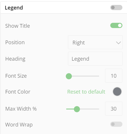
Note: Click on legend items and related data will be highlighted in the visualization.
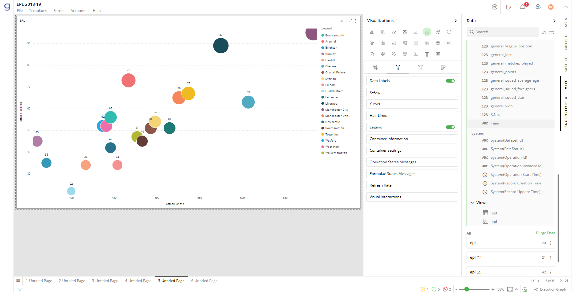
Container Settings
To show/hide the header and border, click the toggle switch.
Turn on the toggle switch to show the border for the container. Change the border color, style and width as shown below:
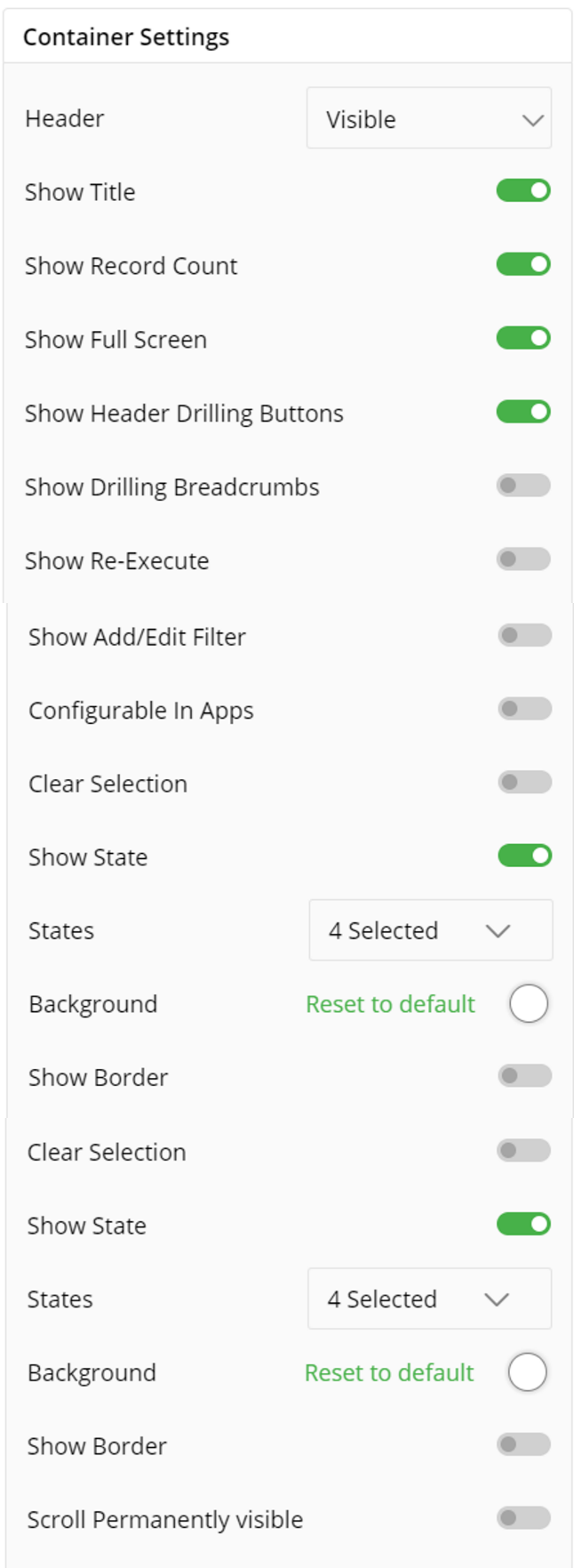
The following image displays the effect of various container settings for your Scatter plot.
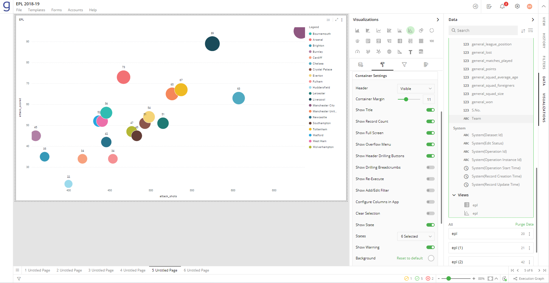
State messages
State messages helps you communicate with app user by letting him know about different states of app, such as processing, waiting etc.
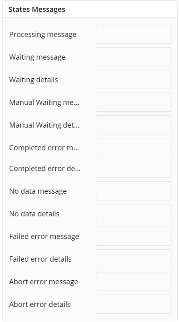
Refresh rate
You can set slow, medium or fast refresh rates as per the requirements of your application.
Visual Interactions
- Select the target behavior and coordinated visualization scope from the below settings.
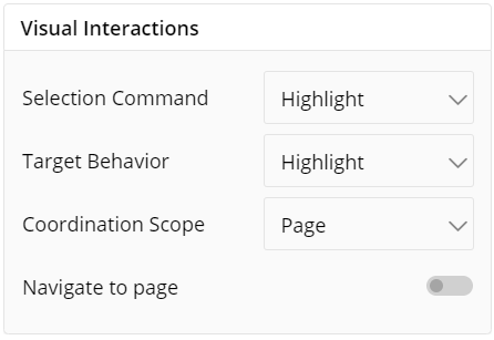
To learn more, refer to section- ‘Configure Coordinated Visualization’.
User-Defined Colors
- Click on the
 icon for user-defined colors.
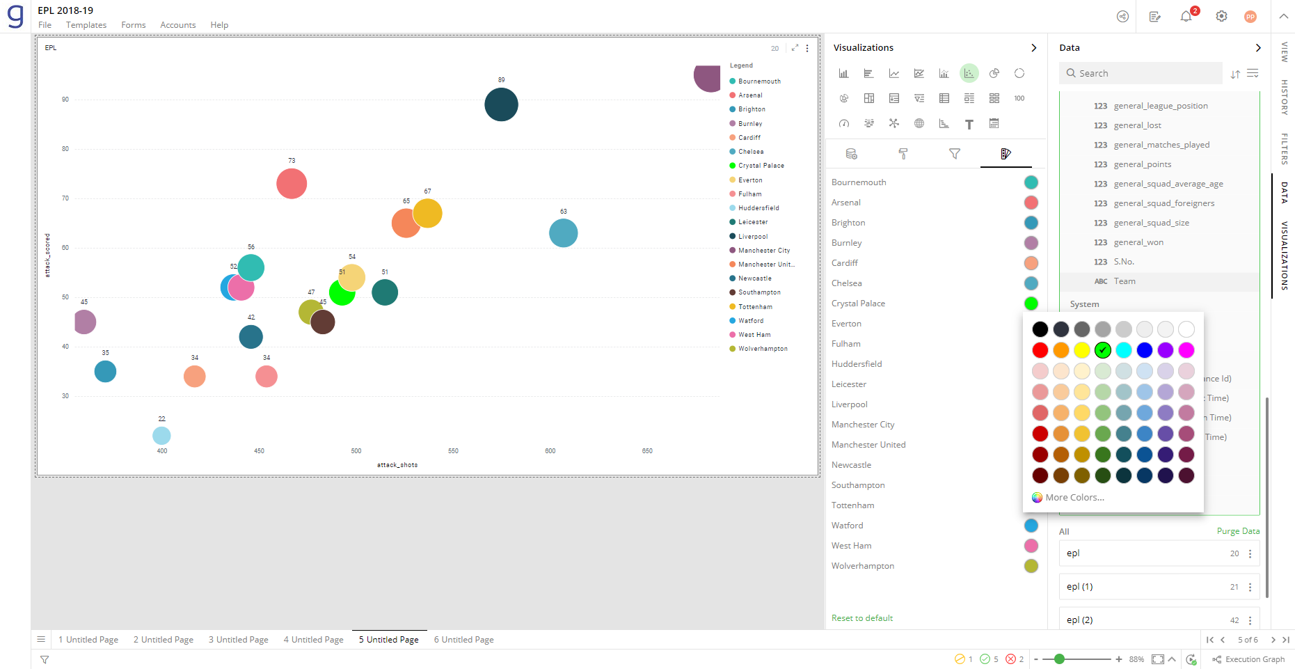
Colors for Individual Data Item
It lets you add meaning to a data item by associating a specific color to it and differentiate some data items from the rest.
To change the colors:
Click on the color picker next to the data item for which you want to change the color.
Select the color from the available color grid or click ‘More Colors’.
To restore default settings, click on ‘Reset to Default’.
As shown below, green color has been added to differentiate that data item from the rest.
Color Saturation Settings
The following image shows the default color saturation settings for your visualization.
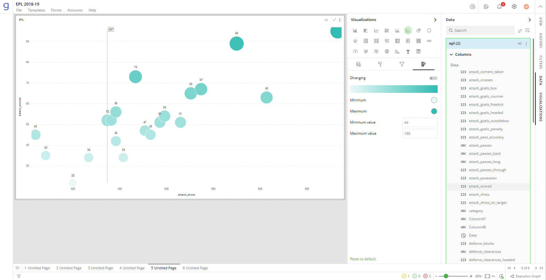
To customize the color gradient effects:
Select the Minimum and Maximum color.
Toggle ‘Diverging’ option. An additional color selector for mid-range value, called Center, appears.
Select the color ‘Center’.
You can provide custom values representing ‘Minimum’, ‘Center’, ‘Maximum’ Values. All Scatter plots larger than ‘Max Value’ are colored in ‘Max Color’ whereas those less than ‘Min Value’ in ‘Min Color’.
Configuration Options in Full-Screen Mode
Visualization can be seen in full-screen mode by clicking on  icon.
icon.
Note: Visualizations Panel is not accessible in full-screen mode.
Click on the
 icon at the top-right corner of the container.
Select ‘Configure View’ from the overflow menu.
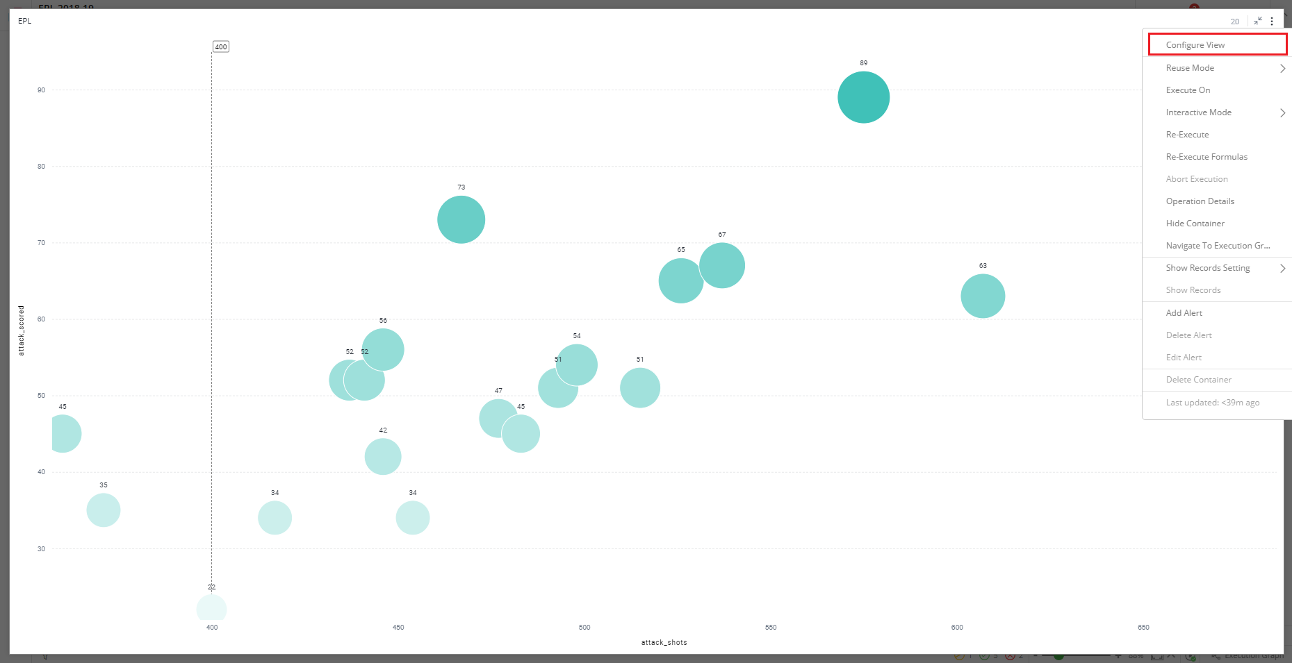
A pop-up form with all the relevant configuration options will appear on the screen.
Configure your visualization and click on ‘APPLY’.
If you have any feedback on Gathr documentation, please email us!
