Slicer Visualization
Slicers are visual filters on your dashboard. They provide you an alternate way of filtering the data.
When to use Slicers for data filtering?
Slicers can be used by Read-only collaborators and users of Published explorations (Generic filters panel is not available in these scenarios)
Slicers filter data for the currently logged in user only, without impacting other users using the same exploration (collaborators, and published users.), Unlike exclude/include and generic filter.
Slicers retain the filtering state even after pressing the ESC key, unlike filtering through highlighting.
The slicer is created on ‘Assignees’ in the sample dashboard shown below. All the visualizations will filter as per the selected assignees.

Slicer GIF
Type of Slicers
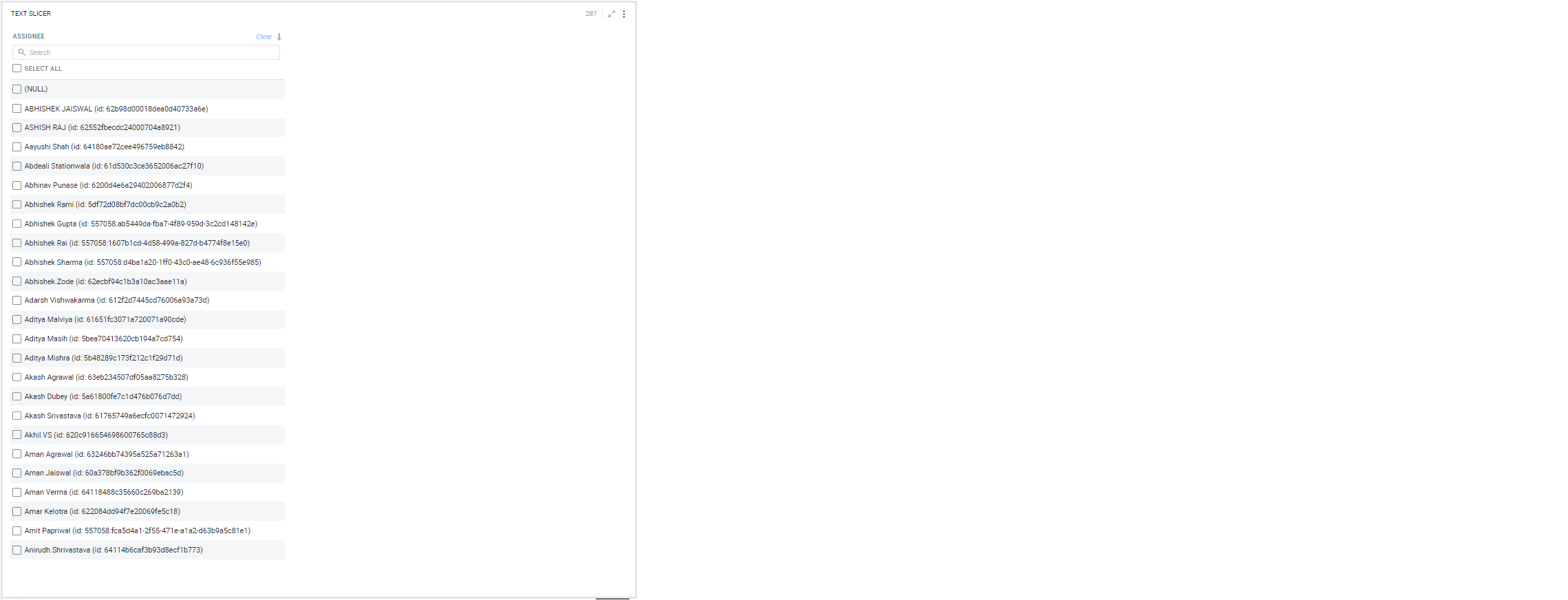
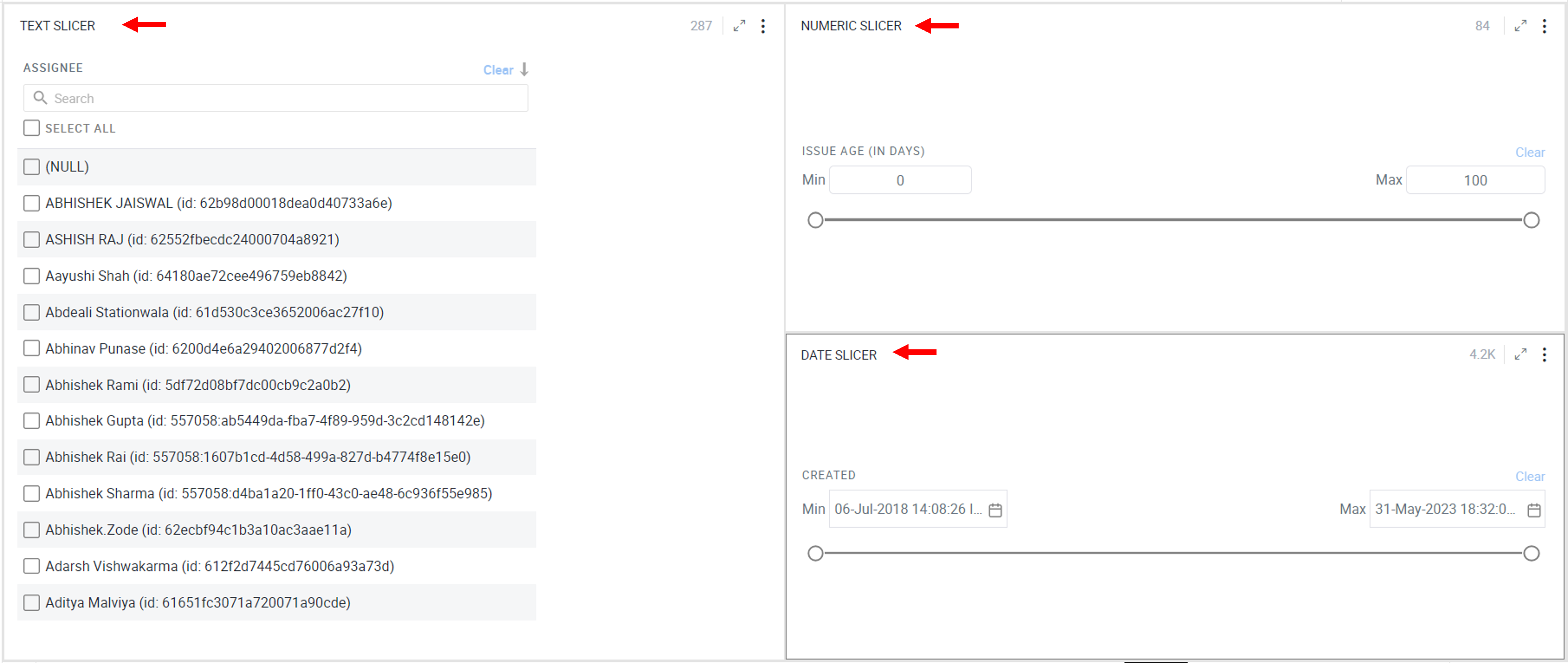
- Text Slicer- It lists all the unique values from the column to create a filter.
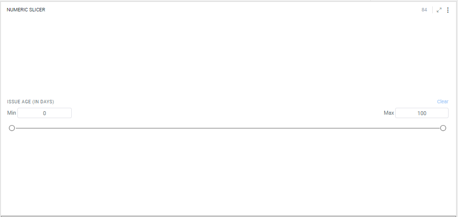
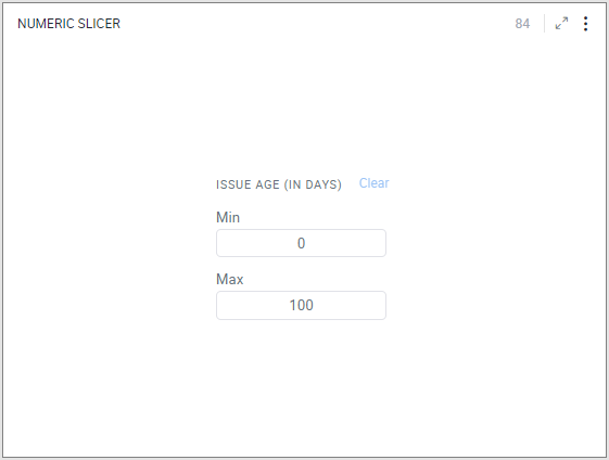
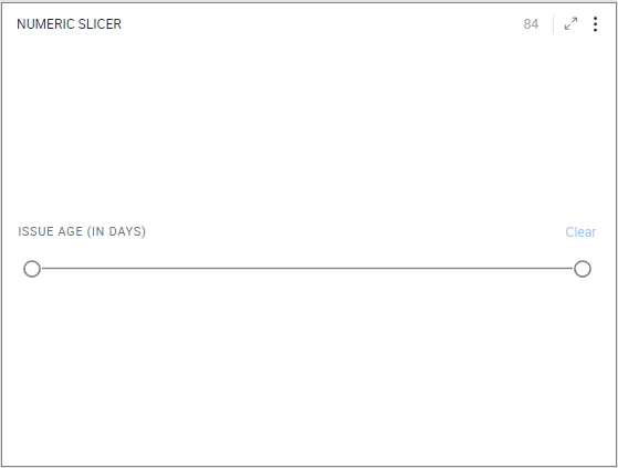
- Numeric Range Slicer- You can filter the data between two numbers. You can edit the Min and Max values or drag the slider handles to change the range.
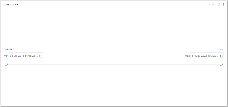
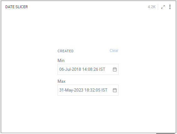
- Date Range Slicer- You can filter the data between a date range. Click on the calendar icon
 to set start and end dates or drag the slider handles to change the date range.
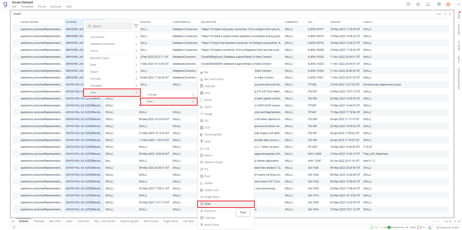
To create a Slicer:
- Right-click on the column > Select View> New > Slicer.
Refer here to learn more about creating a visualization.
Note: You can create the specific type of Slicer depending on the type of column (Text, Numeric and Date).
The following image shows the resulting text Slicer. The Slicer is populated with a list of checkboxes for all unique “Assignee” in the data.
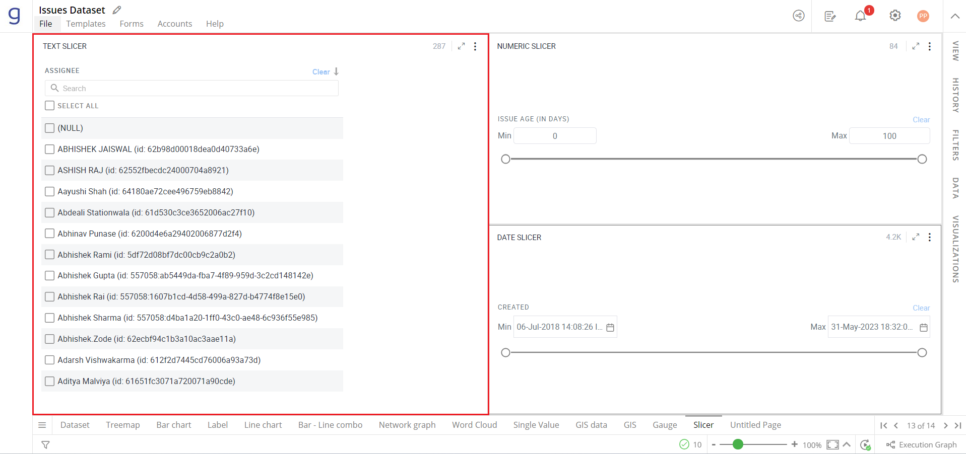
You can create the specific type of Slicer depending on the type of column (Text, Numeric and Date).
- You can add multiple slicers to your dashboard by repeating the above step.
The following image shows the filtered data in the visualizations using various Slicers (text, number and date).
Configure Slicer
- Select Slicer and open the Visualizations Panel.
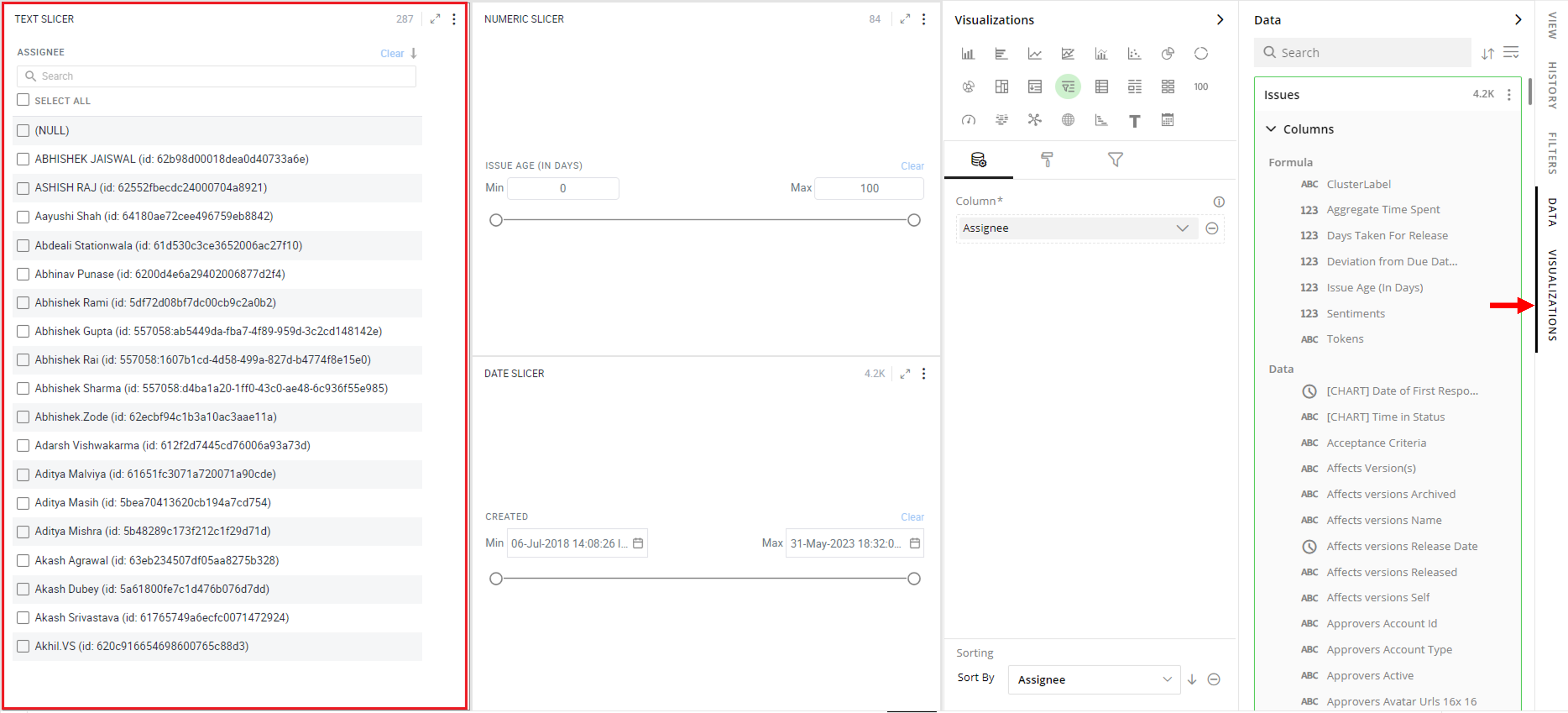
The following configuration options are available for Slicer:
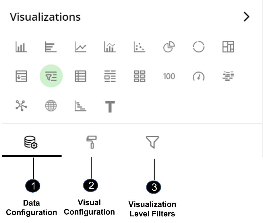
Data Configuration
 : It lets you choose columns for the following settings:
Visual Configuration
 : It lets you configure the visual appearances and interactions for Slicer.
Visualization Level Filters
 : It lets you filter the data in the visualization without impacting the other visualizations.
Refer here to learn more about Visualization Level Filters.
Data Configuration
- Click on the
 icon for data configuration options.
Columns
Specify the column that you want to create a slicer on.
To change the column:
Click on
 to remove the existing column.
From the Data Panel, drag the desired column (text, numeric, or date type) and drop it onto the Visualizations Panel’s “Columns” section. According to the type of column, specific Slicer will be created.
For text slicer, you can add one more column in this section. This column must be a summarized column.
- Select the aggregate function for the summarized column.
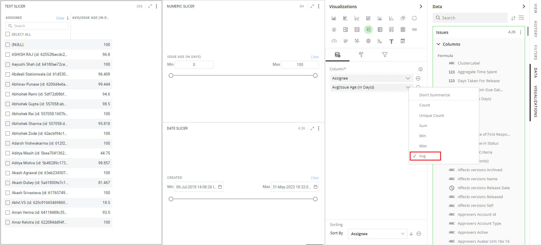
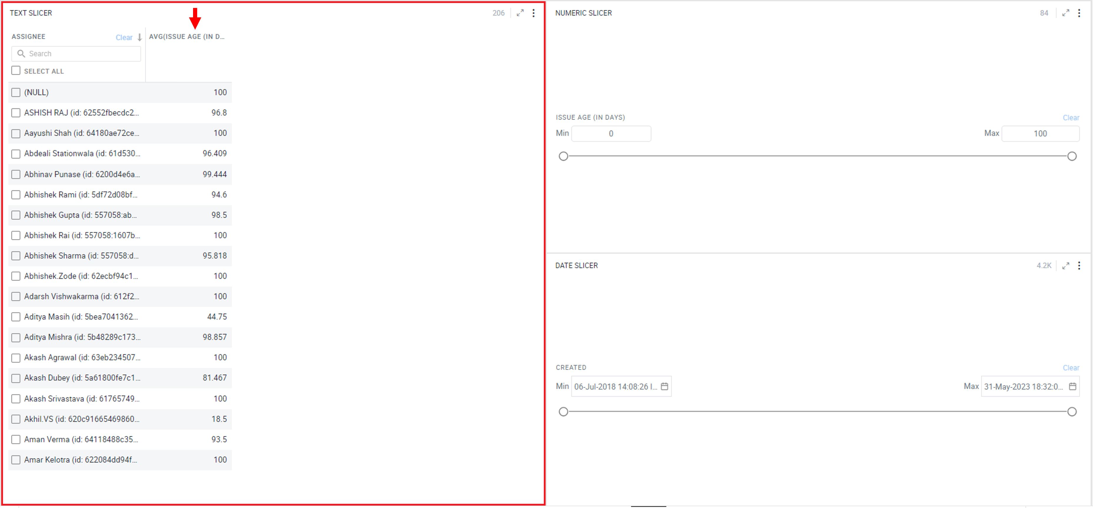
For example, you can add “Average Issue Age” with the Assignee column in the Slicer. This will provide you additional information to decide a filter criterion.
Note: For numeric and date slicers, a maximum of one column can be added to the ‘Columns’ section.
Sorting
Sorting allows you to change the order of data making it easier to find what you’re looking for.
Note: By default, values in Slicer are sorted by the non-summarized column.
To change the sorting order:
- Click on
or
icon to select the sort order (ascending or descending.)
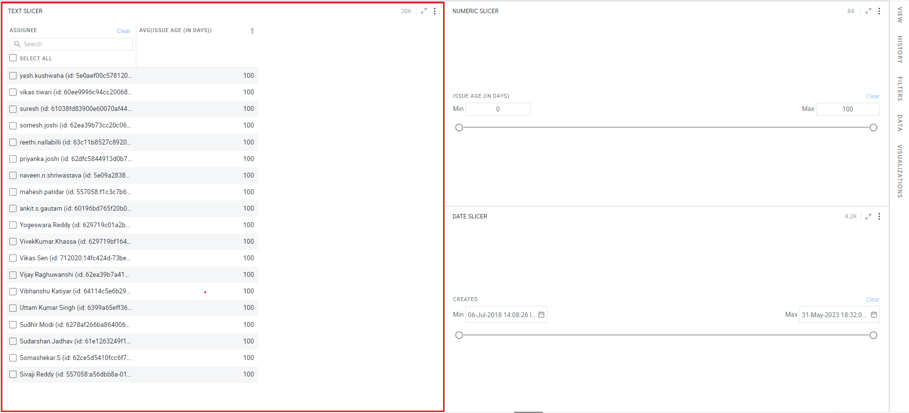
The following image shows the data sorted on average issue age in descending order.
Visual Configuration
- Click on the
 icon for visual configuration settings.
Input Configuration
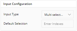
- Click on the drop-down in ‘Input Type’ and choose one of the options given according to the type of column in the data configuration. For Text Slicer with multi-select checklist, you can choose Default Selection from indexes between 1-100. You can input indexes and those options will be selected by default.
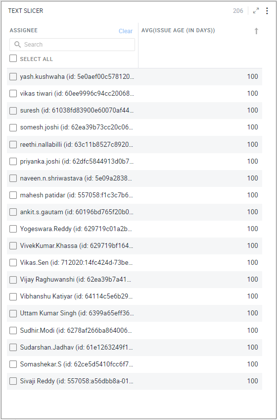
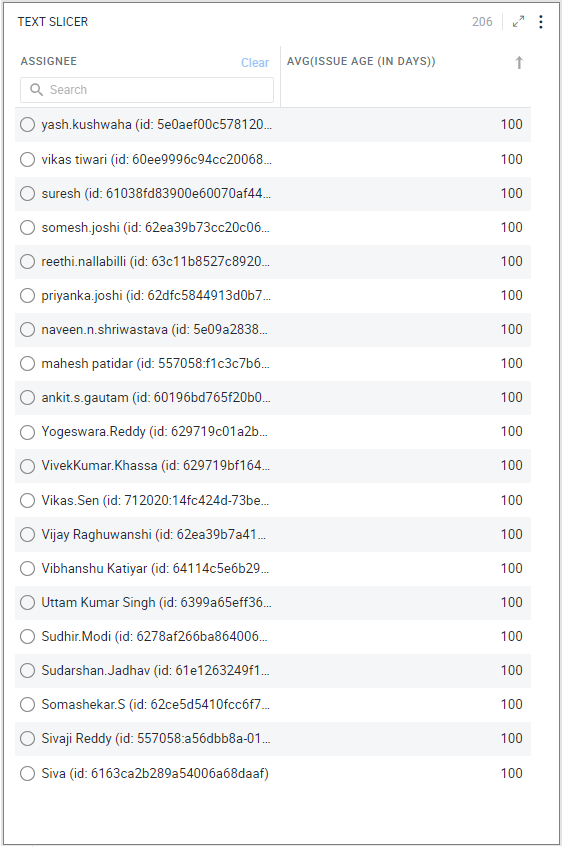
- Text Slicer: It can be shown as the checkbox or radio-button filter.
- Multi Select List
- Single Select list
- Multi Select Drop-down
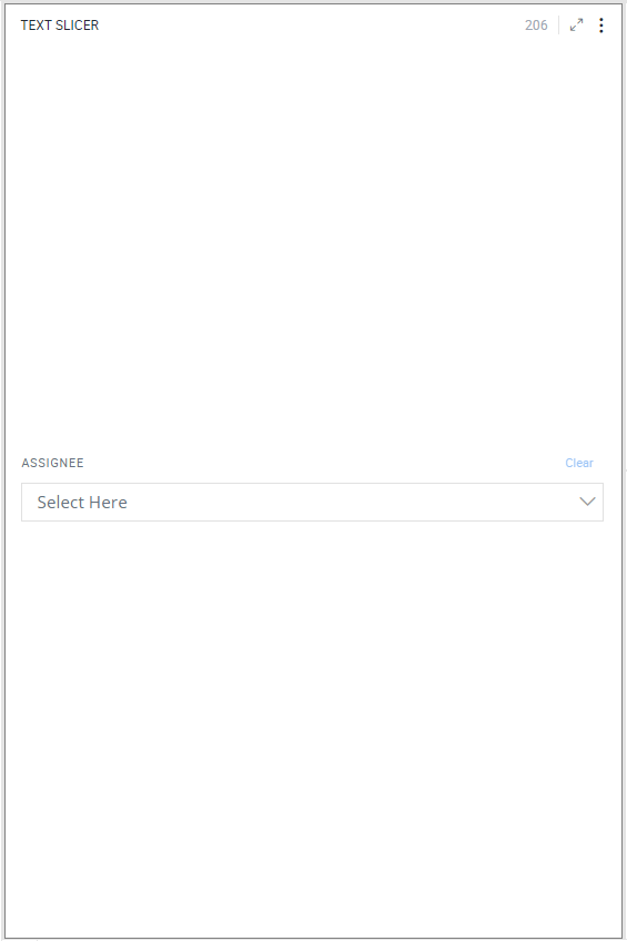
Click on the  icon to select from the list.
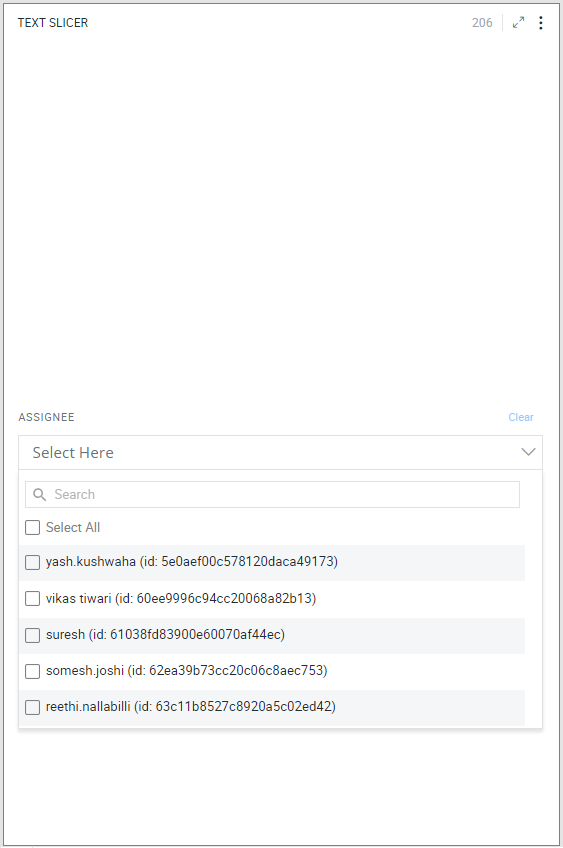
- Single Select Drop-down
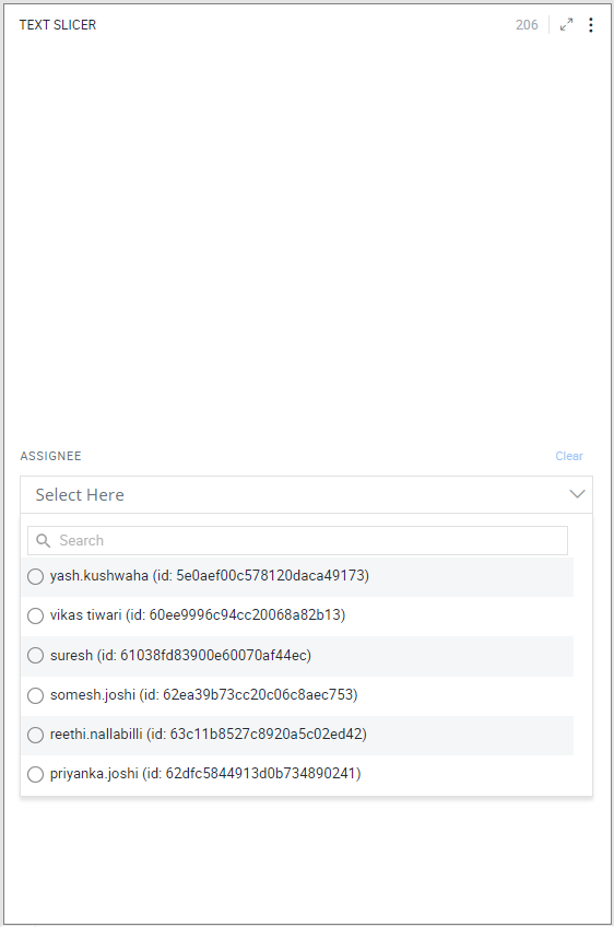
Numerical Range Slicer:
- Input fields and Slider

- Input field
- Slider
Date Range Slicer:
- Input fields and Slider

- Input fields
- Slider
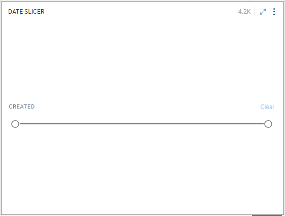
Header
- Select from various configuration options available to customize header view. You can change its Font size, Font color, Border color, Show Header, Show Selection Count, toggle to Show Clear Button, set Clear Button Color, toggle to Show Search bar and set Header Padding as show in the diagram below.
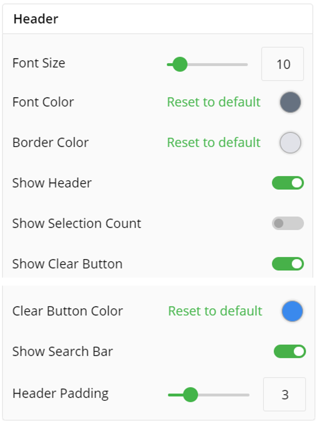
Column
You can toggle to Show Gridlines for your slicer visualization and subsequently set Gridlines thickness and color.
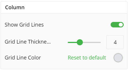
Row
You can toggle to Show Gridlines for your rows in slicer visualization and subsequently set Gridlines thickness and color. You can set row color and row padding, alongwith this if you require alternate row color you can toggle the Show Alternate Row Color.
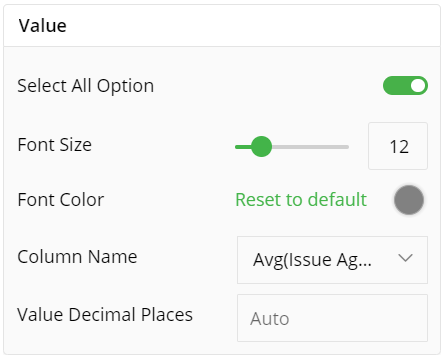
Value
You can add or remove Select All option from your visualization by toggle. You can set the font size, color, Column Name and Value Decimal Places.
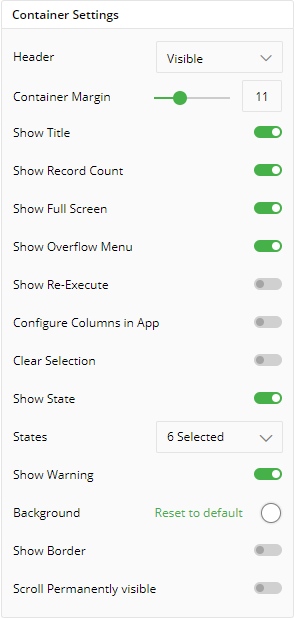
Container Settings
To show/hide the header and border, click the toggle switch.
Turn on the toggle switch to show the border for the container. Change the border color, style and width as shown below:
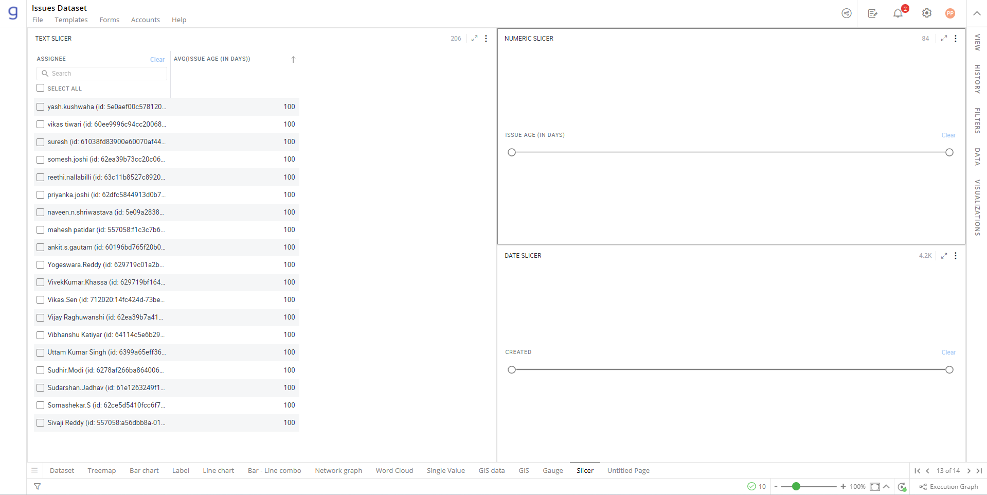
The following image shows the effect of various container settings.
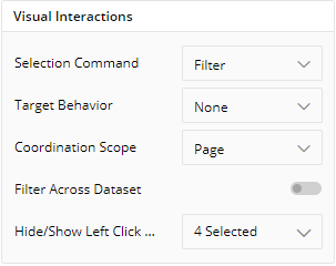
Visual Interactions
Slicers filter the visualizations that are created with the same dataset.
Click on the drop-down in ‘Coordination Scope’. Choose one of the following:
Page: On the selection of this scope, the other visualizations on the current page will be filtered.
Exploration: On the selection of this scope, all the visualizations in the Exploration will be filtered.
To learn more, refer to section ‘Configure Coordinated Visualization’.
Note: By default, slicers have ‘Page’ coordination scope.
If you have any feedback on Gathr documentation, please email us!