Visualizations in Gathr Analytics
Visualizations are graphical representations of your data. The intuitive visualizations in Gathr Analytics help you understand complex data, the relationship between different data elements and derive insights to make important decisions. Each visualization has a specific objective. Choosing the right visualization helps you represent and interpret your data effectively.
For example, a Network Graph helps you visualize the relationship between different entities, a Bar chart can show sentiments from unstructured data like customer feedback or a Single Value visualization can show your key business indicators.
The following figure shows some sample visualizations out of several available in Gathr Analytics.
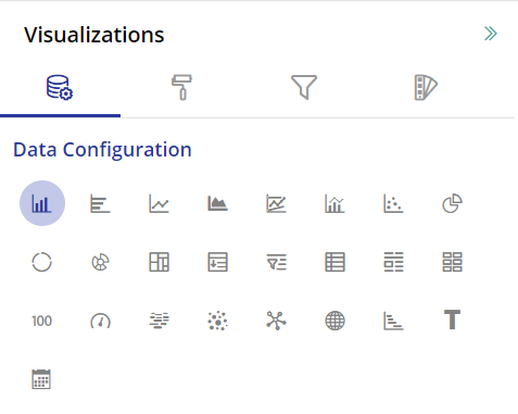
To learn how to create a new visualization, click here.
Here is the list of visualizations available in Gathr Analytics.
Grid Visualization
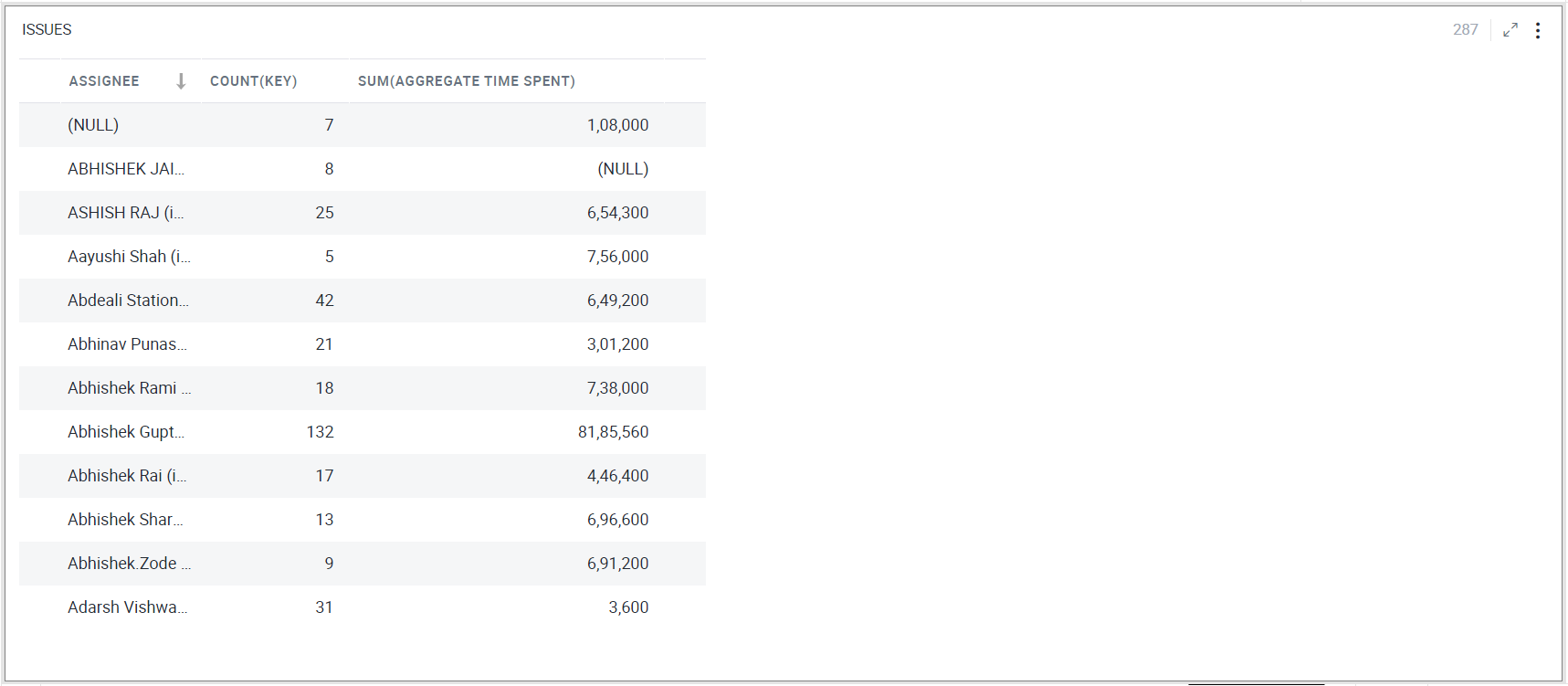
The Grid visualization is the most basic visualization for displaying data in Gathr Analytics. It is a simple arrangement of rows and columns.
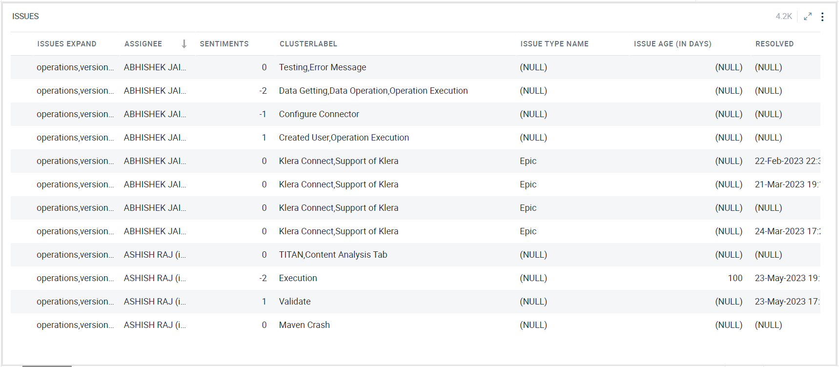
To learn how to configure a Grid, click here.
Pivot chart
A Pivot chart helps you analyze large amounts of data. You can organize and summarize data in rows and columns to obtain a summary report. As shown below, you can add images to values in the pivot chart based on specific conditions.
To learn how to configure a Pivot chart, click here.
Pie Chart
A Pie chart is a circular statistical graph that is divided into sectors to illustrate proportions. Each pie slice or sector represents a category and its contribution, in terms of size or quantity, to the whole.
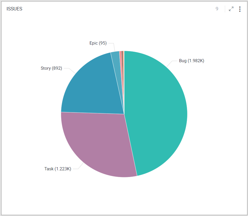
To learn how to configure a Pie chart, click here.
Donut Chart
Donut Visualization is a simple pie chart with space in the center. It represents the composition of value under different categories. Like Pie chart, it is also used in a part-to-whole analysis.
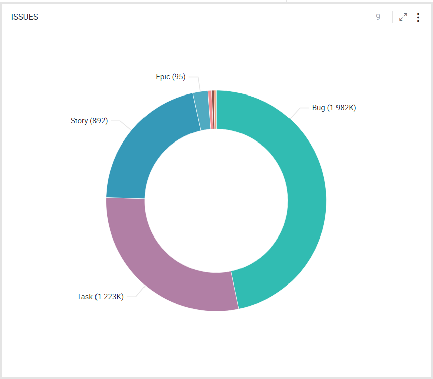
Note: The configuration options for Donut chart are same as Pie chart.
To learn how to configure a Donut chart, click here.
Treemap Chart
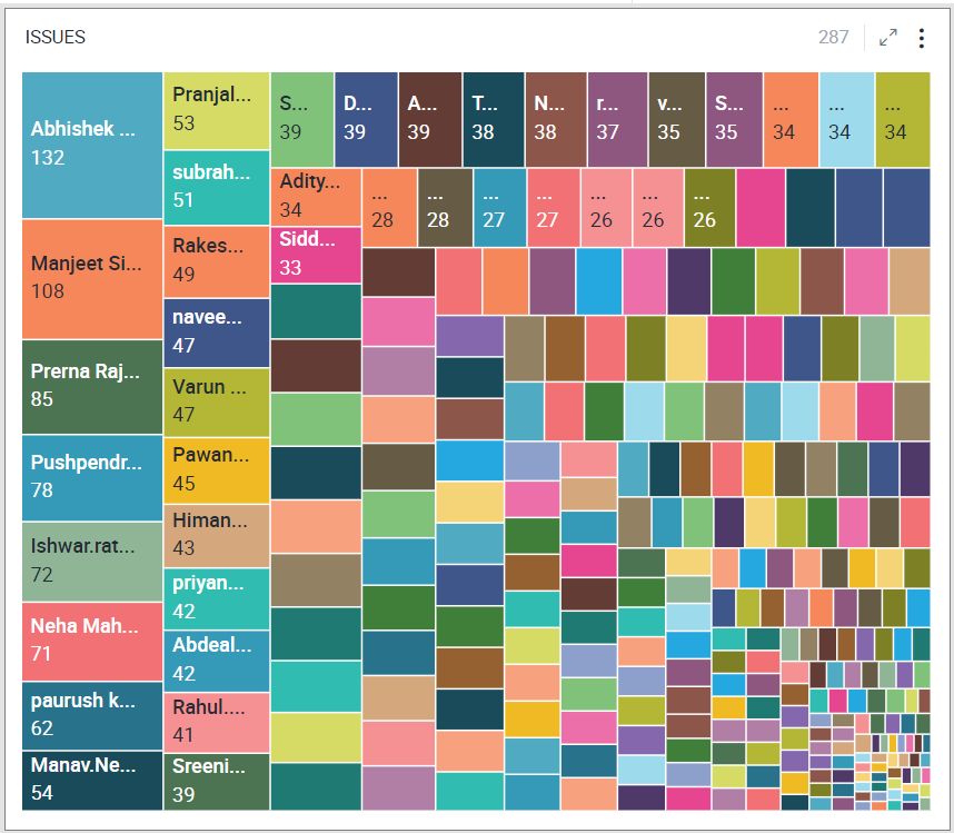
Treemap is a visualization that displays data in nested rectangles. Each rectangle represents a category and the size of the rectangle represents the category’s contribution to the whole. The size of rectangles is calculated using aggregation functions like count, sum, average, etc. The rectangles are arranged by size from top left (largest) to bottom right (smallest). Treemaps provide insights similar to a Pie chart but are more useful with a large number of categories, and are visually attractive too.
To learn how to configure a Treemap chart, click here.
Bar Chart
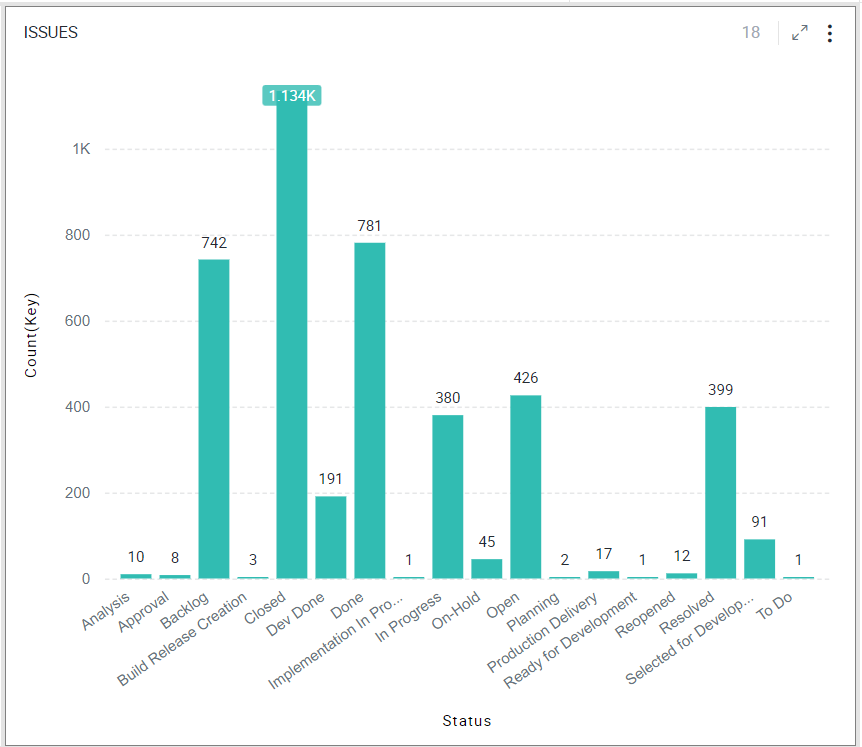
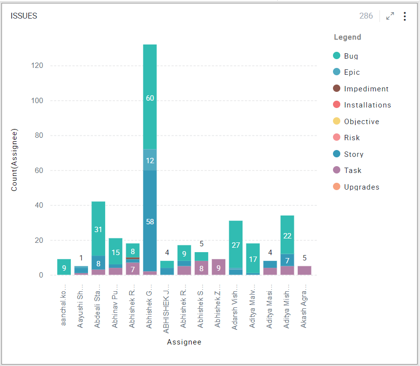
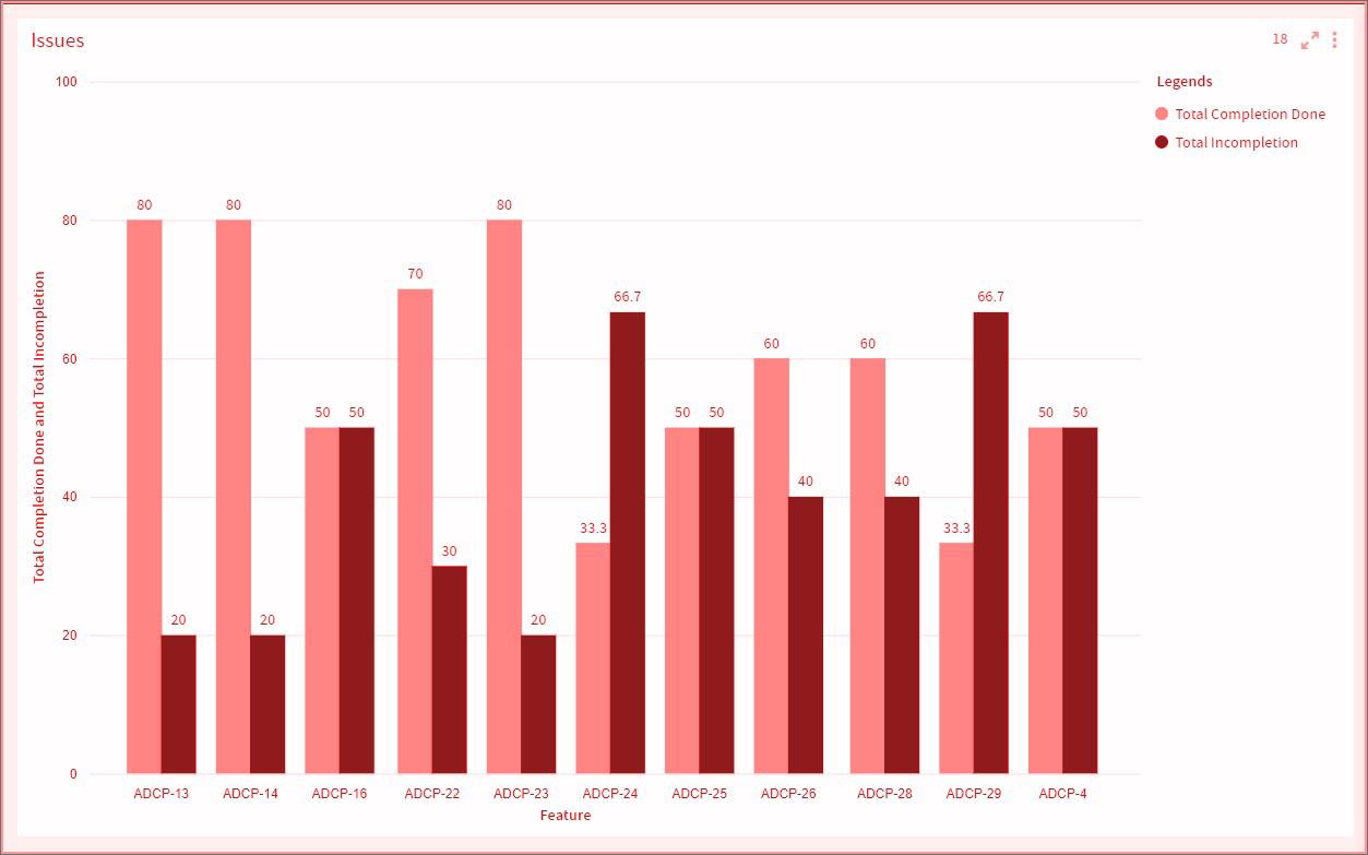
A Bar chart represents categorical data using bars of different heights/lengths.
One axis (X-Axis) of the chart shows the categories called the Dimension, and the other axis (Y-Axis) shows the measured value for each of the categories called the Measure. The measure can be calculated from any of the aggregate (e.g., count/sum/average etc.) functions. The height of the bars represents the measure.
To learn how to configure a Bar chart, click here.
Horizontal Bar Chart
A Horizontal Bar chart represents categorical data with horizontal rectangular bars with lengths proportional to the data values.
You can use a horizontal bar chart when your data values are too big to be shown vertically. They are also useful if your data labels are very long.
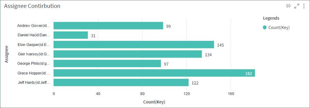
Both Bar and Horizontal Bar charts display data using rectangular bars, where the length of the bars is proportional to the data value. However, their difference lies in their orientation. A Bar chart is oriented horizontally whereas Horizontal Bar chart is oriented vertically.
Note: The configuration options for Horizontal Bar chart are effectively the same as Bar chart.
To learn how to configure a Horizontal Bar chart, click here.
Line Chart
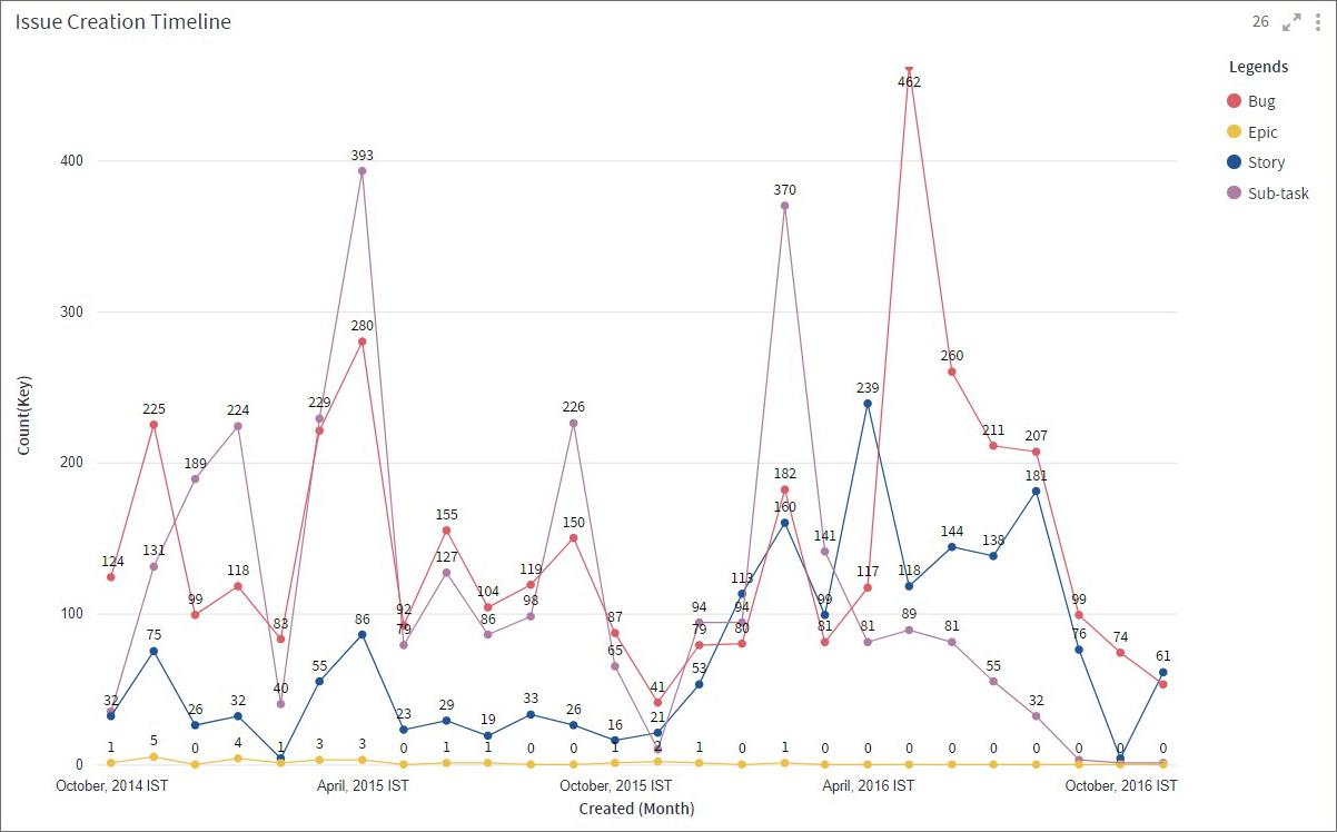
Line chart is used to visualize data points or values, connected by a continuous line. It is useful to see trends in your data over time or to forecast values.
Line chart represents a series of data points, called Measure, on Y-Axis and another set of values, called Dimension, on X-Axis. You can also create additional lines that represent comparison trends.
Below, you can see issues for a project in Jira. You can notice when the issue creation/resolution was the highest and when it took a dip.
To learn how to configure a Line chart, click here.
Bar Line Combo Chart
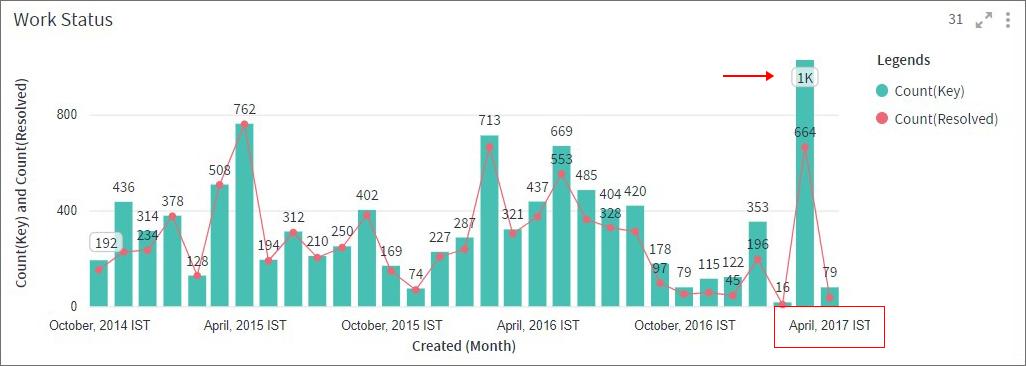
A Bar Line Combo chart combines the features of a Bar chart and a Line chart. With this visualization, you can show data from two different columns on the Y-axis. These metrics, clubbed together on a single visualization, help you discover additional insights.
Take the example below, the primary Y-Axis shows the total number of issues (Bar) and the secondary Y-axis shows the number of issues resolved (Line).
From the visualization, you can easily conclude that the month of April 2017 has the highest number of unresolved issues.
To learn how to configure a Bar Line Combo chart, click here.
Card Visualization
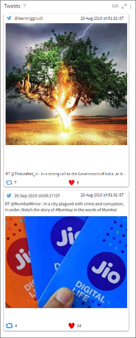
Card visualization helps you represent the records of associated datasets in the form of sequential cards. Each card displays the details of a record like field names and corresponding values. You can format and color the text shown in the Card visualization. It can also render multimedia content.
To learn how to configure a Card visualization, click here.
Gauge Chart
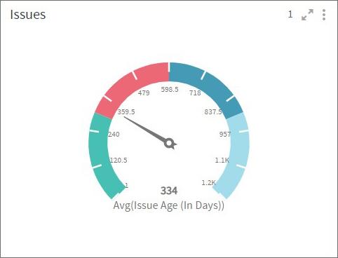
Gauge chart is used to display a numeric value that lies within a range of specified minimum and maximum values. Additionally, you can also define the color sectors to get more clarity if this value is within the acceptable range or not.
To learn how to configure a Gauge chart, click here.
Label Visualization
You can create Label visualizations to add illustrations to your dashboards. You can embed images or text in a Label. Unlike other visualizations in Gathr Analytics, Label visualization is not associated with an underlying dataset. It is used to show a fixed image or text.

To learn how to configure a Label, click here.
Single Value Visualization
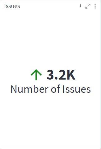
A Single value visualization is a single numeric value displaying some key information. This view is particularly helpful when you want to emphasize key data points like Maximum sales, Total open issues, Average resolution time, etc, at a glance.
To learn how to configure a Single Value visualization, click here.
Network Graph
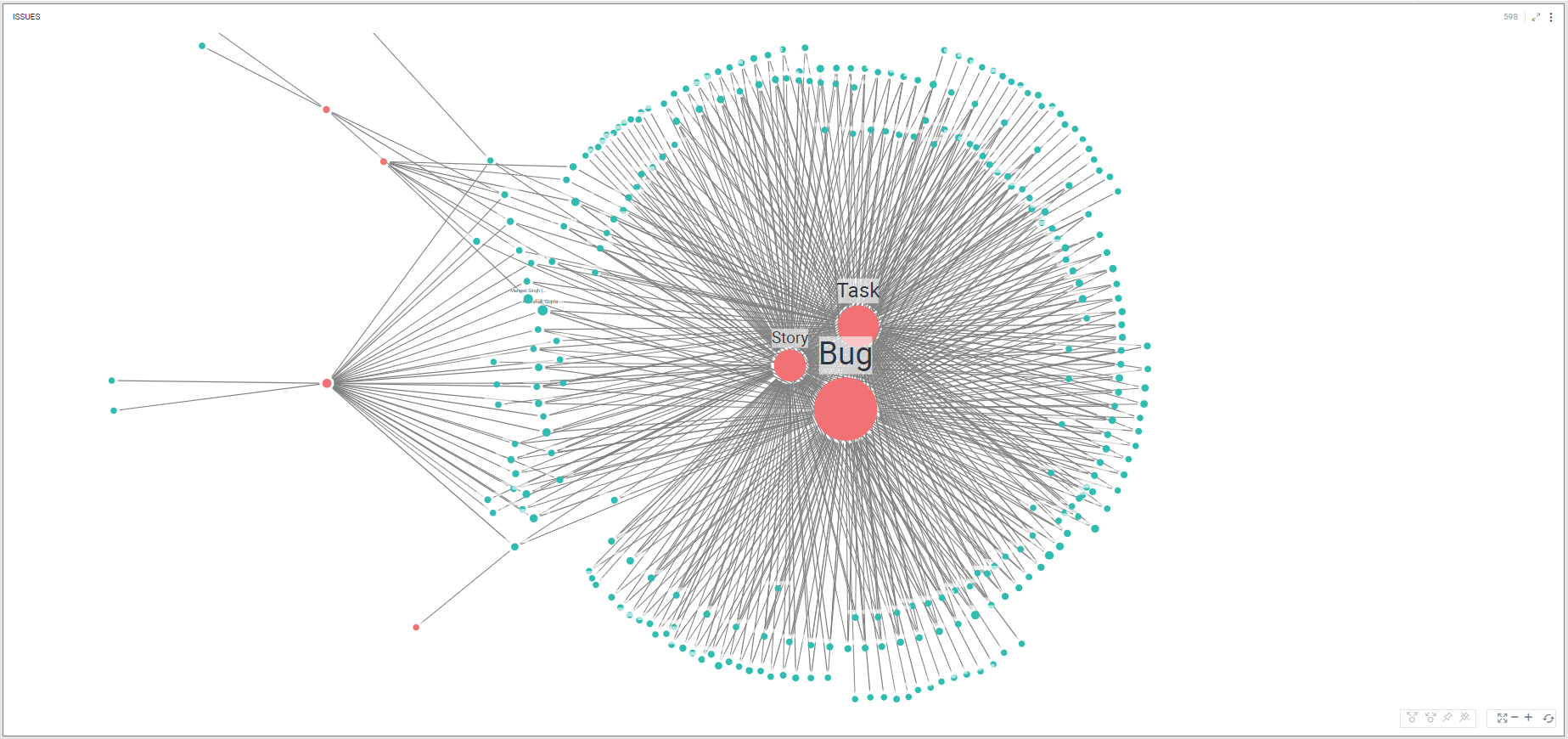
Network graph visualization shows the relationship between entities. Entities are displayed as round nodes and the lines connecting the nodes show the relationships between them. The lines connecting the nodes are called Edges. The edges may have arrowheads indicating the direction of the relationship between the nodes in a directed graph. The vivid display of network nodes can show non-trivial data similarities or discrepancies that may otherwise be overlooked.
Here in this example, the Network Graph shows the relationship between assignees and the type of issues assigned to them.
To learn how to configure a Network Graph, click here.
Word Cloud
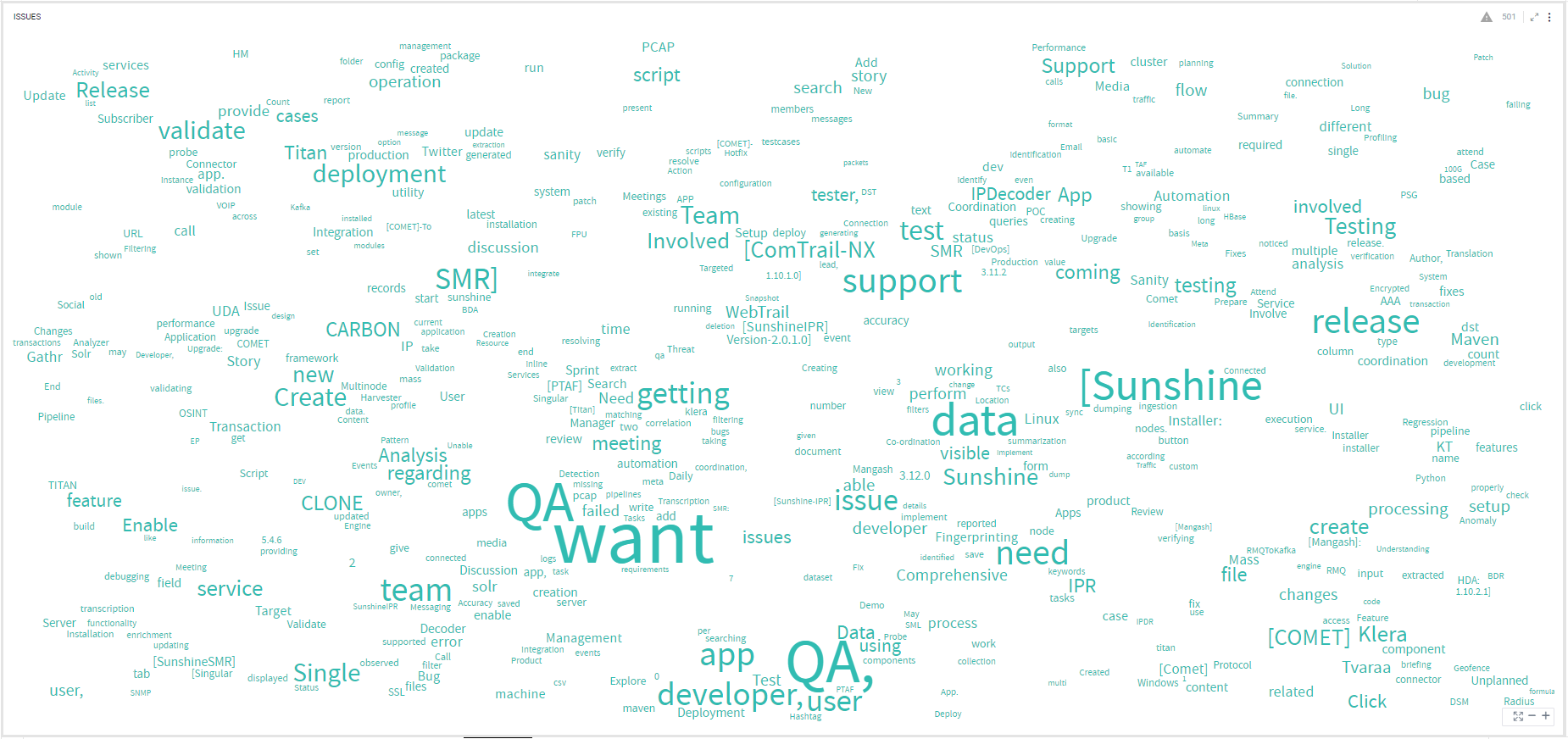
There is an unprecedented need for unstructured data analysis due to the massive growth of textual content from sources like social media, product reviews, messages, announcements etc. While traditional charts and other visualization techniques are great at making sense of structured data, they generally fall short when it comes to representing unstructured data. Word clouds are an excellent way to visually interpret unstructured data and quickly gain insights into the most prominent words in such data by visualizing word frequency and value.
To learn how to configure a Word Cloud, click here.
Matrix Chart
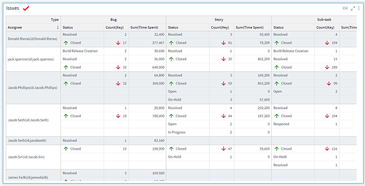
Matrix Visualization is a type of table visualization that contains aggregated values instead of simple tabular data with duplicate records.
It summarizes a large amount of data on multiple dimensions arranged in rows and columns. Various aggregates can be shown on the intersection of each row and column. This helps you create a cross tabular report, that draws attention to key values.
To learn how to configure a Matrix chart, click here.
Slicer
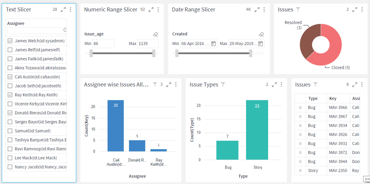
Slicers are visual filters on your dashboard. They provide you an alternate way of filtering the data.
To learn how to configure a Slicer, click here.
Gantt Chart
Gantt Chart is a type of bar chart that is used for tracking a project schedule. It displays activities such as tasks and events.
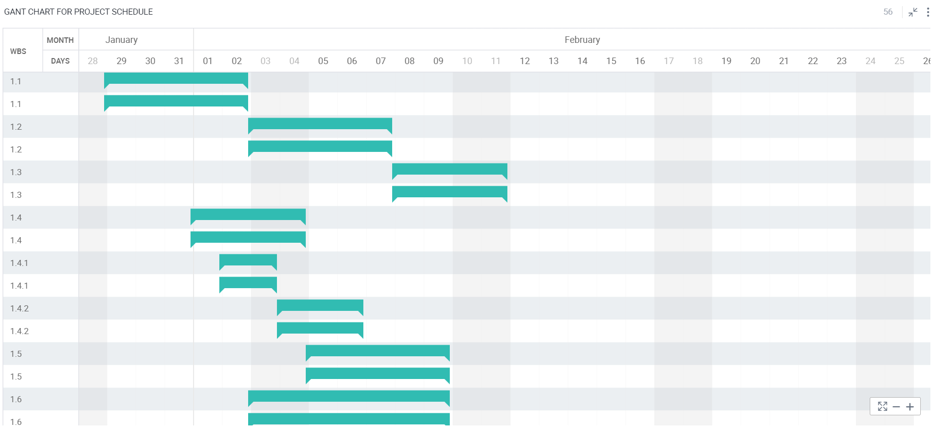
To learn how to configure a Gantt Chart, click here.
Scatter and Scatter Line
Scatter graphs are used to show the potential correlation or relationship between the two variables and find the linear or non-linear trends, clusters, and outliers in your data. It uses dots to represent values for different variables.
It is more useful when you are faced with a large set of data. The more data you include in a scatter chart, the more comparisons you can make.
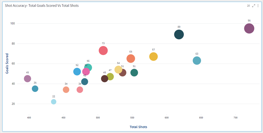
To learn how to configure a Scatter plot, click here.
GIS
GIS is a geographic information system, a system that creates, manages, analyses and maps all types of data. GIS connects data to a map, integrating location data with all types of descriptive information. This provides a foundation for mapping and analysis that is used in science and almost every industry.
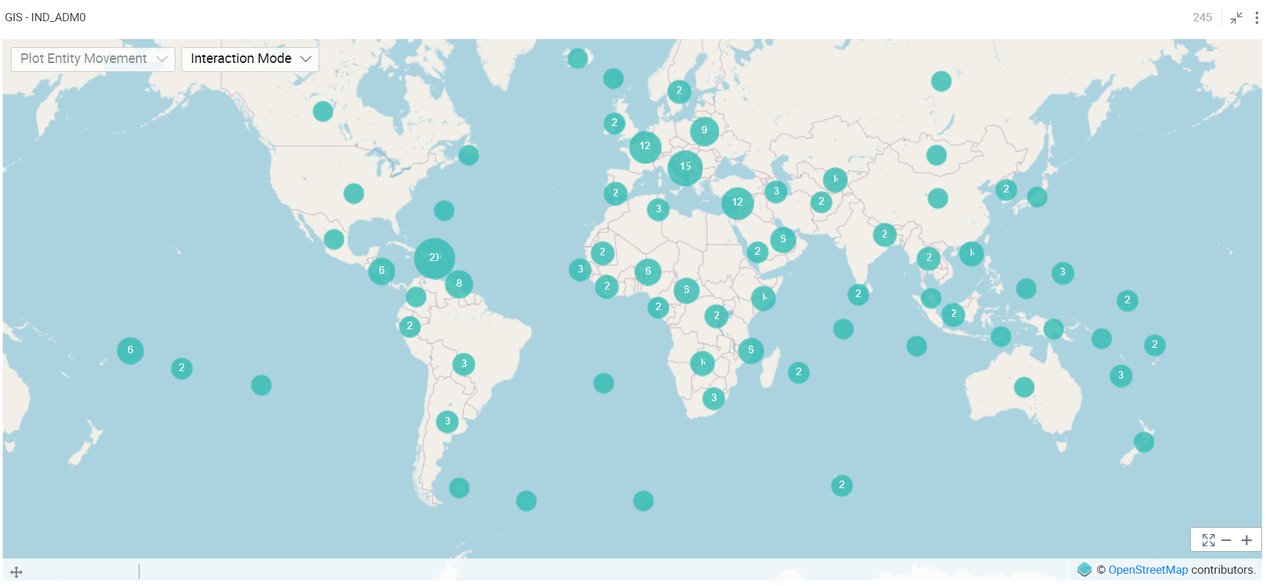
To learn how to configure a GIS, click here.
If you have any feedback on Gathr documentation, please email us!