Word Cloud
There is an unprecedented need for unstructured data analysis due to the massive growth of textual content from sources like social media, product reviews, messages, announcements etc. While traditional charts and other visualization techniques are great at making sense of structured data, they generally don’t work too well when it comes to representing unstructured data.
Word Clouds are an excellent way to visually interpret unstructured data and quickly gain insights into the most prominent words in such data by visualizing word frequency and value.
In this example, a Word Cloud is created for components in Jira.
To create a Word Cloud:
- Select the ‘Component(s)’ column and right-click > select View> change> Word Cloud.
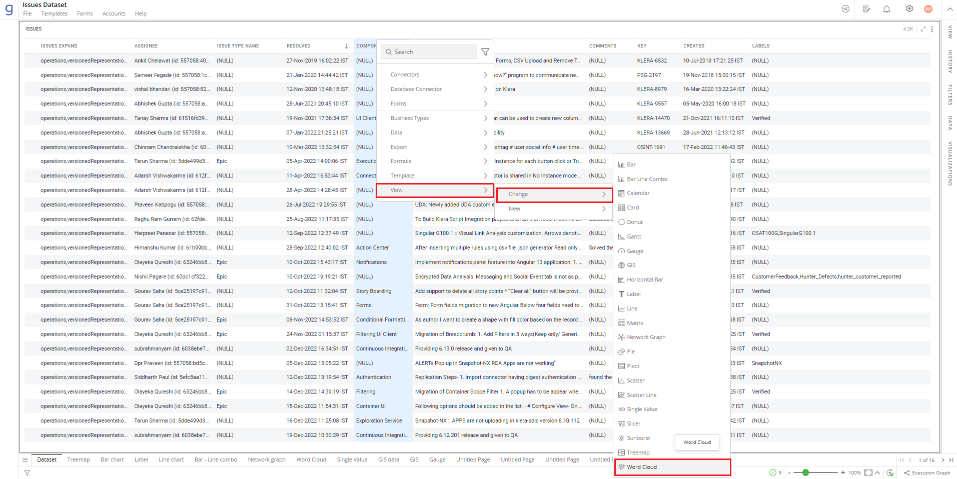
Refer here to learn more about how to creating a visualization.
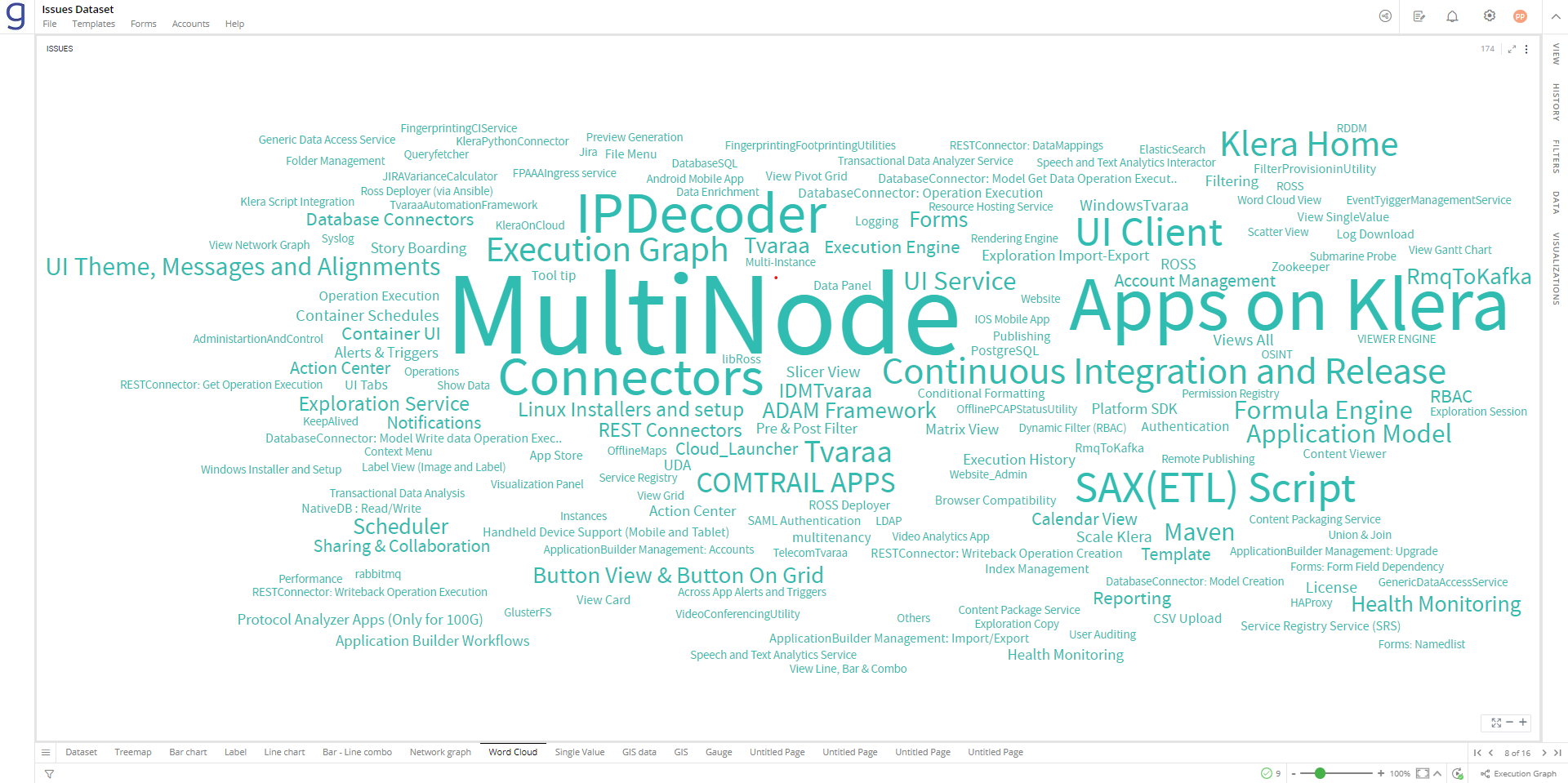
The following figure shows the resulting Word Cloud.
Configure Word Cloud
- Select your Word Cloud and open the Visualizations Panel.
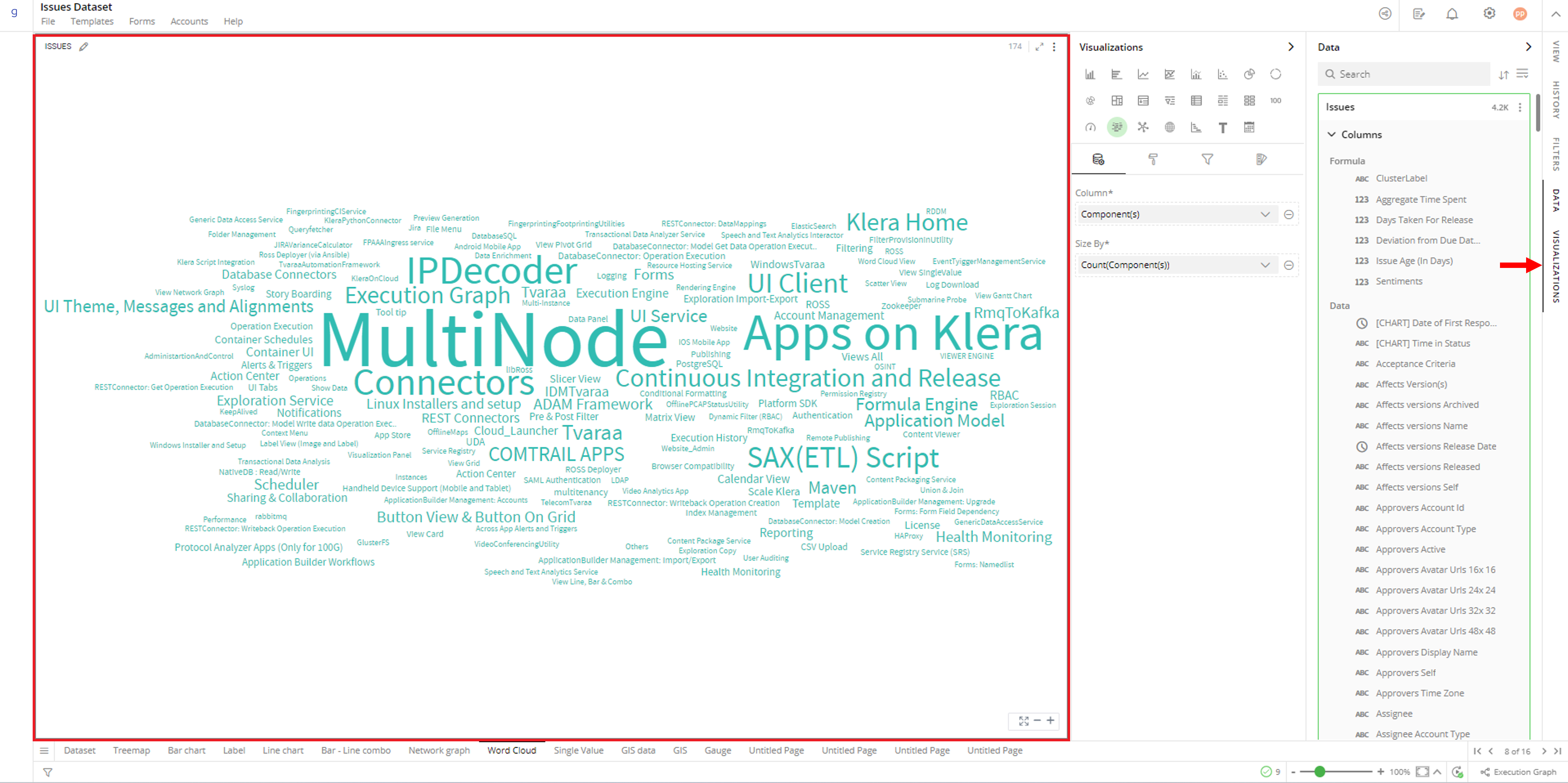
The following configuration options are available for Word Cloud:
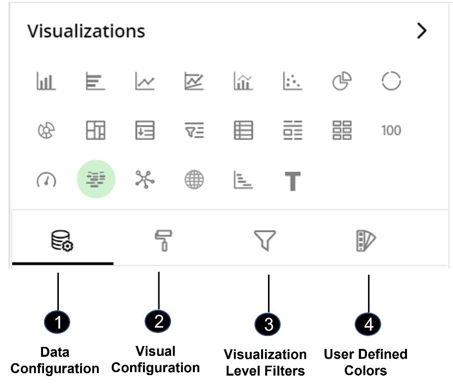
Data Configuration
 : It lets you choose columns for the following settings:
Visual Configuration
 : It lets you configure the visual appearances and interactions of the Word Cloud.
Visualization Level Filters
 : They let you filter the data in the specific visualization without impacting the data in other visualizations.
Refer here to learn more about Visualization Level Filters.
User-Defined Colors
 : They let you add meaning to a data point by associating a specific color to it. User defined colors also help you to differentiate a data point from the rest.
Data Configuration
- Click on the
 icon for data configuration options.
Column
You can specify the column whose values should appear as ‘words’ in the Word Cloud.
To change the column:
Click on
 icon to remove the existing column.
Drag the desired column from the Data Panel and drop it on the Visualizations Panel’s “Column” section.
Note: You can also type the column name in the Data Panel to quickly find it.
Note: Word Cloud considers the value in each row of the column as one word. When dealing with textual data containing sentences (e.g. Issue summary), Word Cloud doesn’t make much sense. The following figure shows a Word Cloud for the summary column.
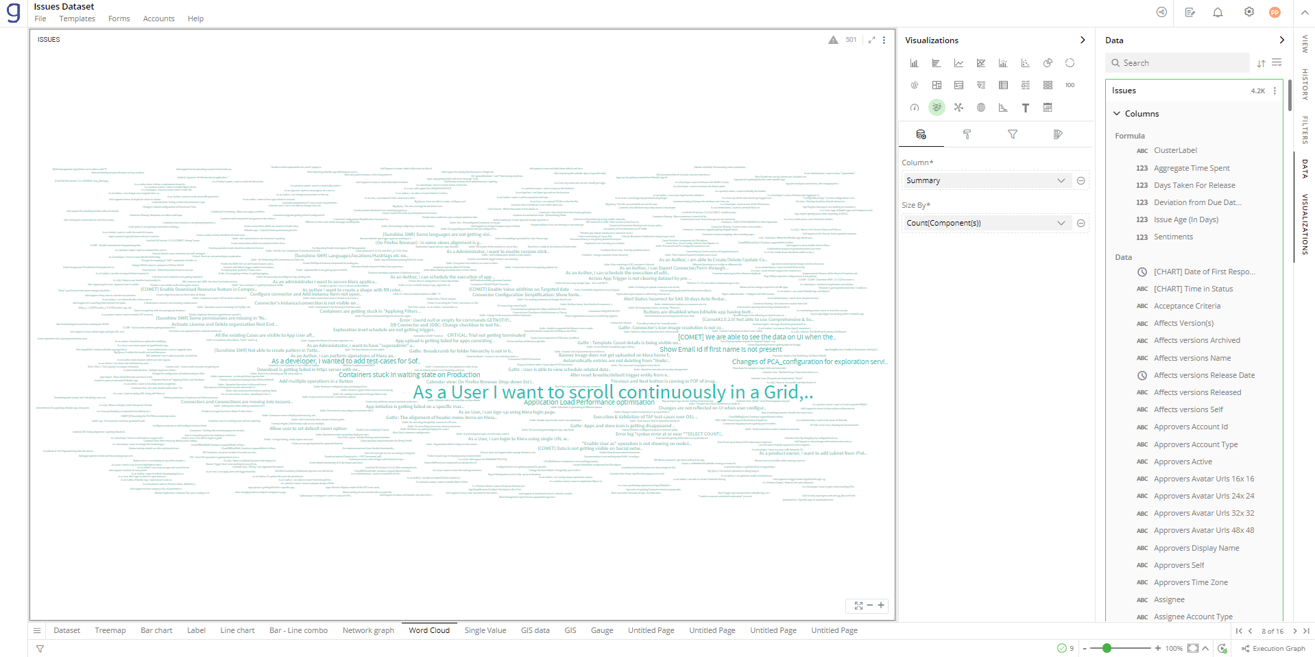
You can break these sentences into words and then use them in a Word Cloud for better insights into unstructured data. Use the Tokenize formula to break a long sentence into words.
- ‘TOKENIZE’ formula
Tokenize takes a sentence as input and splits it on a separator (e.g. blank space, comma etc.) and generates a collection of words in a new column. Now you can use the new computed column to generate Word Cloud. In the following example, a computed column ‘Tokens’ is created.
There are more formulas available to process Unstructured Data. To learn more about such formulas and Gathr Analytics’s formula engine, click here.
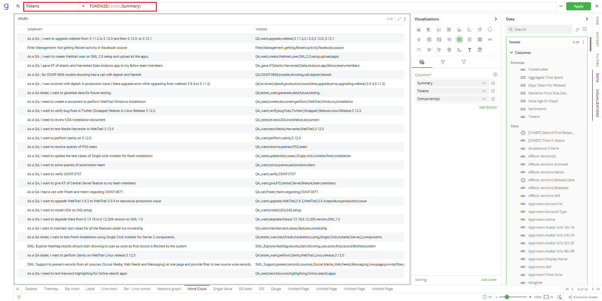
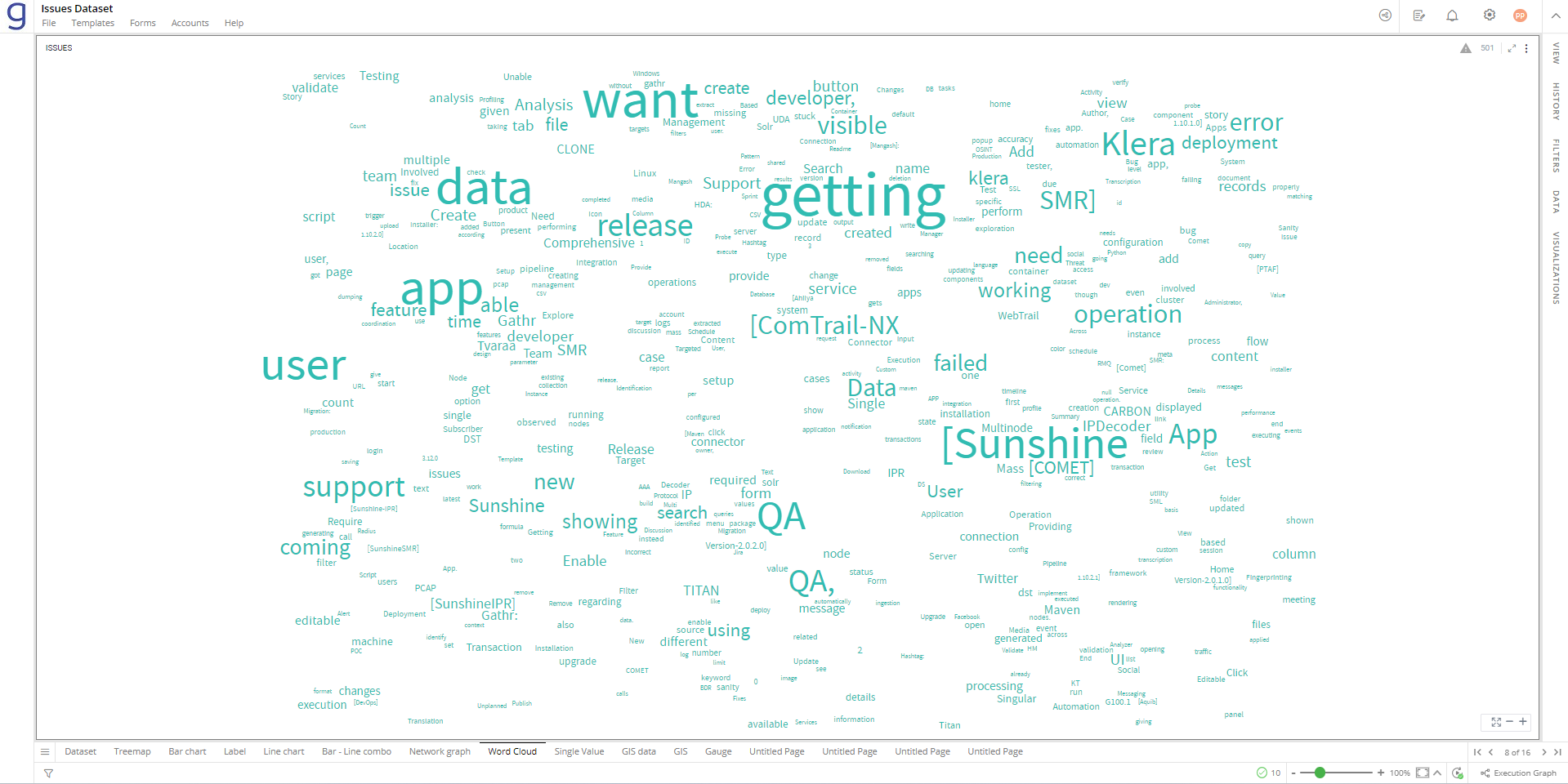
Drag and drop this computed column from the Data Panel to the ‘Column’ section.
Conditional Formatting
This allows you to show an image for the words by applying certain conditions. Multiple conditions can be combined as well.
To apply conditional formatting:
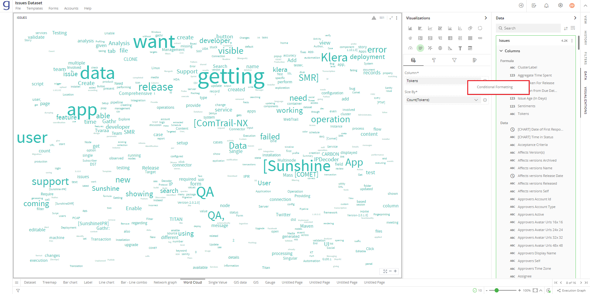
- Click on the
 icon next to the column name and select ‘Conditional Formatting’.
Define the conditional formatting rule:
Select the criteria from the drop-down.
Provide the threshold value.
Set the format style to choose an image to be shown when the above criterion is true. You can provide the image in the following ways:
Select Library and click on Search Image to select an image pre-bundled with Gathr Analytics.
Select File and click on Upload File to choose one from your machine.
Select URL and Type In the URL of your image.
Click on ‘Add’.
Click on ‘Back’ to return to the Data Configuration. This
 icon indicates that the conditional formatting is applied to the column.
To update the condition for a column:
Click on the conditional formatting
 icon.
icon.Change the criterion or format style.
Click ‘UPDATE’.
To remove Conditional Formatting:
Click on the
 icon for the desired column. You will see the criteria listed at the bottom.
Click on the
 icon to remove the condition.
To learn more about conditional formatting, refer to the following GIF.
Note: Steps for conditional formatting are the same for Grid and Word Cloud.

Size By
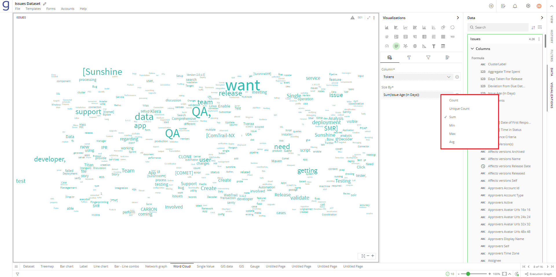
The size of the words represents a certain measured value for each of the words. You can specify the column whose values should be aggregated to represent the size of the words.
To change the column for word size:
Click on the
 icon to remove the existing column.
Drag the desired column from the Data Panel and drop it on the “Size By” section.
Click on the
 icon to select the aggregate function.
Aggregate functions for textual data: Count, Unique Count
Aggregate functions for numerical data: Count, Unique Count, Sum, Min, Max, Avg
In this example, word size is calculated based on the sum of time spent on the issues of a specific status.
Visual Configuration
- Click on the
 icon for visual configuration settings.
View Settings
You can utilise these setting to enable or disable zoom control feature in your visualization.
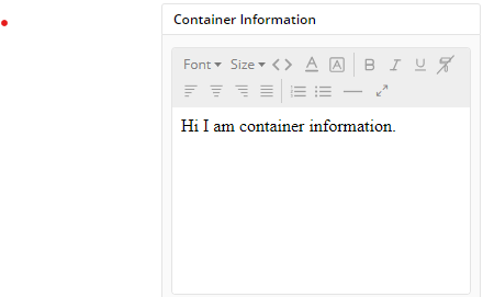
Container Information
Using this feature you can provide description for container having your visualization. When user scrolls over  icon present in container will provide description you provided in Container Information setting of visual configuration.
Container Styles
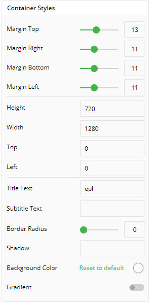
You can change/edit styling of your container. It providings variety of customization options such as:
- Margins
- Margin Top
- Margin Right
- Margin Bottom
- Margin Left
- Height and width of container:
- Height
- Width
- Top
- Left
- Title text and subtitle text
- Border Radius
- Shadow
- Background Color
- Gradient
Container Settings
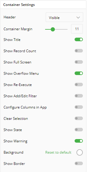
To show/hide the header and border, click the toggle switch.
Turn on the toggle switch to show the border for the container. Change the border color, style and width as shown below:
The following figure displays the effect of various settings for Word Cloud.
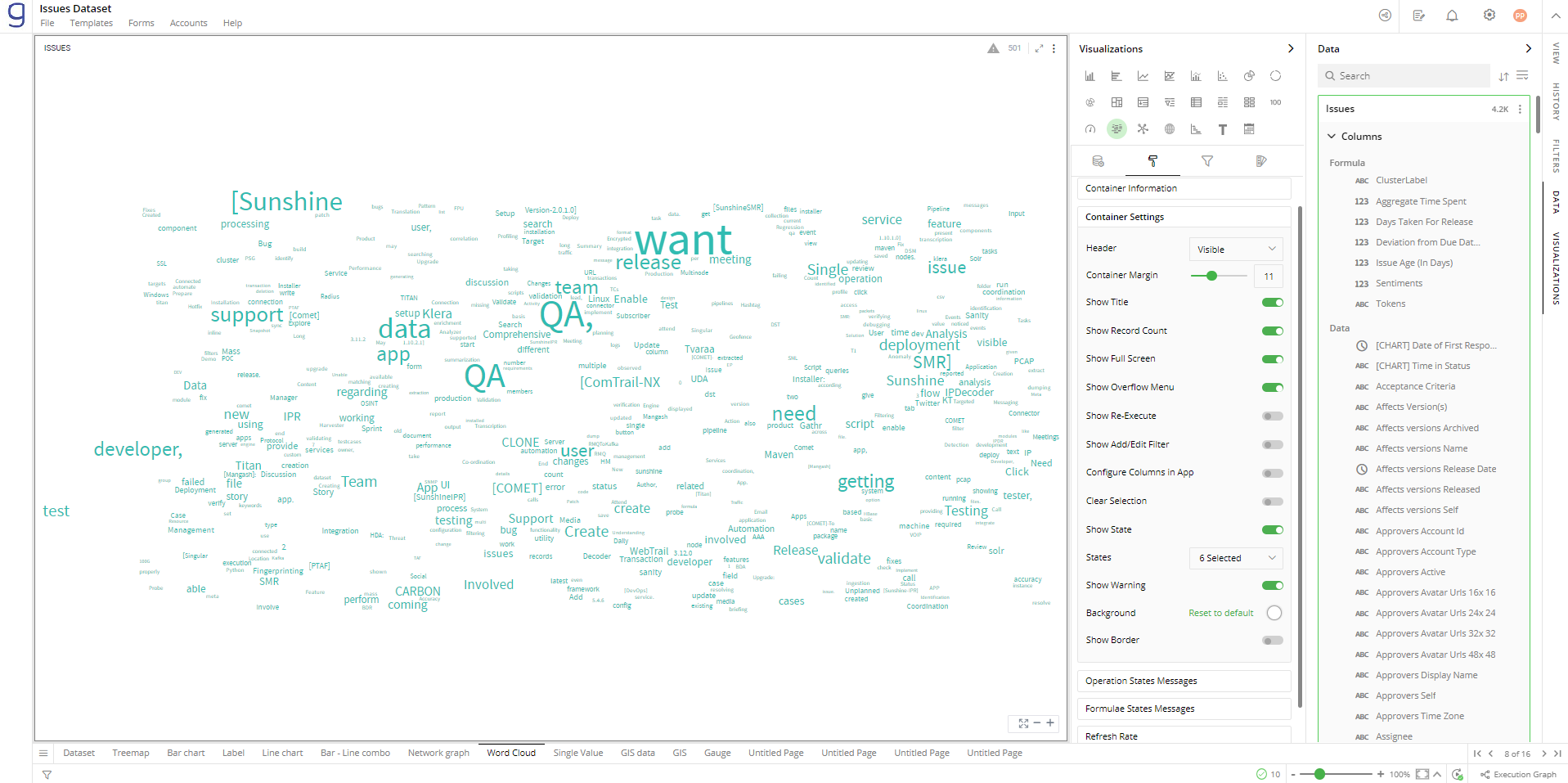
Operation States Messages
- Add/edit the Operation States Messages such as Waiting message, Waiting details, Processing message, etc. to provide a concise information about operation states.
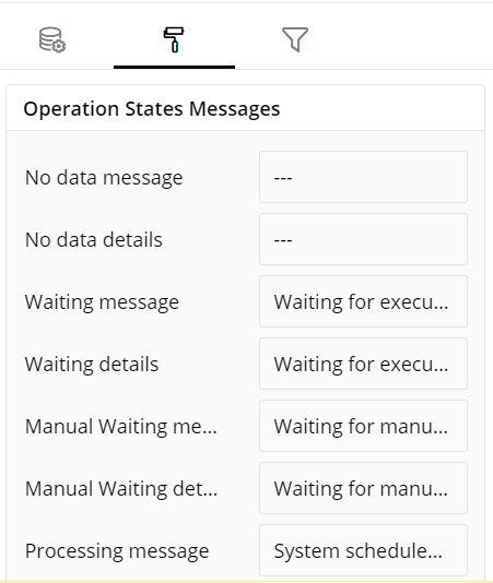
Formulae States Messages
- Add/edit the States Messages such as Waiting message, Waiting details, Processing message, etc. to provide a concise information about Formulae states.
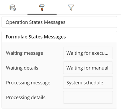
Refresh Rate
- Change the Refresh Rate such as Low, Medium, Fast to display updates in your application.
Visual Interactions
- Select the target behavior and scope for the coordinated visualization from the below settings.
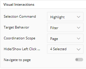
To learn more, refer to section- ‘Configure Coordinated Visualization’.
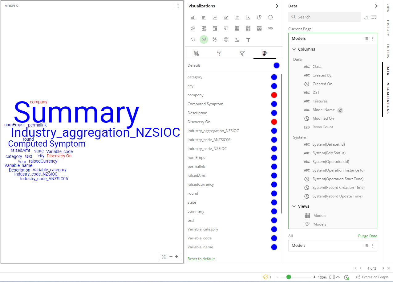
User-Defined Colors
- Click on the
 icon for the following color settings.
Colors of Individual Data Item
It lets you add meaning to a data item by associating a specific color to it and differentiate some data items from the rest.
For example, the red and green colors may be used to represent “Off Track” and “On Track” issues, respectively. Whereas, orange color may be used for the “Bugs” type of issues to draw attention.
To change the colors:
Click on the color picker next to the data item for which you want to change the color.
Select the color from the available color grid or click ‘More Colors’.
To restore default settings, click ‘Reset to Default’.
Configuration Options in Full-Screen Mode
Visualization can be seen in full-screen mode by clicking on  icon.
icon.
Note: Visualizations Panel is not accessible in full-screen mode.
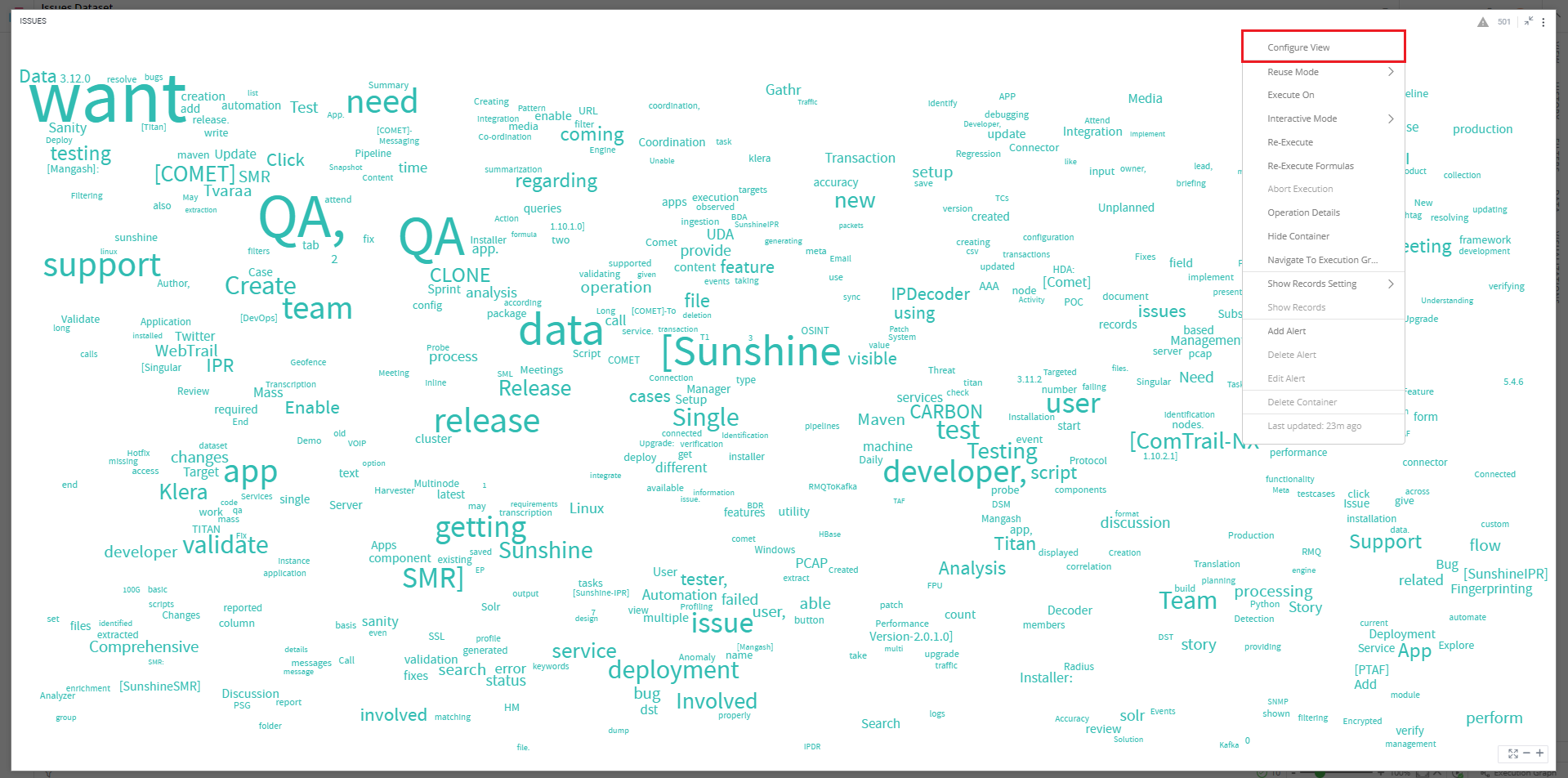
Click on
 icon at the top-right corner of the container.
Select ‘Configure View’ from the overflow menu.
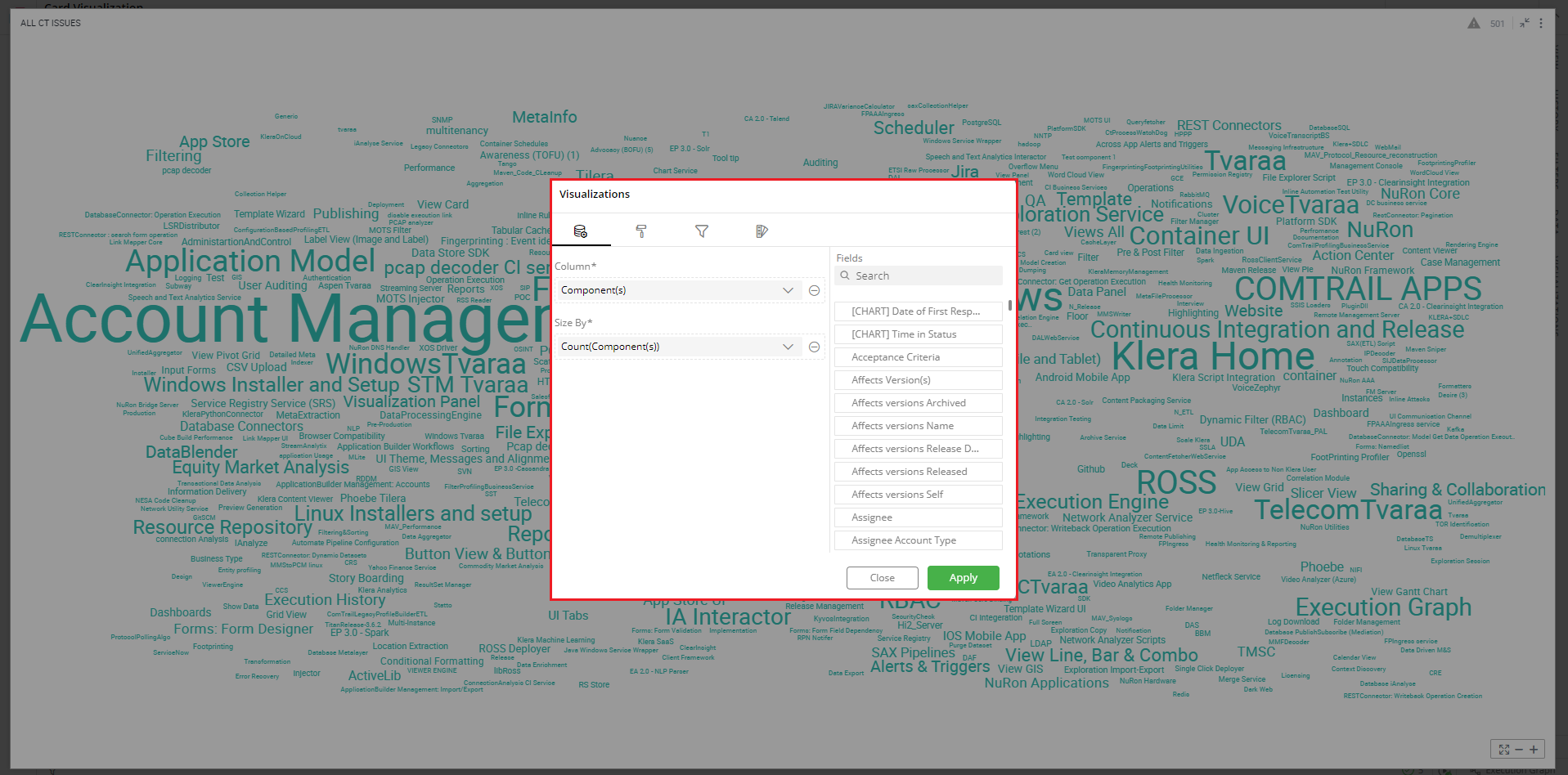
A pop-up form with all the relevant configuration options will appear on the screen.
Configure your visualization and click ‘APPLY’.
If you have any feedback on Gathr documentation, please email us!