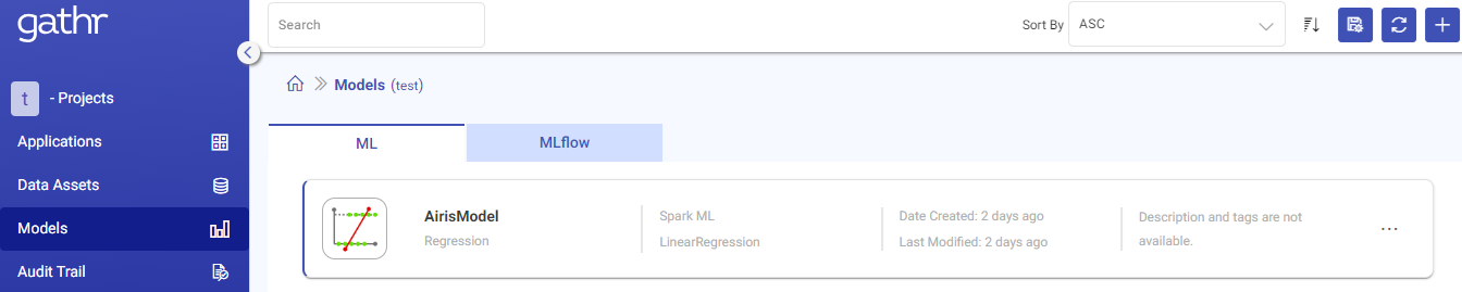
Models in Gathr
Models page lists all the models which are trained through Gathr.
To know about the machine learning algorithms supported by Gathr, see Data Science →
The information displayed and actions that can be performed on the listed models are explained below:
| Field | Description |
|---|---|
| Name | Name of the registered model. |
| Types | Shows the type of the model. |
| Date Created | Created date and time for the trained model. This field will be empty for a failed model. |
| Last Modified | Last modified date and time for the trained model. |
| Actions | 1. Delete: To delete a Model. 2. View Model Versions: To view and create versions for the listed models. |
Model Version
On clicking View Model, the model version details are displayed.
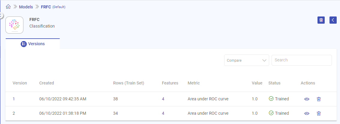
Once you land on the model versions page, following properties are displayed:
| Field | Description |
|---|---|
| Version | Version number of the model. The model version created will go in n+1 order and each model can have as many trained number of versions. |
| Created | Created date and time for the trained model. This field will be empty for a failed model. |
| Rows (Train Set) | Number of data points in the trained dataset. |
| Features | Count of features used to train the model. On hovering the field, Feature names will be shown. |
| Metric | Evaluation metric selected by the user during model training. |
| Value | Value of the selected metric. |
| Status | Describes whether model is trained or failed. Possible values - Trained/Failed. |
| Actions | View: Opens the model configuration, model details and performance visualization. Explained in View Model Version. Delete: Delete the selected model version. |
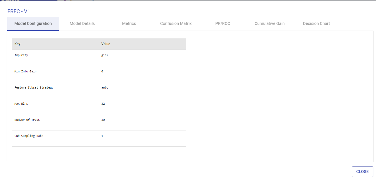
View Model
To open a model’s version, you can click on the view icon.
When you open the model version, depending on the Model Type-Regression or Classification (-Binary and Multi-class), the following properties are defined:
| Classification | Regression |
|---|---|
| Model Configuration | Model Configuration |
| Model Details | Model Details |
| Metrics | Metrics |
| Confusion Metrics | Actual vs Predicted |
| PR/ROC | Residuals |
| Cumulative Gain | |
| Decision Tree |
Not all Classification models will have all of the above mentioned properties but a few; and the same goes for Regression.
Model Properties
Each model property is explained below and the Model-Type under which it will be shown.
Model Configuration
Model Configuration lists the model configuration’s parameters, i.e., Key and Values.
This tab is common for Classification and Regression models.
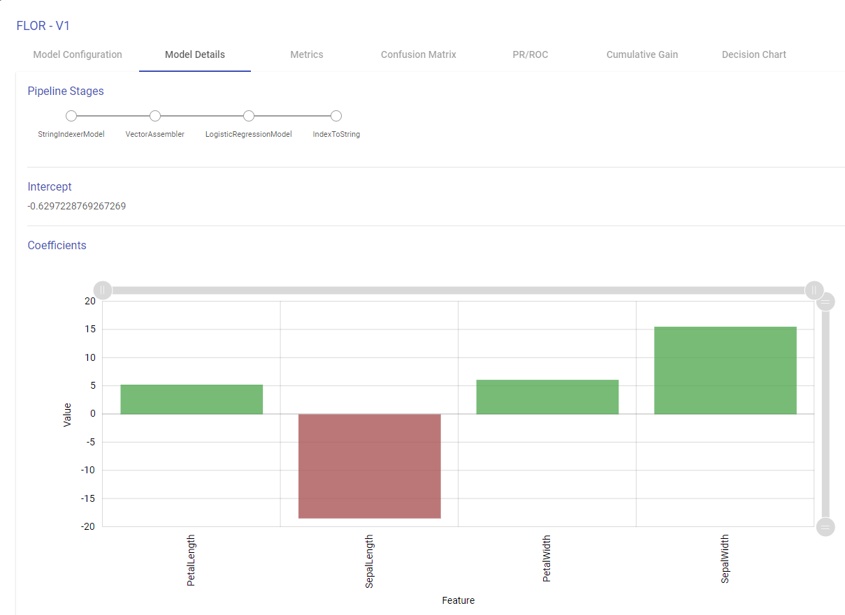
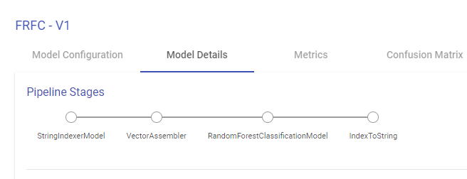
Model Details
This tab enables you to visualize the Model. Depending on the type of models, below tabs are shown:
Pipeline Stages: The algorithm stages of the pipeline.
Intercept: The intercept is the expected mean value of Y when all x=0.
Coefficients: The coefficient for a feature represents the change in the mean response associated with a change in that feature, while the other features in the model are held constant. The sign of the coefficient indicates the direction of the relationship between the feature and the response.
Note: For Isotonic Regression, Naive Bayes, Model Details page shows only Pipeline Stages. Intercept and Coefficients are available for Linear and Logistic Regression Model.
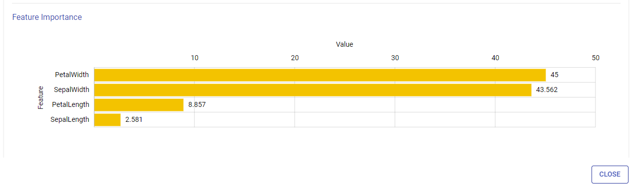
For Tree Based Models:
Feature Importance
This graph shows the estimation of importance of each feature used to train the model. Y-axis shows the feature names and X-axis shows the feature importance in percentage.
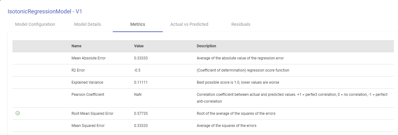
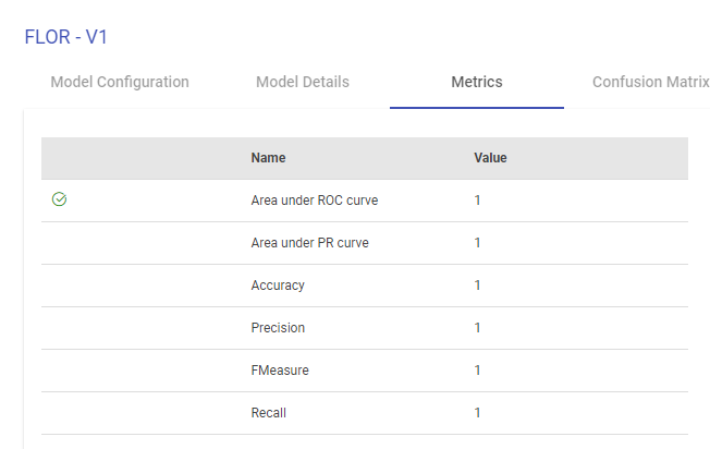
Metrics
The metrics window will display all the performance indicators of the trained model.
For Isotonic Regression and Linear Regression Model, Evaluation Metrics are also generated, as shown below:
For Logistic Regression Model, Naive Bayes and Tree Based Models, performance indicators on which this classification model is evaluated such as Area under ROC, Area Under PR, Precision, Recall, Accuracy, FMeasure are generated, as shown below:
Confusion Matrix
A confusion matrix is a table that is often used to describe the performance of a classification model (or “classifier”) on a set of test data for which the true values are known. Each row of the matrix represents the instances in an Actual class while each column represents the instances in an Predicted class.
Terms associated with Confusion matrix:
True Positives (TP): Number of instances where the model correctly predicts the positive class.
True Negatives (TN): Number of instances where the model correctly predicts the negative class.
False Positives (FP): Number of instances where the model incorrectly predicts the positive class.
False Negative (FN): Number of instances where model incorrectly predicts the negative class.
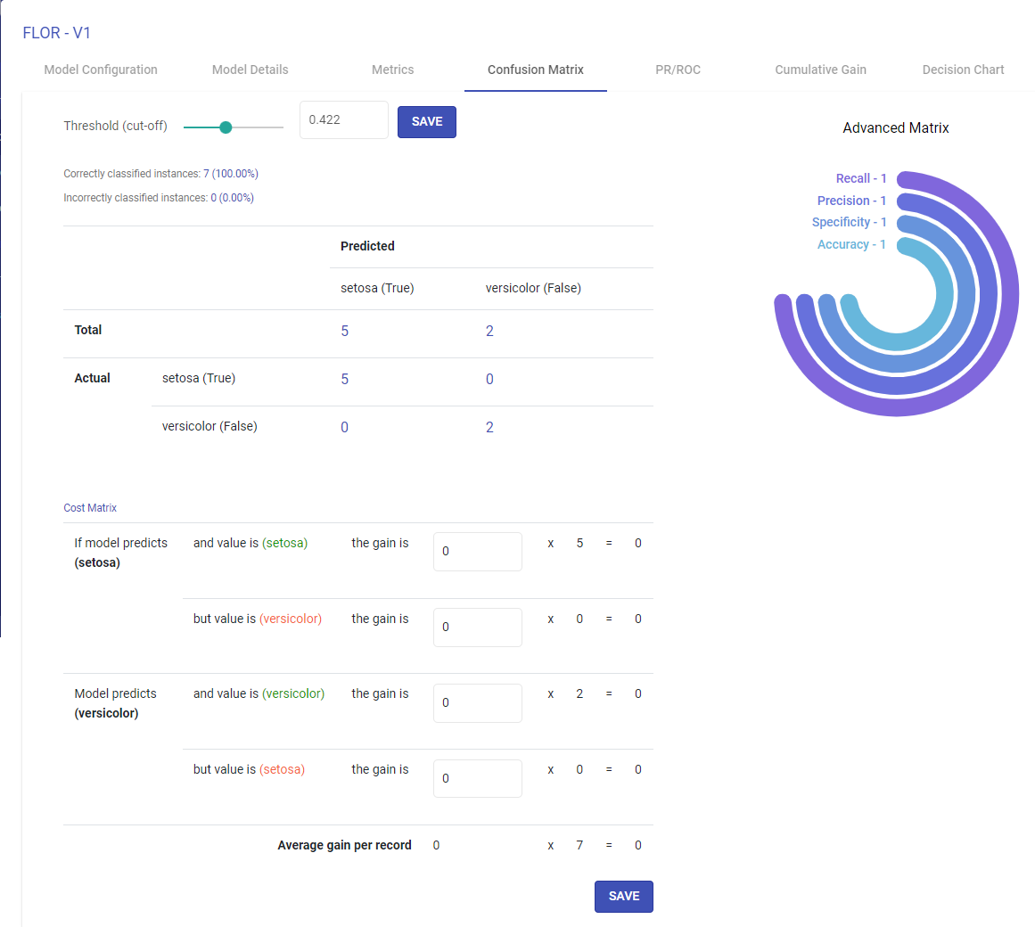
Advanced metrics
Recall, Precision, Specificity and Accuracy are calculated from the confusion matrix
Recall – TP/(TP + FN)
Precision – TP / (TP + FP)
Specificity – TN / (TN + FP)
Accuracy – TP + FN / (TP + FP + TN + FN)
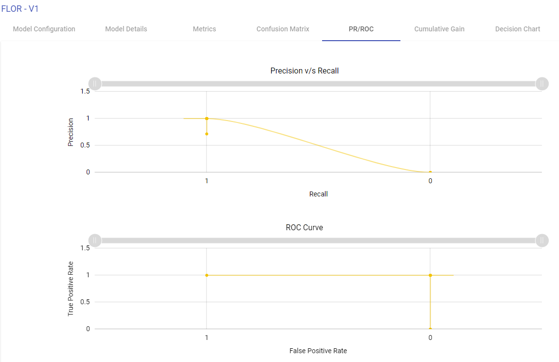
Precision Recall/ROC
ROC Curve:
ROC curves summarize the trade-off between the true positive rate and false positive rate for a predictive model using different probability thresholds.
X-axis shows false positive rate (False Positive/ (False Positive + True Negative)
Y-axis shows true positive rate (True Positive/ (True Positive + False Negative)
ROC curves are appropriate when the observations are balanced between each class.
Precision/Recall Curve:
Precision-Recall curves summarize the trade-off between the true positive rate (i.e. Recall) and the positive predictive value for a predictive model using different probability thresholds.
X-axis shows recall (True Positive/(True Positive + False Negative)
Y-axis shows precision (True Positive/(True Positive + False Positive)
Precision-recall curves are appropriate for imbalanced datasets.
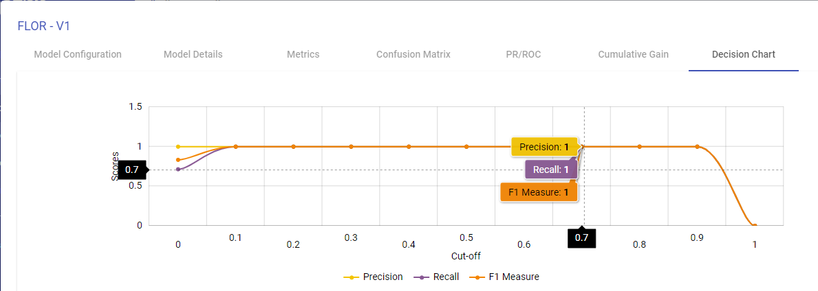
Decision Chart
You can generate the Decision charts for binary classification models to understand a clear picture on the performance of the model.
The decision chart is a plot which is made by varying threshold and computing different values of the precision, recall and FMeasure scores.
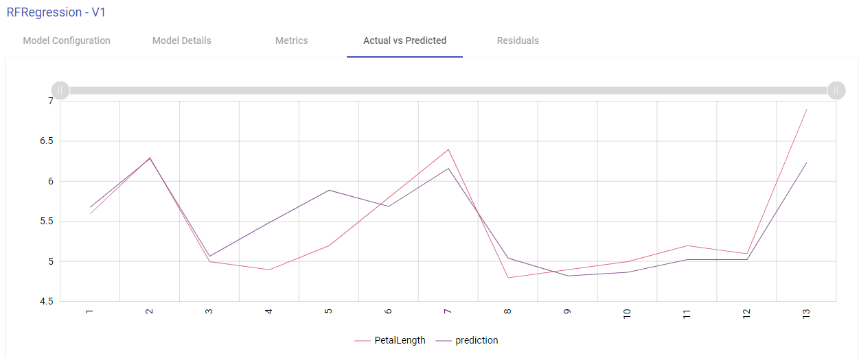
Actual vs Predicted
Line Chart:
Two lines plotted on the graph i.e. one for the actual data and another one for the predicted data. This graph provides us information about how accurate model predictions are. All the predicted data points should overlap the predicted data points.
Scatter Plot:
This graph is plotted between the actual and predicted variables.
The regression line represents the linear line learned by the model.
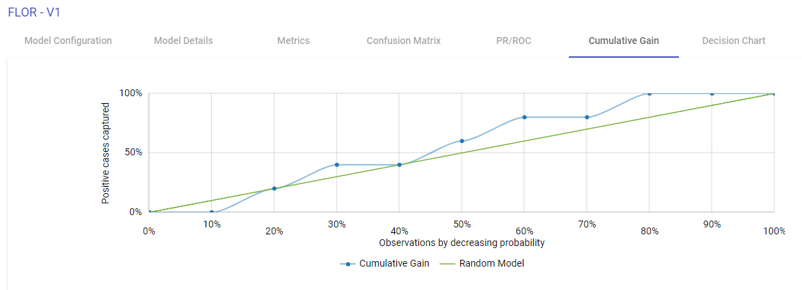
Cumulative Gain Charts
Cumulative Gain charts are used to evaluate performance of classification model. They measure how much better one can expect to do with the predictive model comparing without a model.
X-axis shows the estimated probability in descending order, splits into ten deciles.
Y-axis shows the percentage of cumulative positive responses in each decile i.e. cumulative positive cases captured in each decile divided by total number of positive cases.
Green dotted line denotes the random model.
Blue line is for the predictive model
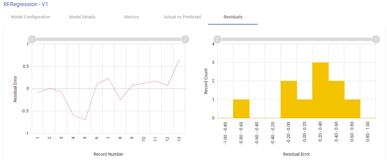
Residuals
Residual error is the difference between the actual value and the predicted values for the output variable.
Shown below are the two plotted graphs to visualize the residuals error for the training model. In the first graph, a line chart is plotted between the residual error on the y axis and the count of the test data rows on the x axis. In the second plot, a histogram is made where the residuals are plotted on the x axis and the record count on the y axis. Histogram helps in providing intuition about how many records are having a particular range of residuals error:
If you have any feedback on Gathr documentation, please email us!