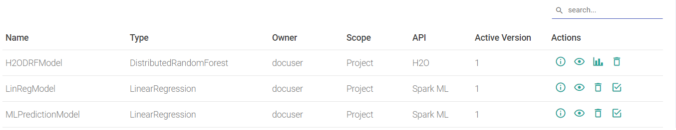
Models Listing Page
Models Page lists all the models that are trained through Gathr and models registered in Projects.
The Models home page consists of the list of models and their configuration details.
| Property | Description |
|---|---|
| Name | Name of the model. A mouseover on the name will display the Tags and Description configured with the model. |
| Type | Type of model algorithm. e.g. Linear Regression, Logistic Regression, Decision Tree etc |
| API | Underlying API of the model i.e. ML and H2O. |
| Category | Model category i.e. Classification/ Regression/ Clustering. |
| Active Version | Version of the model being used in the scoring pipeline. |
| Pipeline Model | Indicates if the model is trained using ML Pipeline API. |
| Actions | View model versions: Click to view the details of the model versions. Refer to Model Version. Enable real time loading of the model: The check box enables every new successfully trained model version to be dynamically activated in the scoring pipeline. Latest version is the active version in the scoring pipeline. Delete: Allows you to delete the model along with version. |
Model Version
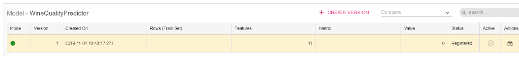
On clicking the Model Version link, the model version details are displayed.
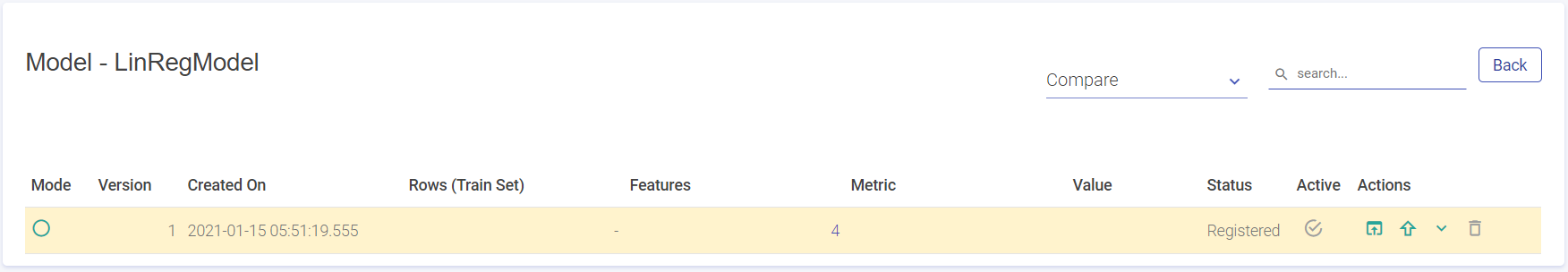
Once you land on the model versions page, following are the properties displayed:
| Property | Description |
|---|---|
| Version | Version number of the model. The model version created will go in n+1 fashion and each model can have as many trained number of versions. |
| Created On | Created date and time for the trained model. This field will be empty for a failed model. |
| Rows (Train Set) | Number of data points in the trained dataset. |
| Features | Count of features used to train the model. On hovering the field, Feature names will be shown. |
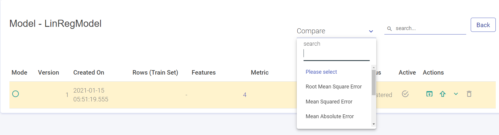
| Metric | Evaluation metric selected by the user during model training. |
| Value | Value of the selected metric. |
| Status | Describes whether model is trained or failed. Possible values - Trained/Failed. |
| Active | This selected model will be activated version of the model, which is used in the scoring pipeline. Activated version cannot be deleted. An activated version is check marked and Grey in color. If it is not, then there won’t be a check mark. (Refer above screenshot). To use the model-version in the scoring pipeline, click the check-mark. |
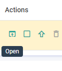
| Actions | Open: Opens the model configuration, model details and performance visualization. Explained in Open Model Version. Download: Download the zipped file of the trained model version. Delete: Delete the selected model version. Enable Drift Detection: Enabling this feature will allow you to monitor the data drift patterns in the deployed model on regular intervals. Deploy as Service: To deploy (H2O MOJO, Scikit, Spark) models as REST endpoints on Gathr, select this option. |
| Compare | Select a Metric to compare the model version. |
Create Model Version
You can create different versions of the H2O MOJO model and use them in prediction pipelines.
To do so, enter the Models page, click on the View model versions (eye icon) under the Actions column. Here, you can view the existing versions of the model.
Click (+)Create Version button on the top of the screen.
The Create Version window pops up. Choose one of the model types:
Distributed Random Forest
Gradient Boosting Machine
Generalized Linear Modeling
Isolation Forest
There are two options to select the model source. These are:
Upload local zip file
Mention the HDFS connection and zip file location on the HDFS server
After mentioning the model source click Validate.
Once the model is successfully validated, click create for version creation.
Click on the link under the Active column to activate the model version. You can now use this version in the prediction pipeline.
View Model
To open a model’s version, you can click on the Open icon, under Actions, as shown below:
When you open the model version, depending on the Model Type-Regression or Classification (-Binary and Multi-class), the following properties are defined:
| Classification | Regression |
|---|---|
| Model Configuration | Model Configuration |
| Model Details | Model Details |
| Metrics | Metrics |
| Confusion Metrics | Actual vs Predicted |
| PR/ROC | Residuals |
| Cumulative Gain | |
| Decision Tree | |
| Density Chart |
Not all Classification models will have all of the above mentioned properties but a few and same goes for Regression. Below explained is each property and the Model- Type under which it will be show.
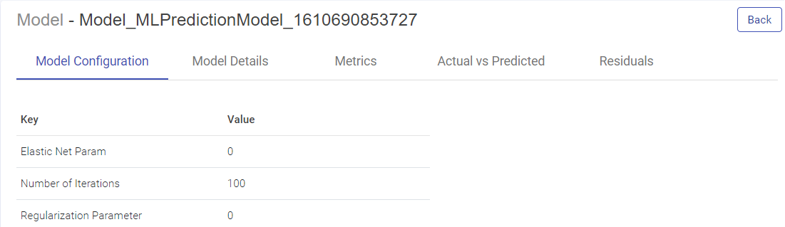
Model Configuration
Model Configuration lists the model configuration’s parameters (Key) and Values.
This tab is common for Classification and Regression models.
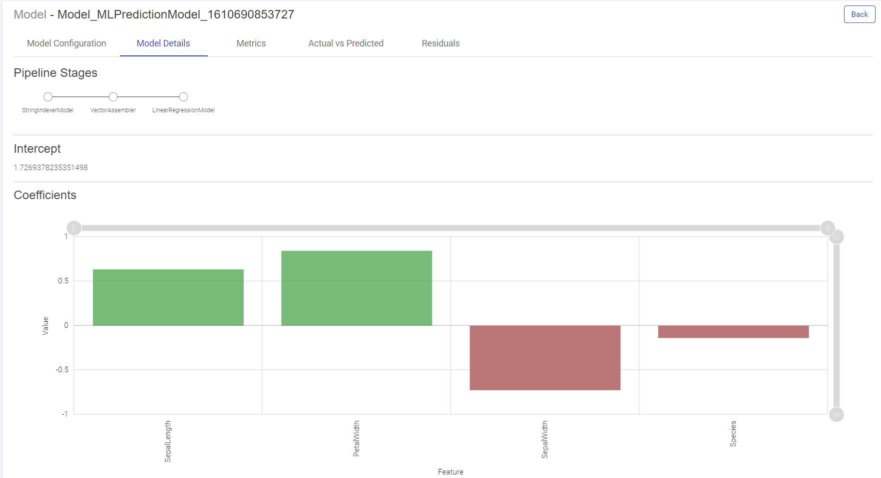
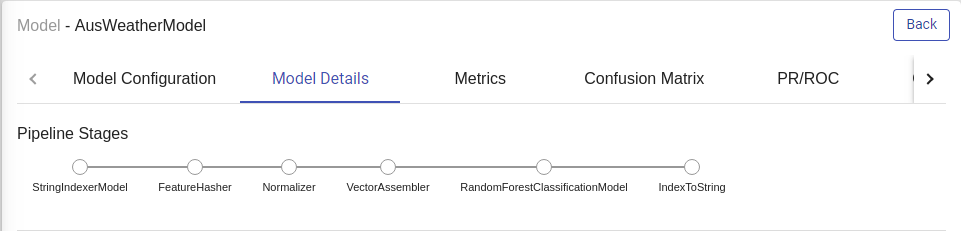
Model Details
This tab enables you to visualize th Model. Depending on the type of models, below tabs are shown:
Pipeline Stages: The algorithm stages of the pipeline.
Intercept: The intercept is the expected mean value of Y when all x=0.
Coefficients: The coefficient for a feature represents the change in the mean response associated with a change in that feature, while the other features in the model are held constant. The sign of the coefficient indicates the direction of the relationship between the feature and the response.
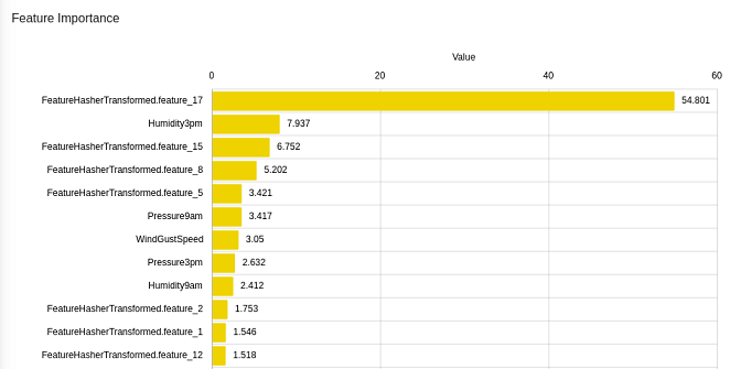
For Tree Based Models:
Feature Importance
This graph shows the estimation of importance of each feature used to train the model. Y-axis shows the feature names and X-axis shows the feature importance in percentage.
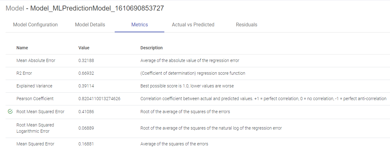
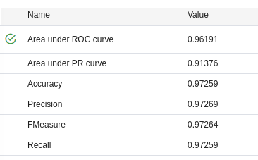
Metrics
The metrics window will display all the performance indicators of the trained model.
For Isotonic Regression and Linear Regression Model, Evaluation Metrics are also generated, as shown below:
For Logistic Regression Model, Naive Bayes and Tree Based Models, performance indicators on which this classification model is evaluated such as Area under ROC, Area Under PR, Precision, Recall, Accuracy, FMeasure are generated, as shown below:
Confusion Matrix
A confusion matrix is a table that is often used to describe the performance of a classification model (or “classifier”) on a set of test data for which the true values are known. Each row of the matrix represents the instances in an Actual class while each column represents the instances in an Predicted class.
Terms associated with Confusion matrix:
True Positives (TP): Number of instances where the model correctly predicts the positive class.
True Negatives (TN): Number of instances where the model correctly predicts the negative class.
False Positives (FP): Number of instances where the model incorrectly predicts the positive class.
False Negative (FN): Number of instances where model incorrectly predicts the negative class.
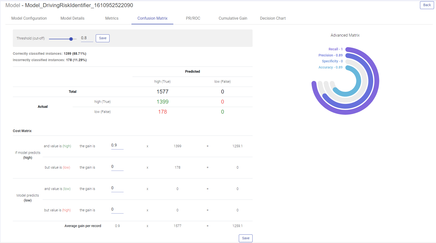
Advanced metrics
Recall, Precision, Specificity and Accuracy are calculated from the confusion matrix.
Recall: TP/(TP + FN)
Precision: TP / (TP + FP)
Specificity: TN / (TN + FP)
Accuracy: TP + FN / (TP + FP + TN + FN)
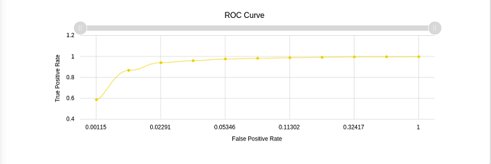
Precision Recall/ROC
ROC Curve:
ROC curves summarize the trade-off between the true positive rate and false positive rate for a predictive model using different probability thresholds.
X-axis shows false positive rate (False Positive/ (False Positive + True Negative)
Y-axis shows true positive rate (True Positive/ (True Positive + False Negative)
ROC curves are appropriate when the observations are balanced between each class.
Precision/Recall Curve:
Precision-Recall curves summarize the trade-off between the true positive rate (i.e. Recall) and the positive predictive value for a predictive model using different probability thresholds.
X-axis shows recall (True Positive/(True Positive + False Negative)
Y-axis shows precision (True Positive/(True Positive + False Positive)
Precision-recall curves are appropriate for imbalanced datasets.
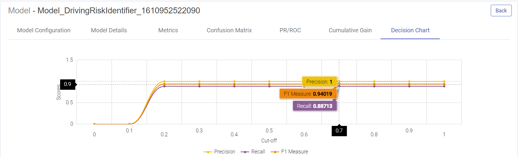
Decision Chart
You can generate the Decision charts for binary classification models to understand a clear picture on the performance of the model.
The decision chart is a plot which is made by varying threshold and computing different values of the precision, recall and FMeasure scores.
Density Chart
Plots the probability vs probability density of different Classes. The minimum the overlapping area between the two curves, the better the model is.

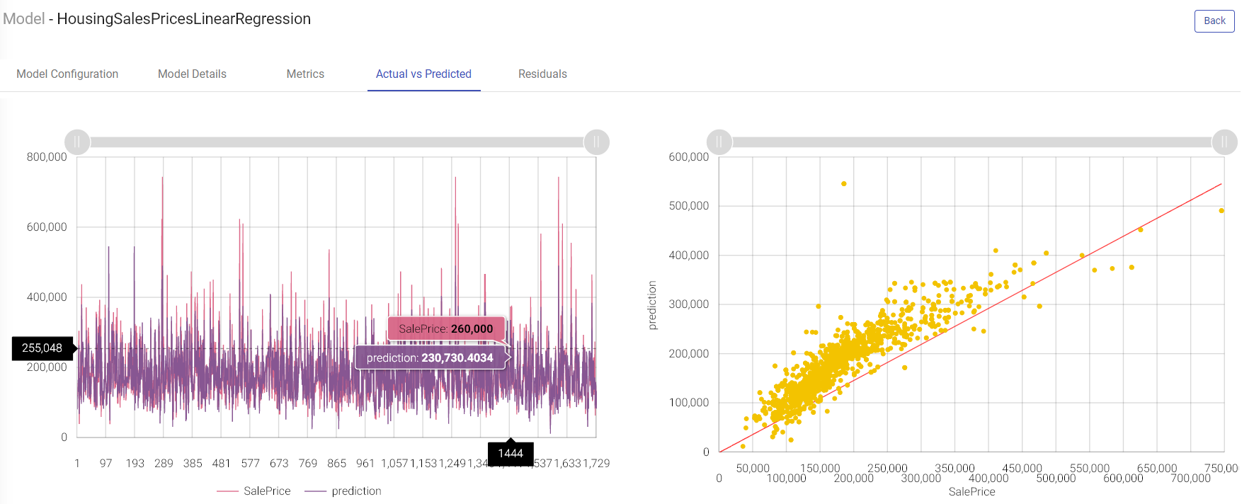
Actual vs Predicted
Line Chart:
Two lines plotted on the graph i.e. one for the actual data and another one for the predicted data. This graph provides us information about how accurate model predictions are. All the predicted data points should overlap the predicted data points.
Scatter Plot:
This graph is plotted between the actual and predicted variables.
The regression line represents the linear line learned by the model.
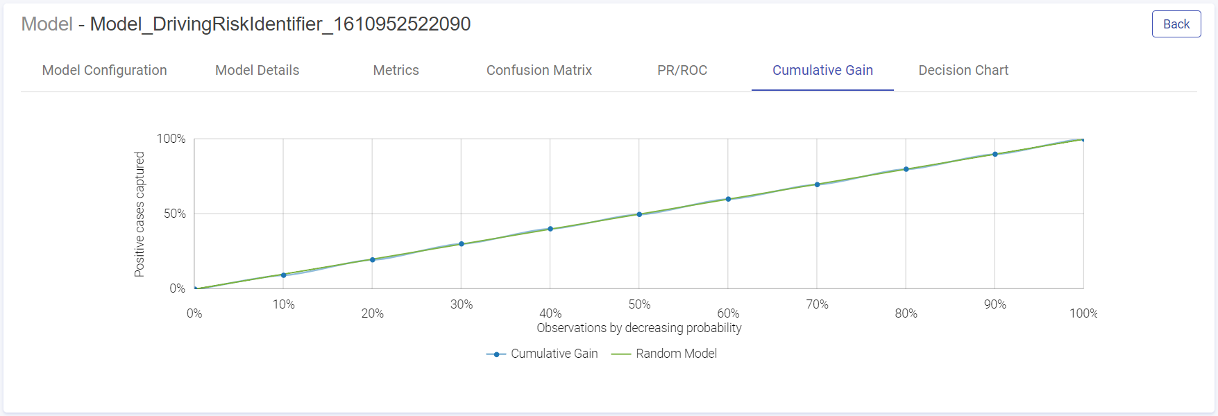
Cumulative Gain Charts
Cumulative Gain charts are used to evaluate performance of classification model. They measure how much better one can expect to do with the predictive model comparing without a model.
X-axis shows the estimated probability in descending order, splits into ten deciles.
Y-axis shows the percentage of cumulative positive responses in each decile i.e. cumulative positive cases captured in each decile divided by total number of positive cases.
Green dotted line denotes the random model.
Blue line is for the predictive model
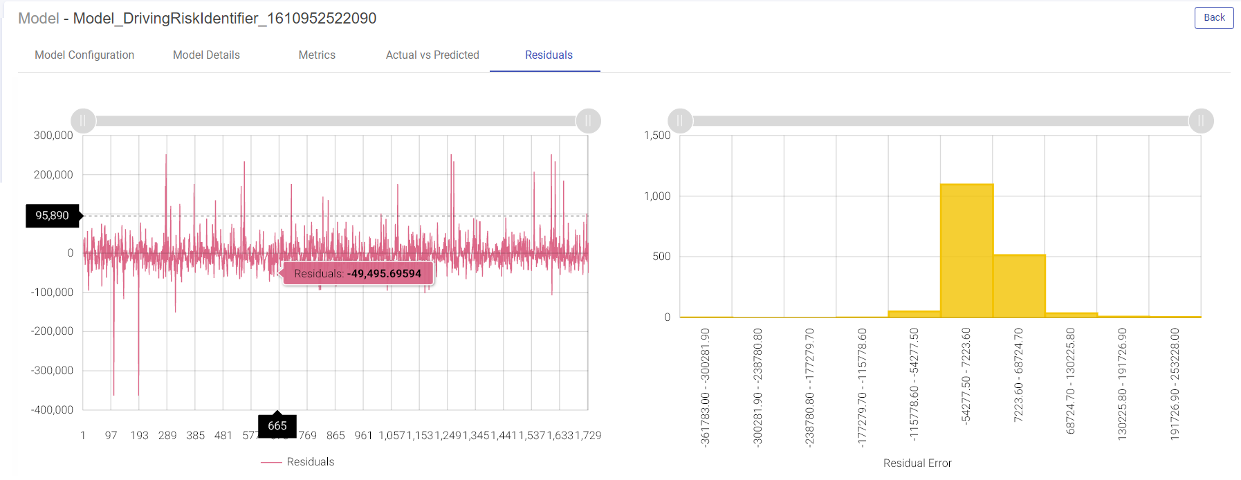
Residuals
Residual error is the difference between the actual value and the predicted values for the output variable.
Shown below are the two plotted graphs to visualize the residuals error for the training model. In the first graph, a line chart is plotted between the residual error on the y axis and the count of the test data rows on the x axis. In the second plot, a histogram is made where the residuals are plotted on the x axis and the record count on the y axis. Histogram helps in providing intuition about how many records are having a particular range of residuals error:
Model Deployment as Rest Service
Model as Service (H2O MOJO, Scikit, Spark)
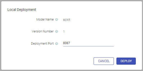
We can now deploy (H2O MOJO, Scikit, Spark) models as REST endpoints on Gathr. In the models page, under the Actions column click on the eye icon to view model versions. You will be redirected to the models version page. Under the Actions column, click the Deploy as service option. Select the Local option. As you click Local, the window appears with fields of model name, version number and deployment port. Mention the port where the model will be deployed. Click Deploy.
Once the model is successfully deployed, a message will be prompted on screen with the end point URL that can be copied on the clipboard.
The deployment indicator will also turn green specifying that the model has been locally deployed. As you hover over the button, you can see the end point URL of the locally deployed model.
Under the Actions column, the two new options that get visible are:
Terminate model service
Test model
Click the Test model. You may add headers in the test request.
In this window, an editable sample request is provided containing the features list for this model.
If you want to test a single record, mention the feature values in the request body or else you may upload a csv file to test multiple records.
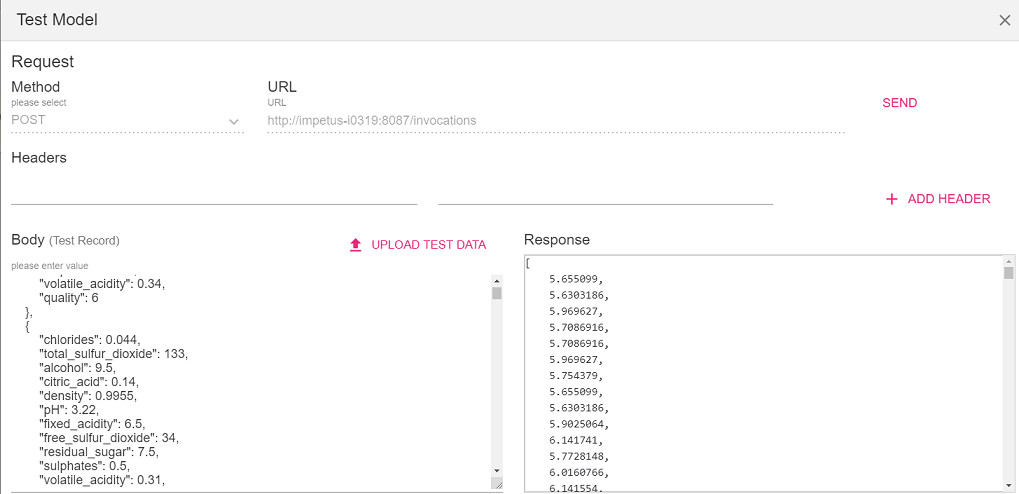
The uploaded file must contain the header row to map the feature values.
Click Send.
Terminate: You can terminate the model service deployed on the local server by clicking on the terminate button under the Actions column.
Data Drift
After a model is deployed into production, the statistical properties of the data may change over time in unpredicted ways. Due to this, the predictions become less accurate. In Gathr, the user can monitor the data drift patterns in the deployed model on regular intervals.
Enable Drift Detection
In the models page under actions column, click on the view model versions eye icon.
Under the Actions column, click on the Enable Drift Detection icon to configure drift detection. Upon clicking the icon, the Drift Detection configuration window pops up.
You may select the data source from which the model was trained from the below mentioned options:
Use Existing Dataset
Upload Sample Data
Select the Dataset and choose its version if any. Click OK.
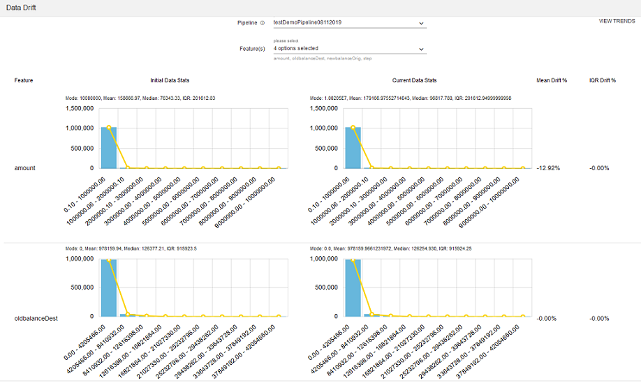
View Data Drift
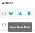
To view the data drift for the last 7 days, click on View Data Drift icon under the Actions column.
In the data drift window, choose the pipeline for which you want to see the data drift. You can select the features for which you want to view the initial data stats, current data stats, Mean Drift% and IQR Drift%

The View Trends depicts the trend of data drift for the selected features:
Data Drift Detector Configuration
To configure data drift with H20 (MOJO) model create a data pipeline with a source, H20 processor and data drift detector processor. Data drift detector processor is available under Analytics within the components palette of the data pipeline canvas.
| Field | Description |
|---|---|
| Algorithm | Select one of the algorithms: - Deep Learning - Distributed Random Forest - Gradient Boosting Machine - KMeans - Generalized Linear Modeling - Naïve Bayes |
| Model Name | Name of the model to be used for prediction. |
| Threshold% for Mean | Threshold% for mean drift notification in case of continuous column. Default value is 10. |
| Threshold% for IQR | Threshold% for IQR drift notification in case of continuous column. Default value is 10. |
| Threshold Euclidean Distance | Threshold Euclidean Distance for drift notification in case of categorical columns. |
| Frequency | Select the schedule for drift notification. |
| Data Snapshot Window | Window for data snapshot to calculate drift detection. |
If you have any feedback on Gathr documentation, please email us!